What furniture colors go well with each other. The combination of colors in interior design. Contrasting and harmonious pairs. Cool and soothing colors
We will send the material to you by e-mail
Choosing the right color palette is essential when decorating any space. So we'll talk about ways to combine colors in the interior and the effect of color on a person's mood. We will also see how the color combination table in the interior can help in self-planning the design of the room.
The color scheme is an important component of any interior.
It is necessary to know not only the meanings of each shade, the ability to correctly combine tones is important. To apply optimal color combinations in the interior, a color wheel and a design table are used.

Before learning about the options for combining shades, let's learn about their meanings in our lives. According to psychologists, they can have an impact on our mood and even our emotional state.
The color that gives a cheerful mood and warms with warmth is yellow. Green is considered the color of cheerfulness, freshness and health. Lilac tones symbolize renewal, while blue has calming properties. Orange is perfect for the living room, as it symbolizes joy and cheerfulness.
You should not use a significant amount of brown tones when decorating a room, only in combination with others, as it causes depression. Do not abuse red, which acts excitingly. Light grayish tones are more suitable for an office, as they indicate composure and rigor.
Designers presented and formulated several concepts related to combinations of shades. The table here has been created with the standard view of palette usage in mind.

You can use the following combinations:
- red shades look with white, golden and very dark tones;
- pink can be used with coffee, reddish and chocolate;
- beige is perfectly combined with salad tones, as well as with pink;
- yellow looks with white and green-brown;
- red, beige or gold will suit burgundy;
- to blue you can pick up purple, white or blue;
- brown is complemented by green, blue and beige.

When working on a solution, do not forget about incongruous colors. Black and purple do not look at all, such a tandem will only visually reduce the space. It is tasteless to combine burgundy with dark green. You can not use gray with orange and green. Milky and beige shades do not fit black at all.
Helpful information! Companion colors from the table must be selected individually in each case.
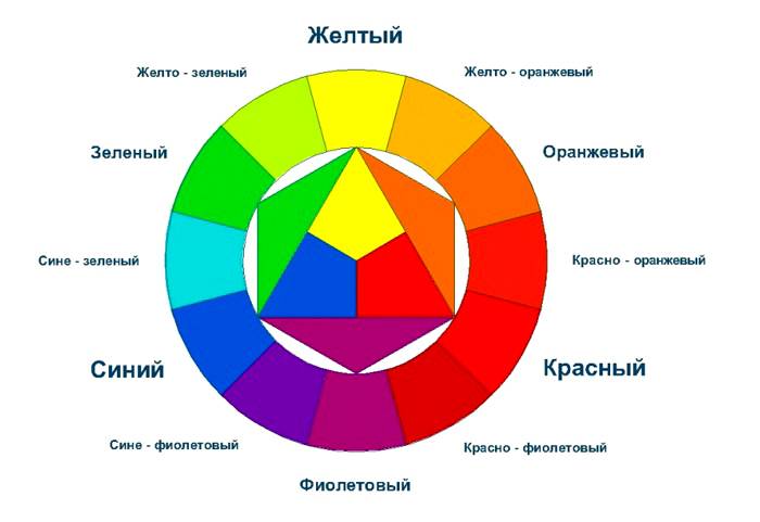
What is a color wheel?
In addition to the color combination table, the color wheel is used in the interior. With its help, the most suitable solutions are selected. The circuit is divided into two components - cold and warm. The latter option includes shades such as yellow, brick or orange. And the cold part is blue, purple and green.

Color palette of color combinations: options for interesting combinations
The table allows you to identify which color combinations can be used in the interior. Photos of the original methods are presented on the site. Particular attention should be paid to the ratio between coloring components and shades.

The combination of colors in the interior of the kitchen: photos of stylish ideas
In the kitchen area, by the way, there will be rich, deep and colorful shades. An interesting option is a yellow-blue palette in a marine style. Cold gamma relaxes, reduces appetite and gives freshness. A warm color palette stimulates the digestive system, increases appetite and invigorates.

When choosing a palette for the kitchen, achromatic interiors are rarely used. It is grey, white and black. This option can be smoothed out with a juicy accent.

In chromatic designs, a palette is a combination of multiple hues. First you need to figure out the base tone, and then think about a suitable environment for shades. For the kitchen, you can offer the following options:
- solid color combinations involve the use of shades in the same color scheme. All effects are produced by varying the intensity of the selected tone. To create a monochrome environment, choose a color and match it with three tones. Contrasting accents are used to enliven a monochromatic design;
- adjacent gamut - a combination of two or more colors that are located next to each other on the color wheel. For example, green and bluish, yellow and orange;
- the contrast scheme involves the use of combinations of tones opposite in the color spectrum. It can be green and yellow. In such an interior, the contrast should be smoothed out with softer tones;
- a three-color interior involves the use of three shades that are at an equal distance in the color wheel.

Harmonious color combination in the living room
The colors for the living room are chosen according to the preferences of the owner of the room. The main thing is to observe a harmonious combination of colors.

Preference should be given to those design options that meet certain parameters:
- monochrome combination looks good. This does not mean that the interior will be boring. After all, in one color you can distinguish more than 40 shades. For example, the wenge color in the interior is used for furniture and a combination from pink to purple is used. A similar design can be seen in the photo;

- looks good design in three colors;

- to choose colors on the color wheel, put an equilateral triangle on the circle and you will see a suitable solution;
- You can decorate the room in bright colors. A mint tone, a shade of vanilla or sand will do.

Helpful information! Terracotta shades are considered joyful and sunny. This color palette includes brown, carrot, brick and dark yellow tones.
What color palette is suitable for the bedroom?
When working on a combination of colors in the interior of the bedroom, keep in mind that you can not use more than seven shades. The best option is to choose two basic shades, for example, for the floor and walls, and all other items are selected according to tone, but can be darker or lighter.You can choose a classic design for the bedroom. In this case, coffee, beige and milky tones are used.

Terracotta, white and gray shades are suitable for style. To decorate a bedroom in a Mediterranean style, turquoise, blue, sand and yellow shades are suitable. Provence style involves the use of pink, green, blue and gray shades.

An article on how to correctly arrange colors in the interior. Examples of successful design solutions.
Listening to the conflicting advice of designers, you can endlessly choose the color of the curtains for the wallpaper or the wallpaper for the color of the furniture. But there is an easier way: nature has already created many harmonious and bewitching color combinations, and a person is arranged in such a way that it is these ranges of shades that are most pleasant for him.
Neutral natural shades in the interior, a combination with green: ideas, photos
Imagine a landscape that pleases the eye. Pay attention to dominant colors and bright accents. If you repeat this combination of colors in the interior, it will be successful.


For example, you already have a light alder-colored linoleum that resembles river sand. So you can complement it with light greens, golden orange or delicate blue, but by no means dark purple, because such a combination of colors is difficult to find in wildlife.
Interior in combination with white: ideas, photos
Snow-white wallpaper in the bedroom evokes thoughts of winter. Light shiny curtains and soft white textiles, similar to fallen snow, will suit them.
Bedroom in combination with white and gray
The correct combination of colors in the interior: table
It happens that the cosmetic repairs are completed, but in the room, as if something is missing, I want to add some kind of “zest”, to make a color accent. At the same time, there are fears that objects of a different color, be it sofa cushions, lamps or paintings, will not fit into the overall range and will look completely different.
The color combination table will help you make the right choice.


There are some general rules for arranging colors:
- As in clothes, in the interior, more than three colors should not be combined, everything more is too much. With the difference that when it comes to the interior, color means its whole gamut, that is, light green and grassy - this is one and the same color.
- Light shades visually expand the space, while dark ones, on the contrary, narrow it. The same can be said about the drawing: it seems that the wall with a small pattern is located further than the same wall with large elements on the wallpaper.
- If there are more than two colors in the room, then they should be in harmony with each other in saturation. For example, bright lemon and orange chairs in the kitchen or colorful pastel sofa cushions. It is desirable that the texture of objects is also the same
How to choose a good combination of beige color in the interior: a play of shades, ideas for a light interior
Beige is considered a basic and neutral color, but it can be very different. Beige can be grey, pink or warm yellow. Please note that the top color in each of the photos can be called beige, but these colors are all different! If your design project calls for another color, choose beige with its notes.


For a classic design, a combination of beige with white, gray and dark wood is suitable. It is this unobtrusive range that is often used for the most luxurious living rooms.


The combination of gray in the interior in a modern style: ideas, photos
Gray evokes thoughts of rainy weather and autumn slush. But this is one of the basic colors of high-tech style! What else should be present in an urban space besides gray? Lots of glass, metal and, preferably, neon lights.


In a classic design, the combination of gray and white is also quite appropriate. Agree, gray furniture is much more practical than white.


How to choose a good combination of colors in the bedroom: ideas, photo projects
It is believed that the bedroom should be a place of rest and therefore it is better for her to choose an unobtrusive light interior in pastel colors.


Interior in dark colors
But in luxury hotels, bedrooms, on the contrary, often use deep dark shades, the interior in dark colors makes the room visually smaller and more comfortable. In such a bedroom it is easier to fall asleep if it is day outside. So, for example, the presidential suite in one of the Hilton hotels looks like:


Psychologists say that the color of the interior in the bedroom should be chosen in accordance with the character of its owner: orange and lemon color will give a charge of vivacity.
For those who cannot fall asleep for a long time, a combination of green color in the interior with white is suitable, which embodies calmness and lightness.
The combination of brown in the interior: ideas, photos
Rich chocolate shades, look simply luxurious. The combination of brown in the interior with white will make the interior lighter.
Dark shades visually make objects heavier, so they are usually used below. For example, a dark brown base of the bed and the same bottom of the walls and a light bed and ceiling.
The appropriate combination of colors in the living room in bright colors: ideas, photos
The interior of the living room is different, ranging from minimalism to classic baroque, with its excessive pretentiousness and an abundance of curlicues. And for each style it is appropriate to choose an interior in white colors. But white itself looks too sterile, so it will not be superfluous to dilute it with bright colors.
In combination with light green and tropical plants, a white living room will evoke completely different associations. It will become like a board of a yacht or a cruise ship floating somewhere in the tropics.


There is a certain rustic simplicity in the Provence style, but such an interior seems cozy and cute.

 Living room from Provence
 Interior in white and black colors: ideas, photos
For a strict and restrained living room, an interior in white and black colors is suitable. The charcoal black color seems to be created in order to emphasize the geometric regularity of the forms. Shades of gray will help smooth out the contrast a little.
Photo wallpapers are not in fashion now, but in black and white they will look stylish and become the hallmark of the interior.


A bright combination of colors in the kitchen: ideas, photos
The kitchen is a room for which you can choose bright juicy colors without fear of overdoing it. The only rule is that there should be only one bright motif in the interior, for example, the color of fuchsia.

Some argue that supposedly juicy color combinations stimulate the appetite and are therefore not suitable for those on a diet. In search of a compromise, you can choose white and black in the interior, and then add red notes. Such a kitchen interior looks both bright and discreet at the same time.

Lovers of spring greenery should like the interior of the kitchen in these colors, the combination of green in the interior with wooden facades looks natural.


Ideas for combining colors in an apartment: photo
To create the impression of a common space, there must be something in common in all rooms of the apartment. It can be a combination of colors or the same color that is present in every room.


The impression of unity of interiors can be achieved without the help of color, using the same textures and finishes, for example, a glossy ceiling and embossed wallpaper everywhere. It helps to visually unite the rooms and the same flooring, if there are no thresholds between the rooms, and they have the same decorative elements, it seems that they smoothly flow into each other.
Color is a powerful tool in creating comfort. Beautiful interiors are inconceivable without a harmonious combination of shades. How to choose a palette so that you feel comfortable, can relax after a busy day, and wake up in the morning, full of strength?
How to decide on a color?
There are many different theories as to which paints to use for certain rooms. At the same time, you yourself decide in which color scheme you feel better.
For example, there are people who love their houses decorated in black, red and white. And for some, this combination has a negative effect, because it increases blood pressure and provokes the release of adrenaline.
The first question a designer asks his clients is: “What is your favorite color?” And if family members cannot come to a consensus, the specialist tries to make friends with their favorite shades in a single combination and find compromises that suit customers.
How to understand which color you like more than many others? Just choose any image that is pleasing to your eyes. With the help of special services, for example, Bighugelabs, you can determine the palette of each image and photograph.
In this case, the program will mix the shades and give an average result of three or five tones. You can see the accents in the original picture and use these colors in the interior.
If you don't find anything suitable, you can use the color wheel. Online services like Colorscheme help you find harmonious combinations for monochrome, contrast and accent palettes. In this case, you can change the degree of lightness of the main tone, darkening or brightening it.
Important! In order for the interior to look professional, it is necessary that the main color occupy at least 65% of the entire space. The remaining 35% is distributed to additional shades. And about 5% of the space is allocated for accents.

For example, if your main color is chocolate and you want to use 5 different colors, then 65% will take the main tone.

In our case, it will be on the sofa, wardrobe and armchair. A companion to him will be gentle turquoise on the walls. And as an accent, use orange pillows and curtains. At the same time, a delicate toffee in the form of parquet will appear on the floor. And the cherry on the cake will be mint or mustard greens in the form of a discreet bouquet.
Style and color
Each style has its own palette, from which you should not deviate. Bringing, for example, neon colors into a classic interior, you will get kitsch on the verge of bad taste.
Physiologically, a person evaluates the environment as safe and stable when the darkest shade is under the feet, the middle tones are at eye level, and sky-white shades extend overhead.


At the same time, modern interiors show that designers love to play pranks and turn everything upside down. Therefore, we can find chocolate and even black stretch ceilings over beige and white floors.
So, before you is a style sheet and color schemes.
| Colour | Style | Combination with other colors | Suitable for: | Peculiarities |
| White | Modern, classic, modern | All | All rooms | Adds airiness and space |
| Grey | Provence, country, classic | Yellow, green, red, orange, black, white, purple | Study room, living room, teen room, kitchen | Neutral color. Suitable for relaxing |
| Black | Art Deco, high-tech, modern, loft, minimalism | Purple, white, gold, red, orange | Large living room | Visually reduces space, associated with luxury |
| Red | Modern, high-tech, minimalism, classic, art deco | White, brown, purple, grey, orange | Living room, kitchen | Activates the optic nerve |
| Orange | Modern, provence, minimalism, modern | Beige, black, white, blue, green, red | Living room, kitchen | Stimulates appetite, associated with oranges |
| Yellow | Modern, minimalism, Provence | White, Grey, Purple, Brown, Black, Red, Blue | Spacious living room, children's room | Reminiscent of summer, the sun, uplifting. Often used for emphasis. |
| Green | Classic, Country, Modern | Beige, brown, white, grey, yellow | Kitchen living room, hall, nursery, kitchen, bathroom | Adds freshness to the interior |
| Pink | Modern, classic, shabby chic, country | Black, red, purple, white, gray | Children's room for girls, living room, kitchen | Pastel pink is soothing, bright pink is tiring. |
| Blue | Classic, high-tech, country, loft | White, green, red, grey, brown, yellow, black | Large living room, children's room, kitchen, bathroom, toilet, studio apartment | Adds solidity and at the same time calmness. Embodies originality and practicality. |
| Violet | High tech, classic, loft | White, pink, green, yellow, black, blue | Studio apartment, bathroom, living room, kitchen, children's room, bedroom | Associated with lilac, spring shades |
| Brown | Modern, country, provence, classic | White, red, green, grey, purple, yellow, black, orange, beige | Living room, kitchen, bedroom, corridor, bathroom, study | Creates a homely atmosphere, adds coziness and warmth |
If you follow the recommendations of designers and use color palettes according to the style, you will always win. Use the color wheel in situations where you are in doubt about choosing one or another element of the interior. And better - entrust the creation of the project to the masters. In this case, your home is guaranteed to be decorated with taste and in full accordance with the chosen style.

Rules for choosing colors for floors, walls, furniture and ceilings
So, we figured out which color goes with which. Next, we will dwell on the objects that are present in each room, we will understand the principles of using certain shades.
Floor
There are a few unspoken rules to keep in mind when choosing a floor color scheme.
Light floor:
- Increases space.
- It is a reflective fabric.
- Can be used on light colored walls.
- Suitable for bedroom, bathroom, toilet, living room

Dark floor:
- It is combined with both light walls, ceiling, and dark ones. But it should be at least 1 tone darker.
- Suitable for any room.
- Against its background, bright accents look good, in the presence of good lighting.
- It does not go well with a dark door.


Walls
Walls can be done in absolutely any color. Depending on the purpose of the room used, it can be active, passive or neutral.

Active colors are an accent. They are combined either with the opposite bright color, or less bright, calm.


A popular solution is pastel-colored walls. They play the role of the background of the main view of the room. In this case, you can use any floor, furniture, ceiling. Since this is a universal option.
Ceiling
The ceiling is most often chosen in white or light shades. Since it is a universal color and can be combined with any furniture, ceiling, floor. May be matte or glossy. If you want to add contrasts, then it is better to add a rich color to the walls or interior items. Can be used in any room.

If the choice fell on a dark ceiling, then it is worth considering a few nuances:
- A black ceiling can only be done in a large space with high ceilings. The minimum height is 3 meters.
- It is combined only with white and light furniture and the milky color of walls, floors, furniture
- Suitable minimalist style
- Create the effect of high cost in a room with panoramic windows

Furniture
When choosing the color of furniture, remember about 2 basic principles:
- It should be darker than the walls
- Lighter than the floor


9 successful color combinations in the interior of the apartment


To test your subjective attitude towards color combinations worth a look at the natural world around. After all, we are part of it and nothing natural is alien to us. Nature lives in a state of halftones, shades and shadows. There are no predominant monochrome colors here. Sand sunset changing orange, red, and sometimes, closer to the horizon, with brown waves against the background of a graying sky - such a picture cannot but inspire!
So why is it that our desire for natural creation does not always harmonize with color schemes in everyday life? Maybe a meager wallet or, conversely, feigned status dictate the conditions for choosing finishing materials, furniture and decor elements? You can come to a harmonious solution with any budget, you just need to know how. Let's consider everything in order.
We know that the tricolor spectrum of red, blue and yellow serves as the basis for the so-called circle of flowers. When paired, auxiliary colors are formed, and when mixing more than three colors or adding white or black shades are obtained that can be created indefinitely.
According to the gamut, colors are divided into cold (blue groups) and warm (yellow groups), which have their own purpose in interior design. So that a large room does not seem empty and uncomfortable, they use sunny, light colors, and in small rooms, groups of blue colors convey the theme of the sky.
| Main color | Matches with flowers | Doesn't match colors | Color influence |
|---|---|---|---|
| grey | blue, pink, brown, yellow, red, black, blue, lilac | green, orange | betrays the room despondency and sadness |
| lilac | grey, chestnut, light purple | red, orange, yellow, brown, black | mystical, mysterious and mysterious interior |
| Violet | light green, golden, orange, yellow | dark green, brown, grey, red | allows you to calm down a person, to find harmony of the soul. Purple is the color of wisdom and inspiration. |
| pink | brown, grey, burgundy | yellow, orange, black | romantic interior |
| brown | golden, grey, beige, pink, yellow | chestnut, burgundy, lilac | causes depression when staying in an interior with a predominance of brown for a long time |
| blue | red, gray, burgundy, golden | green, lilac, brown | makes the room cool sometimes uncomfortable |
| blue | red, orange, blue, light purple | golden, yellow, burgundy | makes the interior cold, if the blue color is turned on too much in the room, scandals occur more often |
| green | red, black, wine red, yellow, orange | grey, purple, blue | has a calming and relaxing effect |
| yellow | grey, purple, brown, green, black | lilac, blue, burgundy, pink | the illusion of sunlight, yellow color gives a good mood and cheerfulness |
| red | blue, green, grey, golden, yellow, black | purple, chestnut, brown | uplifting, does not let you relax, suitable for passionate people |
| white | it is combined with any colors and their shades, as it contains all the spectrums of colors | there are none | inspires a sense of superiority, makes the room cold |
| black | red, grey, white, yellow, green | pink, lilac, beige | narrows the space, instills fear in a person, makes the interior mysterious |
Combinations of shades and colors in different rooms
Important! Not only volume affects the choice of color, but also the intended purpose of each room differs in its specific design.
Color combinations in the interior of the bedroom: warm colors
The combination of colors in the interior of the living room
To retell its essence in brief, then any period in the life of a child after 6 years, a teenager or an adult corresponds to a specific color or shade in which he feels most comfortable. Of course, this does not mean at all that you need to re-paste the wallpaper every year or buy new furniture! It will be enough just occasionally to complement the design of the children's room with accents and accessories in the appropriate color scheme:
Color combinations in the interior of the bathroom and toilet
Bathroom, which has a standard small size, it is not customary to decorate with halftones. Pure compositions of rose, dairy, turquoise accents always look advantageous. As an exception, to create a special contrast with snow-white baths and faience use red, blue, chocolate and black with golden streaks.
The combination of colors in the interior of the kitchen
The kitchen should evoke a hint that it would be nice to have a bite to eat. So that not only the smells or the look of cooked dishes arouse appetite, but also on a subconscious level walls, ceiling, accessories, furniture, dishes would enhance it. Contrasting yellow, orange, lilac, red, light green tones in combination with shading colors will direct your choice in the right direction.
Cold light blue or, conversely, muted coffee, sunny, beige tones can also be used in the kitchen (quite common). Such decisions are conducive to a leisurely conversation at the table, careful chewing, measured reading of the newspaper.
The combination of colors in the interior: combinatorics
In order to avoid visual overwork or, conversely, boring monotony, the selection of colors should take into account three main types of combination - uniformity, contrast, balance. The range of colors in the first case is reduced to one color with fluctuations in light and dark tones. As a rule, a monochromatic finish is diluted with decorative elements of one or two colors.
Guys, we put our soul into the site. Thanks for that
for discovering this beauty. Thanks for the inspiration and goosebumps.
Join us at Facebook and In contact with
Scheme No. 1. Complementary combination
Complementary, or additional, contrasting, are colors that are located on opposite sides of the Itten color wheel. Their combination looks very lively and energetic, especially with maximum color saturation.
Scheme number 2. Triad - a combination of 3 colors
The combination of 3 colors lying at the same distance from each other. Provides high contrast while maintaining harmony. Such a composition looks quite lively even when using pale and desaturated colors.
Scheme No. 3. A similar combination
A combination of 2 to 5 colors located next to each other on the color wheel (ideally 2-3 colors). Impression: calm, relaxing. An example of a combination of similar muted colors: yellow-orange, yellow, yellow-green, green, blue-green.
Scheme No. 4. Separate-complementary combination
A variant of a complementary combination of colors, only instead of the opposite color, the colors adjacent to it are used. The combination of the main color and two additional. This scheme looks almost as contrasting, but not so tense. If you are not sure that you can use complementary combinations correctly, use separate-complementary ones.
Scheme number 5. Tetrad - a combination of 4 colors
A color scheme where one color is the main one, two are complementary, and another highlights the accents. Example: blue-green, blue-violet, red-orange, yellow-orange.
Scheme number 6. Square
Combinations of individual colors
- White: goes with everything. The best combination with blue, red and black.
- Beige: with blue, brown, emerald, black, red, white.
- Gray: with fuchsia, red, purple, pink, blue.
- Pink: with brown, white, mint green, olive, gray, turquoise, baby blue.
- Fuchsia (dark pink): with gray, tan, lime, mint green, brown.
- Red: with yellow, white, brown, green, blue and black.
- Tomato red: blue, mint green, sandy, creamy white, gray.
- Cherry red: azure, gray, light orange, sandy, pale yellow, beige.
- Raspberry red: white, black, damask rose.
- Brown: bright blue, cream, pink, fawn, green, beige.
- Light brown: pale yellow, creamy white, blue, green, purple, red.
- Dark brown: lemon yellow, sky blue, mint green, purplish pink, lime.
- Reddish brown: pink, dark brown, blue, green, purple.
- Orange: blue, blue, purple, purple, white, black.
- Light orange: gray, brown, olive.
- Dark orange: pale yellow, olive, brown, cherry.
- Yellow: blue, mauve, light blue, purple, grey, black.
- Lemon yellow: cherry red, brown, blue, grey.
- Pale yellow: fuchsia, gray, brown, shades of red, tan, blue, purple.
- Golden yellow: gray, brown, azure, red, black.
- Olive: orange, light brown, brown.
- Green: golden brown, orange, lettuce, yellow, brown, grey, cream, black, creamy white.
- Salad color: brown, tan, fawn, gray, dark blue, red, gray.
- Turquoise: fuchsia, cherry red, yellow, brown, cream, dark purple.
- Electrician is beautiful in combination with golden yellow, brown, light brown, gray or silver.
- Blue: red, grey, brown, orange, pink, white, yellow.
- Dark blue: light purple, sky blue, yellowish green, brown, gray, pale yellow, orange, green, red, white.
- Lilac: orange, pink, dark purple, olive, grey, yellow, white.
- Dark purple: golden brown, pale yellow, gray, turquoise, mint green, light orange.
- Black is versatile, elegant, looks in all combinations, best with orange, pink, salad, white, red, lilac or yellow.