Color harmonies in design. Color harmony. Harmony of contrasting colors
Harmony is a philosophical and aesthetic category, meaning integrity, unity, regular connection of all parts and elements of the form, i.e. this is a high level of orderliness of diversity and the correspondence of parts as part of a whole that meets the aesthetic criteria of perfection and beauty.
Color harmony is a combination of individual colors or color sets that form an organic whole and evoke an aesthetic experience.
Color harmony in design is a certain combination of colors, taking into account all their main characteristics, such as
- - color tone;
- - lightness;
- - saturation;
- - forms;
- - the dimensions occupied by these colors on the plane, their mutual arrangement in space, which leads to color unity and has the most favorable aesthetic effect on a person.
Signs of color harmony:
- 1) Communication and smoothness. The connecting factor can be: monochrome, achromaticity, unifying submixtures or raids (mixture of white, gray, black), shift to any color tone, gamma.
- 2) The unity of opposites, or contrast. Types of contrast: by brightness (dark-light, black-white, etc.), by saturation (pure and mixed), by color tone (additional or contrast combinations).
- 3) Measure. Those. in a composition brought to harmony there is nothing to add and take away.
- 4) Proportionality, or the ratio of parts (objects or phenomena) to each other and to the whole. In gamma, it is a similarity to the ratios of brightness, saturation, and color tones. Consider the ratio of the areas of color spots:
- 1 part bright field -- 3-4 parts dark field;
- 1 part pure color - 4-5 parts muted;
- 1 part chromotic - 3-4 parts achromatic.
- 5) Balance. The colors in the composition should be balanced.
- 6) Clarity and ease of perception.
- 7) Beautiful, striving for beauty. Psychologically negative colors, dissonances are unacceptable.
- 8) Sublime, i.e. perfect combination of colors.
- 9) Organization, order and rationality.
Classical harmony should avoid color combinations in the middle interval of the circle: Orange-Green, Violet-Cyan, Purple-Orange; these colors are neither close nor far, they, according to Goethe, have no clarity of expression. Goethe's classic color combination:
harmoniously combined Orange-Blue, Yellow-Purple, Red-Green;
characterless juxtaposition: Yellow-Orange, Orange-Red, Red-Violet, Violet-Blue;
inharmonious combination: Yellow-Green, Green-Blue.
The combination of colors from the standpoint of decorativeness. Harmony is always higher and wider than the concept of "decorative". Decorativeness can be described as a certain maximum of aesthetic quality. From the position of decorativeness, the traditionally harmonious triad of colors is Red, White, Black.
Explanations:
- - Badly
- -- Very bad
Depends on the degree of harmonization.
As you know, all the colors that we see can be divided into achromatic (white, black, shades of gray - there are no color waves, there is only lighting.) and chromatic (colors of the spectrum, color waves that our eye perceives). Color waves smoothly transition into each other, creating color continuum- continuous smooth color change.
These two directions do not exist separately, chromatic colors (the whole continuum) are mixed with achromatic ones, which gives the whole gamut of shades
that our eyes see. The whole gamut is most successfully represented in Munsell's three-dimensional "Tree". 
Impurities of different achromatic colors form different tone directions.
If you mix a pure color with white, you get light colors with black dark.
If we talk about color as color waves, then gray is a mixture of color with its opposite (i.e., for example, orange and blue), two waves "extinguish" each other and color saturation is lost. Therefore, soft colors (mixed with gray pigment, with the opposite wave, in fact) look "complex, nuanced." So, blending with gray gives " soft
colors". 
If we talk about artistic color harmony, then not all chromatic colors of the continuum look good with each other, they are combined with a certain rhythm. Colors with a golden undertone are considered warm , colors with blue - cold . There are also neutral colors in terms of temperature characteristics, which are in a continuum between two shades.

Altogether, we have 6 color characteristics, 3 pairs of dichotomies
.
Dichotomy is a scale. It's not so much a choice of either-or as being on that scale. For example, both colors can be warm, but one is a pronounced warm and the other is closer to neutrals.
Commonly recognized color characteristics are:
Lightness: light
(with white admixture) or dark
(with black admixture).
Brightness (Saturation): bright
(almost pure, rich pigment) or soft
(little pigment, proximity to gray, gray impurity)
Hue (color's place in the continuum). This includes just the division of colors into warm
(with a golden undertone) or cold
(with blue undertone)

Any color is described by all three characteristics, however, they are expressed with different intensity.. This provides a variety of shades. The characteristic that is most pronounced has the strongest effect on the perception of color, the remaining characteristics make adjustments. If you combine all the color characteristics, you get 48 options - 48 color transitions
. I have already told you how they pass into each other. This is an absolutely unique author's development, so I think there will be no questions about what system I work on - I work on MY "Color Harmony" system, built entirely on color theory, due to which it is more accurate than most other color theories, if not everyone. 
All the colors of the continuum can be divided into these cells with blurry borders. However, in practical use 48 palettes is a lot, too many colors will be repeated. Therefore, it is best to reduce the number of palettes to 12. why to 12? I'll explain now. As I said, the most pronounced characteristic affects the perception of color and its compatibility with others. So, we have 6 directions - bright colors, soft, light, dark, warm, cold. In bright colors, first of all, you can see the purity of color, in soft colors - a gray impurity or "complexity" of color, in dark colors - depth, darkness, in light colors - whiteness, airiness, in warm ones - gold, warmth, in cold ones - ice, blue.
Compare cold soft coloring and soft cold. In the first case, blue, cold catches the eye. in the second - complexity, a gray impurity.


The temperature characteristic is also important to us - since it is precisely when the temperature subtone does not match that the skin optically reacts with unpleasant effects (yellowing, pallor, redness, colored shadows) - this is optics. The waves overlap each other and give an unnatural color.
Therefore, those areas where the temperature characteristic is not the first should be divided into two more subgroups.
It turns out bright warm, bright cold, soft warm, soft cold, light warm, light cold, dark warm, dark cold.
In the case of colors, where the temperature characteristic is leading, brightness is important - pure colors or complex ones. Therefore, they are divided in this way: warm bright and warm soft, cold bright and cold soft.
It turns out 12 colors, and Simplified color globe will look like this:

Some color schemes use the old "seasonal" color names, which do not affect anything other than terminology. 
Each person falls into one color out of 12, but with certain amendments and individual transitions. All colors of a person's appearance have the same set of characteristics. , it doesn’t happen that the skin is cold, and the eyes are warm, everything is painted from the same palette, otherwise the colors of your appearance would not be harmonious. It's the law of nature =)


All colors within the main color are suitable for a person, and in addition to them, some colors of neighboring colors are suitable, which are simply added to the individual palette. These supplements vary from person to person.
And I present myself 12 colors that you, in principle, are already familiar with.
I will call them according to their characteristics, although let the seasonal names remain for the terminology correlation =)
And a little bonus - the palettes now have Pantone coordinates (Large resolution pictures can be downloaded from Google Drive https://drive.google.com/file/d/0B2SlBFbzV-EYOHZYSFlRa19YY1E/edit?usp=sharing , reposting pictures in other places is welcome , but only if you link to us =)), in addition, I added some palettes. Pantone colors are requested very often. Although in domestic use it is easier for customers to use classic 12 tone such as these.

And .. I present 12 colors. Each of them causes some associations, I will also give them, but color is not limited to these associations - they will only let you feel the "spirit" of flowers, that make up the palette. But in any particular case, colors can carry different associations (!) depending on their use. But I hope I will be able to show all the colors from their best side =) After the name of each palette there will be links to my pinterest, where I will gradually collect colors and associations, this will help you imagine the colors "in action".
Bright cold colors. ("Bright Winter") "Impressive" palette - "impressive" .
Leading characteristic - brightness, additional - neutral - cold. It can be both relatively light and relatively dark. Often contrasting in lightness. The colors are pure, either without obvious impurities, or with a bluish impurity.
The overall impression of the palette is brightness, catchiness, although there is also some restraint due to the blue undertone.
The palette is reminiscent of a winter landscape on a bright day with color contrasts of pure colors, whites, blacks, reds and cool greens, or tropical islands with vibrant birds, flowers, turquoise water, blue skies and emerald greens.

Bright warm color. ("Bright Spring"). Creative Palette - "Creative" palette.
www.pinterest.com/shahrazade/ch-bright-a nd-warm/
The leading characteristic is brightness. Additional - neutral - warm. It can be both relatively light and relatively dark in color. The colors are pure, either without obvious impurities, or with a bright golden impurity.
The palette is associated with the world of South Asia, with the bright clothes of the inhabitants of this region, splashes of color in their manner of combining colors, with the cheerful colors of tropical nature.

Soft cold color ("Soft summer") - Mysterious Palette - Mysterious palette
The leading characteristic is softness, additional - neutral - cold. It can be both relatively light and relatively dark. The colors are softened, with a gray impurity or grayish blue.
The palette is associated with twilight, fog, forest before rain, creates the impression of mystery, understatement, riddle. The colors are very complex and nuanced.

Soft warm color ("Soft Autumn") - "Sensual Palette" - "Sensual" palette
The leading characteristic is softness, additional - neutral - warm. It can be both relatively light and rather dark in color. The colors are softened, with a grayish admixture or with a softened ocher.
The palette is associated with earthly sensual femininity, with the time before sunset, when the sun paints everything in soft golden tones, with the gifts of the Mediterranean nature - the greenery and gold of the fields, with grapes, cinnamon, olives, figs.

Dark cold color ("Dark Winter") "Luxorious Palette" - "Chic" palette
Leading characteristic - dark, additional - neutral - cold. It can be both quite bright and slightly softened. The colors are deep with a black admixture or with a dark blue.
It is associated with the luxury of royal courts, with velvet of deep burgundy, purple, lilac, blue hues, with rubies, emeralds, jade and malachite, as well as with a dark night and the depth of a dark blue sky.

Dark warm color ("Dark Autumn") - "Exotic Palette" - "Exotic" Palette
Leading characteristic - dark, additional - neutral - warm. It can be both quite soft and quite bright. The colors are deep, with a black or dark ocher touch.
Associated with the colors of the Middle East - with the rich furnishings of Moroccan interiors, the gold of natural lights, the warmth of spices, the sensual complexity of colors, the rich colors of southern nature.

Light cold color ("Bright Summer") - "Innocent Palette" ("Innocent" palette)
Leading characteristic - light, additional - neutral - cold. It can be both quite bright and quite soft. The colors are light, pastel, with a white or light blue admixture.
The palette is associated with tenderness, freshness, childhood, as well as seaside holidays, with light turquoise water, light greenery, yellowish white sand, delicate flowers and carelessness.

Light warm color ("Bright Spring") - "Tender Palette" - "Delicate" palette.
Leading characteristic - light, additional - neutral - warm. It can be both quite bright and quite soft. The colors are light, cheerful, with a white or light golden admixture.
The palette is associated with youth, joy, flowering fruit trees, all colors are pierced with delicate gold and remind of the rebirth of nature.

Warm bright color ("Warm Spring") - "Lively Palette" - "Cheerful" palette
The leading characteristic is warm, the additional one is bright. It can be both quite light and quite dark. Colors with a clear bright golden undertone.
The palette is associated with a meadow in the midst of spring with many colors of bright colors - lilac, yellow, red, purple, with the golden color of the sun and the blue of the spring sky.

Warm soft color ("Warm autumn") - "Spicy palette" - "Spice Palette"
http://www.pinterest.com/shahrazade/ch-warm-and-soft/
The leading characteristic is warm, additional - soft. It can be both quite light and quite dark. Colors with a clear ocher undertone.
The palette is associated with spices - pepper, turmeric, cloves, saffron, mustard and with autumn nature, deep blue water and warm foliage colors.

Cold bright color ("Cold Winter") - "Noble Palette", "Noble" palette
The leading characteristic is cold, the additional characteristic is bright. It can be both quite dark and quite light. Colors with bright blue undertones.
The palette is associated with the world of the Snow Queen - with icy luxury, detachment and some drama, this is a palette of precious stones.

Cold soft color - ("cold summer") - "Elegant Palette" - "Elegant" palette.
The leading characteristic is cold, the additional characteristic is soft, it can be both quite light and quite dark. Colors with a soft blue undertone.
The palette is associated with elegance, with the restrained colors of the northern summer with blue cool water, bluish-green summer foliage and hints of berries.

All information in this article is the intellectual property of the author, so the repost is only with an indication of the source. =)
Path to Your Charm Project 2014, Color Harmony 2014
Color harmony
When people talk about color harmony, they are evaluating the impression of two or more colors interacting. Painting and observations of the subjective color preferences of various people speak of ambiguous ideas about harmony and disharmony. As a rule, the assessment of harmony or dissonance is caused by a feeling of pleasant-unpleasant or attractive-unattractive. Such judgments are based on personal opinion and are not objective.
The concept of color harmony should be withdrawn from the realm of subjective feelings and transferred to the realm of objective laws.
Harmony is balance, symmetry of forces.
The physiologist Ewald Hering owns the following remark: “The average or neutral gray color corresponds to the state of the optical substance in which dissimilation - the expenditure of forces expended on the perception of color, and assimilation - their restoration - are balanced. This means that the average gray color creates a state of equilibrium in the eyes. Hering proved that the eye and the brain need a medium gray, otherwise, in its absence, they lose their calm.
The processes that take place in visual perception cause corresponding mental sensations. In this case, the harmony in our visual apparatus testifies to the psychophysical state of equilibrium, in which the dissimilation and assimilation of the visual substance are the same. Neutral gray corresponds to this condition.
Two or more colors are harmonious if their mixture is a neutral gray.
All other color combinations that do not give us gray become expressive or disharmonious in nature. In painting, there are many works with one-sided expressive intonation, and their color composition, from the point of view of the above, is not harmonious. These works are irritating and too exciting with their emphatically insistent use of any one predominant color. There is no need to argue that color compositions must necessarily be harmonious, and when Seurat says that art is harmony, he confuses the artistic means and the goals of art.
The basic principle of harmony comes from the physiological law of complementary colors. In his work on color, Goethe wrote about harmony and integrity as follows: “When the eye contemplates a color, it immediately comes into an active state and, by its nature, inevitably and unconsciously immediately creates another color, which, in combination with a given color, contains the entire color wheel. . Each individual color, due to the specificity of perception, makes the eye strive for universality. And then, in order to achieve this, the eye, for the purpose of self-satisfaction, searches next to each color for some colorless-empty space on which it could produce the missing color. This is the basic rule of color harmony.”
The color theorist Wilhelm Ostwald also touched upon the issues of color harmony. In his book on the basics of color, he wrote: “Experience teaches that some combinations of some colors are pleasant, others are unpleasant or do not evoke emotions. The question arises, what determines this impression? To this we can answer that those colors are pleasant, between which there is a regular connection, that is, order. Combinations of colors, the impression of which we are pleased, we call harmonious. So the basic law could be formulated as follows: Harmony = Order.
It can be generally concluded that all pairs of complementary colors, all combinations of three colors in the twelve-part color wheel, which are connected to each other through equilateral or isosceles triangles, squares and rectangles, are harmonious.
Yellow-red-blue form here the main harmonic triad. If these colors in the system of the twelve-part color wheel are combined with each other, then we will get an equilateral triangle. In this triad, each color is presented with extreme force and intensity, and each of them appears here in its typical generic qualities, that is, yellow acts on the viewer as yellow, red as red and blue as blue. The eye does not require additional additional colors, and their mixture gives a dark black-gray color.
Yellow, red-violet and blue-violet colors are united by the figure of an isosceles triangle. Harmonious consonance of yellow, red-orange, violet and blue-green are united by a square. The rectangle gives a harmonized combination of yellow-orange, red-violet, blue-violet and yellow-green.
A bunch of geometric shapes, consisting of an equilateral and isosceles triangle, square and rectangle, can be placed at any point on the color wheel. These figures can be rotated within a circle, thus replacing the triangle of yellow, red and blue with a triangle of yellow-orange, red-violet and blue-green or red-orange, blue-violet and yellow-green.
The same experiment can be carried out with other geometric shapes. Further development of this topic can be found in the section on the harmony of color consonances.
Types of color harmonies and principles of their construction
Dear friends,
when working with color, the goal of the artist, designer is to create color harmony.
Color harmony- this is the consistency of colors among themselves as a result of the found proportionality of their areas and shapes, balance and consonance, based on finding a unique shade of each color. This harmony should evoke certain positive feelings and sensations in a person.
According to the nature of psychophysiological perception, it is customary to subdivide harmonic combinations into five color groups: single-tone harmonic color combinations, harmonic combinations of related colors, harmonic combinations of contrasting colors, harmonic combinations of related-contrasting colors and harmonic combinations "Triad".
- Monochrome harmonies based on the same color. They are created by combining the selected color with its light and dark shades, obtained by adding white and black. As a result, it is possible to achieve, on the one hand, a strong tonal contrast, and on the other, subtle color relationships. The overall color tone gives monochromatic combinations a calm, balanced character.
monochrome harmony
Depending on the tasks set, color harmony can be organized in different light ranges. For example, the use of the full light range expresses peace, stability. The selection of colors separated from each other by different intervals contributes to the manifestation of activity, intensity of color. To express dynamic contrast, choose two colors with a small tonal interval between them and a third one with a larger interval. The uniform ratio of the areas occupied in the combined colors confirms the statics, the uneven one - the dynamics.

Monochrome harmony in nature
- Harmonious combinations of related colors are achieved by using three colors that are side by side on the color wheel. Due to the proximity of the location, these colors are easily combined. This harmony can have a lot of depth, it has a rich originality and an elegant look. The harmony of related colors is based on the similarity of color tones (or on their slight contrast in color tone) and evokes a feeling of balance and tranquility.

Harmony related colors
The introduction of a small amount of white or black into combinations of related colors leads to harmony, enhances the emotional expressiveness of the composition. Harmonies of related colors have an active light contrast, which contributes to the expressiveness of tonal combinations. For example, equally saturated three color tones of the same lightness do not form subtle color combinations. As soon as black or white is added to two of the three combined colors, color combinations acquire consistency.

Harmony of related colors in nature
- Harmonious combinations of contrasting colors are created by using two colors that are opposite each other on the color wheel. This technique is usually used to create accents, so combinations of these pairs of colors have the highest color contrast, which causes an active sound, tension and dynamism of the composition. This allows one color to complement another in such a way that one of them attracts attention and the other is the background.
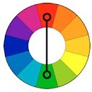
Harmony of contrasting colors
When starting to create contrasting harmonic combinations, the initial color is first chosen, then the contrasting color corresponding to it is determined. By creating a harmony of contrasting colors, you can add achromatic colors to each of the combined colors.
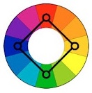
Harmony of contrasting colors. Square
"Square"- a kind of harmonic combinations of contrasting colors from four colors equidistant from each other.
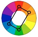
Harmony of contrasting colors. Tetrad
"Tetrad"- a kind of harmonic combinations of contrasting colors of four colors, in which there are two pairs of colors located opposite each other.
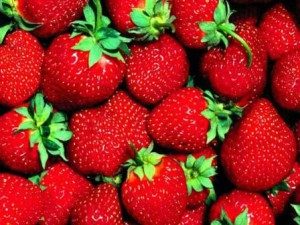
Harmony of contrasting colors in nature
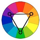
- Harmonious combinations of related-contrasting colors - the most common type of color harmonies, forming an isosceles triangle in the color wheel. Here harmony is achieved through the use of any color and colors adjacent to its complementary. Such colors are softer than a combination of just two complementary colors.
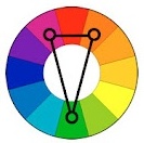
Harmony of related-contrasting colors
A characteristic feature of the compilation of harmonic combinations of related-contrasting colors is the presence in the combinations of the same amount of the main and contrasting colors.
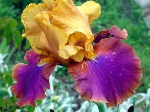
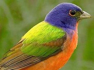
Harmony of related-contrasting colors in nature
- 5. Harmonic combinations "Triad" - a combination of three colors equidistant from each other and forming an equilateral triangle in the color wheel. This scheme is popular with artists because it offers strong visual contrast while maintaining balance and saturation. Such a composition looks quite lively even when using pale and desaturated colors.
Triad harmonics show very distinct and strong color combinations, but they are the most difficult to create correctly. To achieve harmony in the triad, one color is taken as the main one, and the other two are used for accents.
Triad in nature
However, it should be remembered that in creating color harmony, not only the colors themselves are of great importance, but also the configuration of the spots, the size of the areas of the compared color tones. There is an obvious relationship between the different colors of any composition, each color balances or brings out the other, and two colors together influence the third. Changing one color leads to the destruction of the coloristic, color harmony of the work of art and makes it necessary to change all other colors.
Hello! In this article we will try to highlight the topic of color matching as much as possible. As a theory, we suggest that you familiarize yourself with the translation of an article from the Adobe blog about color harmonies, the author Tony Harmer. And for practicing in practice, we have a video lesson: how to choose colors in adobe illustrator. The lesson will focus on the Color Guide panel, you will find the video at the end of this post.
Color harmonies
Color harmonies are combinations or combinations of colors that are pleasing to the eye. We use color harmonies all the time: when we choose clothes, when we decorate our homes or workplaces, and when we, as designers, want to convey some meaning or mood.Color circle
The color wheel is a tool that allows the designer to select matching colors and create palettes. Johann von Goethe called it The Theory of Colors, but there is no real theory here. During the existence of the color wheel, many theories and ideas about color have been developed. But it is the color wheel that is quite convenient to use in practice when color matching. That is why it will be the starting point for our work.
Twenty-three color harmonies are built into Adobe Illustrator, all of which are available in the Color Guide (Shift+F3) and tool Recolor Artwork (Edit > Edit Colors > Recolor Artwork). Therefore, in this post we will look at them.
Features of the color wheel in Adobe Illustrator
Technically, the color wheel in Adobe Illustrator looks more like the LAB wheel, but visually it is closer to the RYB model, which has more in common with the traditional art model.
On the RGB color wheel, red is at zero degrees. At the same time, Cyan is on the opposite side, that is, 180 degrees. This is what the color wheel looks like in Adobe Illustrator.

At the same time, it can be seen with the naked eye that on this color wheel, the opposite of red is green, and blue is a little off to the side. But if you take the red color and rotate it 180 degrees using the sliders in the Recolor Artwork dialog box, you get Cyan! This is just a feature of the work of Adobe Illustrator, unlike, for example, the same Photoshop.
Color combinations, color harmonies
Here we will show you all the color harmonies using the example of color combinations, where red will act as the base.Complementary colors
Complementary colors - everything is quite simple here, they are located opposite each other on the color wheel.

Adobe Illustrator has 4 variations for complementary harmony. They are no longer so strict in comparison with the classic complementary colors, that is, slight deviations from the opposite arrangement of colors are allowed.

Analogous colors (Analogous)
Analog Harmony generates four complementary colors with hues spaced 15 and 30 degrees clockwise and counterclockwise from the original color. The brightness and saturation of colors changes. There is a variation of analog harmony with 5 colors.

Monochromatic colors (Monochromatic)
This harmony generates variations in saturation and brightness. There are three of them: Monochromatic, Monochromatic 2 and Shades.

Triadic Colors
In triadic harmony, colors are arranged in 120-degree increments on the color wheel. As in the previous cases, there are variations with additional colors and changes in hue and saturation.

Square and Rectangular Pattern (Tetrads)
Tetrads are most commonly referred to as square or rectangular color combinations. You can also see a rhombus in the position of the flowers on the circle. The original Tetrad generates three complementary colors in 90 degree increments. But there are, of course, variations.

Compound colors (Compounds, secondary)
Compound colors are those that can be obtained by mixing the primary (red, yellow and blue). Harmony Compounds works in a similar way, producing compound colors that blend with the base color.

Contrasting colors (High Contrast)
High Contrast are essentially triadic harmonies that include the rules of some other color combinations.

Pentagram
And we will finish with the harmony of Pentagram. These are five colors in 72-degree increments on the color wheel. The saturation and brightness of the colors also change.

On this we can finish our journey into the world of harmonious colors. But we don't want you to be limited by these rules. People make rules, and they tend to make mistakes. That is why rules can and should be broken. Adobe Illustrator harmonies can be your starting point, and then amazing discoveries and creative experiments await. Any harmony can be edited through Recolor Artwork. So good luck with your color combinations and fruitful creativity!
How to Match Colors in Adobe Illustrator
In this video tutorial, you can take a closer look at the Color Guide panel (color guide). We will look at how to use the Color Guide panel to select color combinations based on harmonies. Also you will find a review of professional monitor for designers BenQ PD2700Q.Another color matching video. This time we are considering such a tool as Recolor Artwork. Thanks to Recolor Artwork, you can choose colors in Adobe Illustrator right on the color wheel, recolor an illustration, adjust brightness and saturation. In addition, a review of the BenQ PD2700U professional 4K monitor.
And one more video for a snack. Useful scripts for working with color in Adobe Illustrator.
Want more practice?