Gray wallpaper with patterns in the interior. We create an unusual interior against the background of gray wallpaper. How to use gray walls in the interior
Wallpaper in a gray tint visually expands the space, creates a non-staining interior for the kitchen, hallway, living room and bedroom.
Rules for decorating various rooms with gray wallpaper
The absence of a pronounced color temperature and the variety of shades make it easy to combine gray coatings with bright textiles, to give the room a brighter or more neutral color scheme. Depending on the saturation of the tone, graphite wallpaper can be used as a background for bright paintings, mirrors, stucco, or be a central element in the design of “empty” walls.
Hallway
Most new buildings have narrow miniature rectangular hallways without additional sources of natural light. Decorating the interior with wallpaper in a light graphite visual shade expands the space, while additional floor lamps and wall sconces should be used to make the interior look more welcoming.
Texture. The interior is complemented by wallpaper with a pronounced relief, which visually levels the walls and becomes a bright element of the room's decor. For example, an imitation of textured plaster in combination with a small shimmer creates a retro style, combined with large accessories made of metal, natural wood.
Material. The easiest to install and maintain are non-woven wallpapers or light options based on textile fibers. Such material creates the effect of "damask" wallpaper, gives the hallway comfort.
Colors. Small rooms are decorated with plain materials, small patterns. For example, geometric colors are combined with furniture of any style, allowing you to decorate the walls with miniature lamps.
Living room
The interior design of the living room with the help of textured wallpapers of this shade in combination with bright curtains, massive crystal chandeliers, glazed cabinets creates an empire or art deco style. Owners of small apartments with combined kitchen-living rooms decorate the room with light-colored wallpaper with a pronounced pattern.
Texture. The area of the living room usually allows you to choose a pronounced texture that imitates natural fabric, marble or textured wood. Mirrors, floor lamps, coffee or coffee tables will help to complement the decor. Families with kids and pets choose non-staining canvases for painting in gray.
Hue. The walls of the living room can be pasted over with deeper shades of gray: graphite, gray-green. Such an interior is colored with light textiles: bedspreads, curtains, carpets. Choosing colors for the living room, they stop at more saturated shades of green, olive, which have the same intensity as the main tone.
Ornament. The spacious living room will be decorated with wallpaper with a large floral ornament, geometric patterns. A miniature lounge is decorated with gray and white wallpaper with a smooth texture.
Advice
A combination of several types of gray-colored wallpaper zones the hallway into an area for relaxing and receiving guests. For example, placing a sofa for guests and a TV in one half of the room, it can be decorated with neutral wallpaper. Bookshelves, a coffee table and armchairs create an area for communication with guests, which is decorated with rich gray walls.
Kitchen
The kitchen in a city apartment is used for cooking, relaxing and receiving guests. Coatings with a smooth texture in a gray tint allow you to choose furniture in rich colors, comfortably place large appliances, and combine several styles in one interior. Wallpaper for the kitchen should be easy to clean, resistant to chemicals and wet cleaning.
Texture. Smooth and dense surfaces of materials containing natural fibers look expensive and are resistant to regular temperature changes. Refinement of the interior will give a relief on the wall covering, the presence of a small shimmer shine or ornament.
Material. Pasting the walls of the kitchen with wallpaper with a high content of fiberglass will allow you to regularly clean the material without compromising the appearance. Ordinary non-woven materials are easy to install, but they tolerate regular cleaning with aggressive detergents worse.
Colors. Most of the kitchen walls are occupied by built-in furniture, an apron, overall appliances, so it is better to choose wallpapers to match the kitchen facades.
Advice
Owners of white household appliances add saturation to the interior, combining lead and mother-of-pearl shades with wine-colored textiles, kitchen facades in beige, gray-steel shades. Dark asphalt shades require the installation of a powerful chandelier, lamps built into furniture cases.
Bedroom
The bedroom is suitable for decoration with rolls with a large pattern, a pronounced texture and additional shine (shimmer, rhinestones, silk-screen printing). The decor of the bedroom is limited to a bed or a sofa, a wardrobe and bedside tables, so the walls are decorated with bright ornaments of large sizes.
Texture. The choice of canvases with a pronounced texture distracts attention from uneven walls, creates a richer interior, combined with light furniture upholstery and a neutral shade of textiles. The canvas can imitate dense velvet fabric, natural fibers, often decorated with silk-screen printing.
Material. The bedroom is finished with damask cloths, dense velor, felt, vinyl materials. The fleecy texture muffles sounds, creates a softer, more relaxing atmosphere in the room.
Colors. Soft gradient transitions and contrasting tones enliven the interior, creating a more modern interior. Abstract, floral patterns are combined with textiles in a vintage style, forming a provence, vintage interior.
Advice
Geometric gray wallpaper, imitating natural materials, is combined with bleached oak floors, other light shades of wood. The gray-beige range of walls, decorated with posters with abstract drawings, forms a bright eclectic interior.
Ornament choice
Monochromatic wallpapers in light graphite shades visually increase the space, combined with dark and light colors of textiles and furniture. For example, smooth gray transitions are performed using decorative plaster, a neutral gray wall is easy to create using thin paper sheets.
Liquid wallpaper
Decorative plaster is suitable for decorating even walls in new buildings and country houses. The material imitates marble, standard gypsum plaster, creates the effect of pronounced texture on the walls. Liquid wallpaper tolerate daily cleaning with chemicals, wash well and visually even out minor wall defects.
It is recommended to choose a shade of liquid wallpaper with small transitions. For example, the lower half of the walls are decorated in a darker tone, the upper half - in a gray-white tint with the addition of decor. Installation involves applying the finished mixture to the walls, so you can create a drawing yourself.
The drawing on liquid wallpaper is limited by the ornament, which is created with a figured spatula during installation. This design does not draw attention to the walls, goes well with bright decor and an abundance of additional lighting in the rooms.
.Advice
Covering with liquid wallpaper creates a “cold” office interior, so it is recommended to decorate the windows with lush curtains, choose textured upholstery for furniture in the rooms. The coating is convenient for the interior of the kitchen or hallway, which are intensively used every day.
Wallpaper with a pattern
Traditional large floral ornaments draw attention to the walls, allow minimal use of accessories and additional lighting. The combination of graphite-colored wallpaper with a large pattern, white furniture and textiles in bright colors serves as the basis for the interior of a small room.
- The theme of the drawing. Floral ornaments look brighter, create a festive atmosphere in the room, combined with accessories in loft, Provence styles. Geometric patterns require more massive accessories, create a laconic interior, visually expand the space.
- Drawing size. Large ornaments in the form of paintings or lithographs are combined with furniture and textiles of a single color, do not require the installation of mirrors, paintings in massive baguettes and large clocks on the walls. As a rule, canvases with an extensive pattern are chosen for spacious rooms with a good level of illumination, a small amount of furniture and accessories.
- The color scheme of the picture. Gray tone in combination with warm colors (yellow, red, green) creates a harmonious, intense interior. Such combinations decorate the walls of living rooms, kitchens, spacious hallways with chandeliers. Soft patterns, combining several shades of gray, are used for more miniature rooms, environments for daily rest and relaxation.
Advice
Rolls with a pattern are chosen to match the textile used to decorate the room: curtains, bedspreads, carpets, tablecloths. The second way to create a common style is to choose a common theme for drawings made in different colors.
plain
Wall covering with a single shade of gray is used in the setting of miniature apartments, rooms with a low level of illumination. A monochromatic canvas is combined with an abundance of decorative elements on the walls: paintings, massive wall clocks, mirrors, installations.
- Color selection. Saturation and color temperature should be slightly lower than the surrounding pieces of furniture, in which case the space will look larger. For example, gray-white wallpaper in combination with dark furniture creates a strict Scandinavian interior, an abundance of metal elements creates a loft style.
- Texture selection. Plain canvases with a pronounced texture mask minor wall defects, give the room sophistication. For example, paintable wallpaper imitating cork or linen is used in the interiors of living rooms, libraries, and offices.
- decoration. You can diversify the design of the walls with the help of massive fillets of a lighter tone, large plinths made of natural wood, mounting posters and mirrors on the wall surface.
The color temperature of plain wallpaper and furniture should be the same, creating a complete image of the entire room. For example, cold daylight lamps in combination with pearl-graphite colors are used for interiors in northern latitudes with low levels of natural light.
Choice of colors
The classic graphite tone needs to be complemented by lighting and accessories, and is used in stylized interiors that mimic a laconic design. Wall coverings with a gray tone in combination with additional colors look more cozy and colorful:
- white;
- beige;
- brown;
- pink.
Depending on the saturation of the base color, the walls look more bright or austere, modern or vintage.
Advice
Saturated colors of dark tones are used to decorate living rooms and kitchens: an abundance of lighting creates a festive atmosphere. Small rooms, densely packed with furniture and overloaded with accessories, are decorated with wallpaper in light colors: gray-beige, gray-white.
Gray-white wallpaper in the interior
Cloth for finishing rooms, kitchens and hallways of a small area, abundantly equipped with furniture and appliances. Cold colors require the addition of saturated colors with textiles, setting the lighting to match.
- Pattern selection. Ornaments imitating floral colors and lace look softer. Gray-white canvases with photographs, geometric patterns, gradient filling create strict interiors, are used to decorate workrooms, libraries.
- Texture selection. Neutral colors allow you to choose a pronounced texture that imitates fabric, wood, gypsum plaster.
- Material selection. Gray-white shades are quite easily soiled, so it is recommended to pay attention to washable compositions made of fiberglass or non-woven base.
Dark gray
The material is used to stylize bright interiors, it requires light-colored furniture, an abundance of decorative mirrors. Dark gray canvases decorate the walls of kitchens, hallways, spacious living rooms. The pronounced color scheme in combination with contrasting textiles (for example, in a green tint) and wall lamps is suitable for everyday relaxation.
- Pattern selection. A rich tone implies a small geometric or floral pattern that draws attention to the walls, combined with light floor coverings, an abundance of stucco on the ceiling.
- Texture selection. Small rooms are decorated with dark gray canvases with a smooth texture; imitation of bulk materials is appropriate for built-in furniture and spacious rooms.
- Material selection. The dark gray gamma is non-marking, so the material can be chosen from a simple material: paper, textiles, cork.
Advice
Dark asphalt shades are combined with warm colors of furniture upholstery; floral ornaments in the room's decor will help visually “warm” the interior.
Grey-beige
The popular "warm" wall design option is suitable for owners of rosewood-colored furniture installed in small rooms. The shade of the walls is quite catchy, so the decorative elements are selected to match.
- Pattern selection. The ornament on gray-beige canvases is chosen large and noticeable, which gives the interior a touch of Provence style, vintage accessories complete the picture.
- Texture selection. The beige tone is combined with a pronounced texture and an abundance of additional decorations: false stucco, sequins and rhinestones.
- Material selection. The gray-beige tone is quite easily soiled, the wall covering is treated with protective wax or washable wallpaper is bought.
Grey-pink
A combination of colors that suggests a festive interior of a living room, guest room or nursery. Depending on the pattern and material, such canvases may look more vivid and emphasize the palace interior, or have a relaxing effect.
Neutral shade in combination with warm colors is suitable for small spaces, forms interiors of Provence, loft, vintage styles.


The selection of colors for the future interior is perhaps the most important step after choosing the design style for your home. To date, there are almost no restrictions on the range of colors, modern technologies allow you to reproduce any desired shade and realize even incredible fantasies.
A room with gray wallpaper looks restrained and luxurious at the same time.
In light of the latest fashion trends, there has been an increase in the popularity of gray in the interior as the dominant one. Moreover, absolutely any room in an apartment or house, from the hallway to the living room, can be decorated in such a range. Even a kitchen made in silver or ash tones can look very bright, fashionable and elegant.

Gray is a complex and multivariate color that can look different and convey different feelings, depending on the choice of shade.
The main thing is to know and understand how to correctly apply such a complex color, what it can be combined with, and what techniques designers use to give the interior nobility and sophistication, and not turn it into a dull, gloomy space.

Gray wallpaper with ornaments, perfect for creating a classic style in the bedroom.
The uniqueness of gray lies in its diversity. Steel, mother-of-pearl, coal, wet stone or pewter, marengo or gainsborough, slate or grey-green. In fact, there are a huge number of shades. Like the main color palette, they are all divided into cold, warm and neutral. Examples in the table below.

Thanks to this diversity, you can choose a huge number of different stylistic solutions and options for use in the interior.
With the help of a competent combination with each other, as well as with other colors, you can easily create any atmosphere and mood in the house that matches the temperament and individual preferences of your owners.
In order to determine the scope, first you need to decide in which design genre the interior will be made. The versatility of the palette makes it possible to use it in one form or another in almost all styles. It can be both classic and, for example, Provence style, or country, Scandinavian, or loft, hi-tech, or art deco, etc. There are as many options as there are shades of this wonderful color.

Wallpaper with a pattern is suitable for the bedroom and living room in a classic style.
Walls are the most common application. For their design, you can use decorative plaster, paint or wallpaper. And gray wallpaper in the interior can be absolutely any texture, plain or with a pattern. It all depends on the purpose of the room and the chosen design.

Geometric and abstract patterns are suitable for medium to large rooms.
Styles such as urban and loft are characterized by the use of charcoal and anthracite for the floor and ceiling. It is even possible to perform all parts of the room in gray tones, for this a smooth transition from dark to light is used, and materials of different textures are also used. For example: for the floor - natural stone, concrete or wooden laminate of dark colors (wet asphalt, coal), for walls - plaster or medium-tone wallpaper (tin, slate, dove), and the ceiling is painted in light gray shades (zircon, gaysboro) .

Gray wallpaper is a great option for creating an accent wall in a loft-style bedroom.
Shades of gray look no less impressive in decorative elements and textiles. Furniture and curtains made in such a range perfectly convey the atmosphere of practicality and conciseness of high-tech style. A variety of textures and ornaments of gray-smoky tones in the decoration and objects that fill the space will emphasize the luxury and sophistication of art deco.

Gray wallpaper can decorate the wall by the fireplace or TV.
Application in the interior of different rooms
Gray wallpaper in the interior, when used correctly, can help solve several problems at once.
- By combining light and dark tones, you can visually adjust the size of the room.
By shading unnecessary corners and niches, you can hide architectural flaws and focus on the central part.Dark gray wallpaper can make a large room more compact and cozy, filling it with calmness and warmth. And light gray and cool ones can make even the smallest room more spacious and brighter, bringing a sense of freedom and light.

For a small living room, it is better to choose medium tones and contrasting textiles.
- Giving preference to certain tones when decorating the walls, you can adjust the mood of the interior.
Cold ones will make the space more strict, solemn. Such shades in the interior go well with bright colors (blue, red, etc.). A great option for a living room, kitchen or hallway.Warm ones, on the contrary, will make the room softer and more comfortable. They are wonderfully combined with almost all pastel colors.

A good solution for the interior of the bedroom and nursery.
- Through the ornament gray wallpaper in the interior you can radically change the style and image of the room.
A textured pattern on a gray wallpaper background can become the main decoration and set the direction for the entire interior. The versatility of shades allows you to play with the design, just changing or removing bright accents. Accordingly, in order to inhale fresh notes and update the interior, you do not need to do major repairs.

Wallpaper with flowers is suitable for a bedroom in a classic and modern style.
Hallway
The choice of colors for the interior of the hallway directly depends not only on individual preferences, but also, mainly, on the size of the room. Most often it is not very large, and often devoid of natural light. In such cases, it is recommended to choose plain gray wallpaper in cold light or medium shades. They will visually expand the space and make it more airy.

Gray wallpaper in the hallway is best combined with white and black.
If you still want to make a small hallway in dark colors, then you need to choose warm, muted colors, for example, grey. It would not be superfluous to complement such an interior with bright accents and take care of good multi-level lighting.
When choosing wallpaper with a pattern for small hallways, you should give preference to small ornaments, and for spacious ones - larger motifs. A vertical strip made of several shades of different widths will look great.

Striped wallpaper can also help visually adjust the space.
Another good design trick for the hallway is when gray wallpapers are combined with various finishing materials. These can be wall panels, decorative stone, plaster, or painted surfaces. For this, both plain and floral wallpapers with a gray background are suitable.
If the size of the room allows, then plain gray wallpaper of dark colors framed by white wide moldings looks very impressive.

As a decor, you can use black and white photographs in beautiful white or black frames.
Living room
Deciding what should be gray wallpaper in the interior the living room should take into account its functional orientation. After all, if this room serves not only for receiving guests or family leisure, but, for example, also for a bedroom, then it is better to choose a softer, warmer color. This will create a calm, relaxing environment.

The interior will be complemented by luxurious upholstered furniture and sconces.
If the living room is also used as an office or library, then cooler and sharper tones can be used. In combination with bright colors (blue, red, cold shades of green), on the contrary, they will not let you relax and add not only rigor to the interior, but also energy.

The combination of light and dark shades can help correct the imperfections of the room.
Regarding the choice of ornament on gray wallpaper, there is only one rule - it must correspond to the style direction of the room's design. For example, a geometric pattern (rhombuses, circles, stripes) is more suitable for art deco, hi-tech and retro styles. Ornate complex motifs, made in white or gold, are typical for classicism and modern style.

A floral ornament in pastel colors will emphasize the romanticism of Provence.
If we talk about how to properly combine gray wallpaper with textiles and furniture, then there are practically no restrictions. The main thing is to observe the general style and color type of the design. That is, if the color scheme of the wallpaper belongs to cold shades, then the colors of curtains, furniture upholstery, decor elements should also belong to the cold spectrum. Well, vice versa.

Gray can be used in any style, from classic to minimalist.
As for color compatibility, then, of course, the tandem with white and black is classic. But, as has been said more than once, gray wallpapers are quite versatile and perfectly combined with almost the entire palette. The table shows examples of the most fashionable color schemes.
Table of combinations with another color in the interior

Gray walls in the bedroom set a calm tone when combined with a companion color.
Nursery and bedroom
To decorate the walls in the bedroom or children's room, it is more expedient to choose gray wallpaper in light colors. They are well combined with delicate pastel shades (pink, blue, beige, etc.) and give a state of peace and tranquility. For a nursery, this is just a godsend, especially if there are hyperactive children in the family.

Gray wallpaper in the nursery combined with light furniture and delicate pastel colors will create a stylish look.
To create a harmonious space, designers advise filling the interior with a variety of accessories and decor items. It can be numerous bright colored pillows, vases and caskets, figurines and candlesticks, photo frames and paintings. Everything that makes our home so cozy.
It is neutral gray wallpapers, due to their versatility, that can become a good background and smooth out the fussiness from a large number of objects.

Suitable for both boys and girls room.
An interesting option for an adult bedroom can be a monochrome interior. The combination of several shades, thanks to different materials and textures, will create an incredibly stylish and elegant look.
The psychology of color
A lot of people perceive gray wallpapers as boring, overly conservative and even gloomy. Indeed, by themselves they are rarely able to evoke positive emotions. For people prone to melancholy and depression, they are categorically contraindicated.

Dark gray wallpapers in steel, charcoal and pewter colors look self-sufficient, they can be lightened with pastel tones.
However, with the right choice of shade and saturation, in combination with natural materials, gray wallpapers can give a sense of calm and security.
The combination of bright and saturated colors (blue, red, purple, etc.) for furniture and decor with gray wallpaper fills the space with energy and strength. This combination will appeal to eccentric, extraordinary people who love to emphasize the individuality of the interior with bright accents.

This combination can only be used in spacious bright rooms and as an accent.
More gentle and sophisticated natures are more likely to use a combination of light gray shades with pink, green or blue. This color gives the space freshness, lightness, elegance.
Conclusion
Do not be afraid to use gray wallpaper in the interior. Refined, noble and stylish, they will give a feeling of comfort, stability and peace.

The gray-pink combination of muted shades creates a feeling of relaxation, the freshness of rain and a flower garden.
The main trump card of gray is its versatility. It is combined with any color, it can be used as a main or as a background. His entire palette is perfectly characterized in various design genres, and it is also suitable for absolutely any room in the house. This gives unlimited possibilities for the realization of any creative fantasies when creating an interior.

Gray walls are a great backdrop for any furniture and suite.
When planning the renovation of a house or apartment, it is so difficult to decide on a single color scheme, because each family member has his own preferences. But there are universal colors that will look appropriate in any room. Grey, too, belongs to them. It has a wide range of shades, so you can choose gray wallpaper for interiors decorated in various styles.
Let's look at the varieties of gray wall coverings, their use for finishing different rooms, combinations with other shades. Photos of gray wallpaper in different interiors can be viewed in our selection.


Gray color in the decoration of the room, its role and perception
Gray wallpapers in the interior have a special psychological effect on a person, they calm and pacify. Neutral color allows them to be used for interior decoration in traditional and modern style. Due to the large number of shades, gray wallpapers can be used on their own, or as a base background for brighter accents. This type of wall decoration goes well with materials such as metal, glass, stone, textiles, wood.
On a note: despite the versatility of gray, it is also quite complex. Therefore, it should be used in the interior carefully so as not to create a depressing atmosphere.
Light gray wallpaper in the interior focuses on the furnishing of the room, decor items
If light shades make the room light and airy, then dark gray wallpaper in the interior gives it drama. Such shades are more dynamic, so it is better to dilute them with contrasting details, light blotches.

Interesting creative interior with gray wallpaper, photo
Those who find monochrome wall decoration boring can use wallpaper from the catalogs of modern designers, with a pattern, or with various textures. So the trend of the last few years is striped wallpaper. Their use is not just a tribute to fashion, but a design technique that allows you to revive the interior, make it more dynamic.

For a room with a low ceiling, striped wallpaper is what you need.
If, when decorating a room, it is necessary to focus on the walls, then for these purposes it is better to use wallpaper with a geometric pattern, a texture that imitates natural stone, wood, plaster.
On a note: Floral wall coverings will emphasize the aesthetics of a room decorated in a classic style, and they will add expressive brightness to a room decorated in a modern style.
Gray wallpaper with roses - romance and special elegance in the interior
For more options for using gray wall coverings in various interiors, see our photo selection.


The role of gray wallpaper in the interior of rooms for various purposes
What place do gray wallpapers occupy in the design of different rooms? Let's look at examples.
Gray walls in the bedroom
Using gray finishes in a break room helps to create a calming and soothing atmosphere. Gray wallpaper for the walls will create a smooth, calm environment. Against their background, furniture and decor items will effectively stand out.
Advice: plain wallpaper in the bedroom is not recommended for use on the entire surface of the walls, it is better to highlight one of them with brighter accents.
An example of how to beat the gray wallpaper in the bedroom, photo
grayscale kitchen
The kitchen room, decorated in gray tones, gives a feeling of freshness and coolness. Wallpaper in these shades will make the kitchen more spacious and emphasize its cleanliness.
On a note: A gray kitchen is easy to clean and hard to get dirty.
Practical and aesthetic gray wallpaper in the kitchen, photo
The use of gray in the living room
Gray wallpapers make the interior more comfortable and calm, which is what is required for the hall. With them, the room will acquire elegance and sophistication.
Attention: when using gray to decorate the walls of the living room, consider the size of the room. In a small room, you should use as light colors as possible, and in spacious rooms, you can safely use darker shades.
Refined and aristocratic guest room with gray wallpaper, photo
The use of neutral finishes in the hallway
The hallway is the most frequently used room in the house, so instead of paper wallpaper, it is better to buy vinyl that is more resistant to wear. The most practical and optimal color option would be gray. It is better to decorate a small room with plain light canvases, and a spacious one with darker ones, with a bright decorative pattern.

An example of an interesting design of the walls in the corridor
Combinations of different wall coverings in the interior
Gray can be used in interior decoration both as a primary and as a secondary color. By themselves, the wallpaper of these shades may look unattractive, but with a skillful combination with canvases of other colors, they can sparkle with completely new colors.
Gray is a complex color, consisting of many tones. It is based on 3 basic colors - green, red and blue, thanks to which it receives various shades (from dove-gray to the color of wet asphalt). Therefore, these three colors are the main companions for gray wallpapers.
The closest neighbors of a given color in the spectrum are white and black. It is with them that he gives neutral combinations, in which he acts as a dominant tone. Gray and white wallpaper is a classic in interior design. This combination creates a cozy and calm atmosphere in the room.
Advice: to emphasize the full depth of gray, for combination with it, one should take not pure white, but with a slight shade of beige.
The interior in white and gray tones is an eternal classic
Smoky and black colors are close to each other, and therefore combine well. An interesting solution would be to paste over the walls of the room with metallic wallpaper, and highlight one of the surfaces with a black matte finish.

Elements of black and gray color will be appropriate both in a minimalist interior and in art deco.
Gray and pink wallpapers will help create a soft and gentle atmosphere in the room. This combination will be most effective if these two colors are used in equal proportions.

Light and casual combination of gray and pink wall coverings
Elegant, although slightly cool, the combination of gray-blue wallpaper for the walls looks. This color combination has a calming effect and is suitable for decorating common rooms.

Gray-blue wallpaper in the interior creates a classic seasoned and interesting combination.
If this neutral color is combined with green, you get an eco-style interior. Natural motives are known to help relieve fatigue.

Touching and gentle eco-friendly interior
Gray-yellow wallpaper will give the room an original look. They enhance the feeling of warmth in the room, while maintaining a certain neutrality.
On a note: saturated yellow and orange tones are best used locally, as bright accents on a neutral background.
Bright bathroom interior - stylish and modern
A very effective and sensual combination is created by lavender, purple or lilac-gray wall coverings. Bright canvases can be used to completely cover one of the walls, or as contrasting inserts.
Attention: gray and purple should be combined carefully, otherwise they can cause depression and discomfort.
A spectacular interior is created by gray-violet wallpapers
The red-gray wall decoration looks bright and exciting. You can dilute it and balance it by adding white or black shades. The combination of three colors in the design of the walls is quite acceptable, because the third color acts as a balancing link for two bright shades.

An example of a combination of smoky and red wall coverings to create a bright modern interior
Outcome
The stereotype that with the help of gray wallpaper you can only create a boring interior is easy to destroy. This color has many shades, which, with the right combination with other elements of decoration and decor, will create an interesting environment. It is easy to work with gray wallpapers, with their help you can achieve a harmonious color balance in the room.
Wallpapers of this color occupy a leading position among the finishing materials of recent years. Moreover, various variations of gray are successfully used in both classic and modern interiors. Many world-famous designers have drawn attention to its rich palette.
Wall design features in gray

The popularity of gray in the last couple of years is due to its versatility. It can influence the mood of the interior, create a calm, relaxing atmosphere on its own, or emphasize the brightness of other shades. Not without reason, from the office version, he migrated to houses and apartments. At the peak of fashion, wallpaper colors "wet asphalt", "lead", ashy. Silver wallpapers also proved to be very popular (see the photo below):

It is difficult to find a shade in the color palette that would not be combined with it, and this is another advantage of gray (photo):

Such a variety allows you to choose the color of the wallpaper, based on many conditions - the size of the room, darkness, its functional qualities and one of the important criteria - your taste. You can leave a monochromatic gamut.


But there is an opportunity to dilute it with both pastel and bright colors.

Choosing gray for wall design as the main or auxiliary color, you can take advantage of the fact that it looks great in large areas. If you need to be careful with bright yellow or purple, then it is simply impossible to go too far with gray.
The right shade will be good in the design of any room, whether it be a bedroom, living room or children's room. And the use of this color for decorating the hallway is the perfect solution:

Calm, deep shades of gray can immediately seem harsh, rough. But modern designers have long moved away from such stereotypes and embody wonderful interior ideas based on these tones.
A gray bedroom can be fashionable, and at the same time cozy (photo):

The living room, whose walls are decorated with gray wallpaper, often becomes a favorite place for receiving guests and spending family evenings:

And even from the baby’s room, with the right choice of shade and additional accents, it will exude tenderness and warmth:

If the gray color is defined, then it personifies nobility and elegance. It has depth, mystery and unobtrusiveness.
But designers appreciate it not only for these qualities, the gray palette is a lot of neutral and versatile tones, which means you can use any combination. It is able to enhance the brightness and emphasize the tenderness of a light color.
What are the rules to rely on so that the combination of wallpapers turns out to be harmonious, and which combinations are not the best option for decorating certain rooms? There are many nuances, it is worth considering the variations in more detail.
How to combine gray wallpaper
Almost all neutral shades can be a good backdrop for rich, vibrant tones. But gray in this sense also has disadvantages - with excessive brightness and catchiness of accessories or finishing materials, it will enhance their severity. Therefore, experts recommend not to get carried away with extreme colors when combined with gray wallpaper. Even one or two bright spots against its background can “revive” the interior and at the same time look very harmonious:
It is also important to decide on the style of the intended interior and choose the right tone. If you take it at random, then the result may not please - a dark gray, earthy color in some cases makes the room gloomy, and a too pale, blurry tone - boring, faceless. To avoid this, it is worth taking the experience of professionals into service. When choosing gray wallpaper, they are based on two combination options:
- Any light pastel, muted tone pairs with gray and is a great design addition.
You can give an example of combining pastel pink and light gray wallpaper. The bedroom turned out to be very cozy (photo):

Pastel shades give the room lightness and serenity. This is a great option for designing a place to relax and sleep - a bedroom.

Pastel smooths out its severity and asceticism, makes it more homely and cozy: (photo)
- Combination of bright colors.
A more risky option, where gray wallpapers and interior items can be the basis, or "calm" intense shades. In this case, you can get an overly catchy composition, but with a balanced approach, the apartment will become the standard of style and taste.
Various combinations of gray in the interior
There are many design ideas for decorating walls with gray wallpaper, sometimes they are so incredible that they evoke a variety of emotions. But it is not always worth following fashion or trying to experiment at random.
Gray-brown interior
Combining shades that are close to each other in the palette is a difficult task, since in this case the colors can merge into one spot. But with a combination of brown and gray, the latter color can simply “get lost”, losing its expressiveness. In this case, it is not recommended to use contrasts.

The combination of light gray and dark brown tones turns out to be calm, sometimes even very. Shades absorb each other, the interior can turn out to be boring. You can correct the situation by using several shades of brown in the design of the room at the same time. This color combination can be very interesting:

Also, adding white accents to gray wallpaper and brown will help get rid of the dullness of the interior. They will add light and airiness to the room (photo):

Gray and white in one interior
Modern designers quite often resort to such a combination. However, the nature of the interior depends on which shade is used. The light gray tone of the wallpaper in a duet emphasizes the whiteness of the companion color. This combination makes the room more spacious and bright:

Dark gray is contrasting:

This combination is suitable for both large and small rooms. A kitchen in this color will look very neat:

A small living room, as in the photo, will visually expand.

If it seems that something is missing in such a color combination, you can always dilute the interior with furniture or accessories of a different color.

Perfectly fit into the gray-white design of the plant, their natural juiciness looks quite natural:

Gray wallpaper combined with a blue palette
Gray and blue wallpapers harmonize perfectly, however, they depend on the saturation of the shades.
The combination with rich blue, turquoise may seem very strict and even rude. From such an interior breathes strength and masculinity:

But, on the other hand, such an interior cannot be called habitual and monotonous; individuality is felt in it.

If you want to make the interior more feminine, while maintaining the color scheme and intense blue, then you can use wallpaper with floral prints and ornaments in the design. This will add softness:

A completely different effect is obtained if the companion of gray wallpapers is light blue:

Two light colors create a fresh, cool interior, which will add comfort to home accessories - pillows or panels with embroidery, ruffles on curtains and bedspreads, floral decor.
Gray and blue wallpaper shades of the same intensity create an even, calm atmosphere.


Gray and beige for decoration
A great option for lovers of stability and tranquility. The combination of two noble shades is perfect for an elegant, seasoned interior of living rooms, bedrooms, offices and even a bathroom:

I am not pretentious, these colors on the wallpaper will not drown out and will be able to emphasize the dignity of luxurious things - furniture made of rare woods, antique jewelry, beautiful upholstery, handmade accessories:


Grey-green interior
The combination of light gray wallpaper and green shades by all canons should be unsuccessful, as two neutral colors look bland. However, the calmness of the base tone allows the green to look light and fresh:


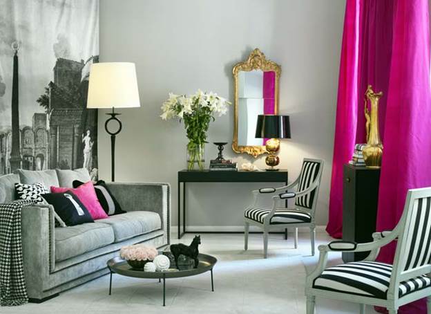
Hello Love! The gray color is quite neutral and many different shades can approach it, sometimes unexpected for our interiors. But if you are a creative and courageous person, you can consider them. For example, let's take as an example the interior shown in the first picture. As you can see, the walls in this image, like your case, are decorated with zones. Some of the walls are painted a pale peach, and at least one wall is covered in pink wallpaper with gray patterns. The sofa is probably a little darker than the one you have. But, I think this is not critical and this option could well suit your interior. As you can see, the pink color is represented in some large and small details: curtains and pillows. And the color of the sofa is supported by the color of the carpet. It can also be supported by gray images in the paintings.
I believe that this combination of colors is appropriate in a sunny room. Shaded, in my opinion, despite the presence of pink and peach flowers, the room may seem gloomy.
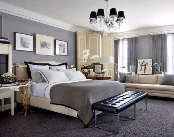
The next picture is with a lighter sofa than the previous picture. As you can see, the walls in this room are also decorated in gray. Breaking this monotony are darker gray patterned curtains. In your case, the role of such a breakdown can be played just by the zone on the wall, highlighted by other wallpaper, different from the wallpaper on all other walls. That is, instead of curtains, against the background of the sofa, you can paste wallpaper with a pattern.
Such dullness is also broken by delicate inclusions of green plants. In my opinion, quite calm and harmonious interior. Restrained and stylish. .jpg)
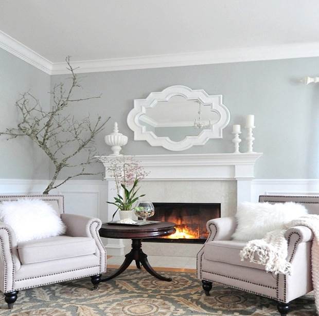
If you want to bring red shades into the interior of your living room, then the third image will clearly show you that it is completely optional to decorate the walls with this color. The walls in this picture are painted in a neutral warm tone. And on the wall along which the sofa stands, a separate zone is highlighted with a drawing (perhaps a sticker). Too much red in a living space is not always good, but in this case, you can kill two birds with one stone: use the red you want, and at the same time not oversaturate the room with it. Please note that white colors are also used in this room: in the window frames, in the chairs, in the floor lamp, on the floor. It seems to me that such a combination can be applied not in the sunniest room. Even in a northern room, red, white and warm peach walls will enliven a dark room and give warmth to the gray tint of the sofa.