Three ways to simulate realistic effects. AK-Interactive Chemistry Methods by Mig Jimenez How to Create a Colorful Effect
Introducing a new series of articles "Technologies of Rob Ferreira"! This is a well-known American modeler, one of the best in his business - creating models of rusty, aged and burnt equipment. We recently took from him. Rob kindly agreed to publish his materials on the website of our Studio, which will be interesting and relevant to many Russian colleagues.
The first article is devoted to the use of a series of new products from AK Interactive. Vladimir Yashin has already prepared for this production, but Rob has his own tricks.
“We will consider the use of liquids, which are enamel paints already diluted with a solvent in the right proportion for immediate use. Liquids are supplied in 35 ml jars, they are liquid enough for an airbrush, and do not have sedimentation at the bottom characteristic of enamel paints. I strongly recommend that you ventilate the room when working with these products!
Paints can be mixed with each other to obtain different shades, which is absolutely necessary to obtain good results in the tint of the model.
First of all, AK 011 White Spirits. White spirit is a solvent that is suitable for diluting and cleaning brushes from these agents.

AK 013 Rust Streaks. (Rust Streaks) As the name suggests, this product is used to create rust streaks and rust washes. The picture below shows the effect of this rusty wash:


AK 012 Streaking grime and AK 014 Winter Streaking Grime. (Mud streaks and Winter mud streaks). These two tools, in my opinion, are a useful acquisition for a set of weathering tools. They can be used for streaks often seen on appliances. The pictures below speak for themselves:


The last three tools are also important for tinting military equipment.
AK 015 Dust Effects, AK 016 Earth Effects and AK 017 fresh mud(Dust Effects, Earth Effects, Fresh Earth)

These products are an alternative to oil paints and pigments commonly used in tinting vehicle models. They can also be mixed to get different shades. To simulate dried dirt and earth, I recommend mixing these paints with plaster.
The pictures show some examples of what can be achieved with these three colors: 
All of these products can be used by layering one on top of the other. I always start small and gradually add tint as needed, and these products are ideal for this purpose.
Instead of painting pieces of plastic, which is boring and unrealistic, I'll show the effects I've achieved on real models using the techniques shown in the movie (AK Interactive CD)
Leaks of dirt.
I started with AK 012 Streaking Grime, brushing it on in a few rough streaks tapering down. I planned to apply them in two coats, so the first coat applied quite lightly.

After 30 minutes of waiting, it was time for the streaks to form. Using a brush soaked in mineral spirits, I began to work on the streaks in downward strokes. The goal is to achieve faded streaks instead of unrealistic black outlines.
Enamels do not leave a glossy sheen, they are matte, and dry fairly quickly. Using oil paints it's not uncommon for you to get a glossy sheen to get the same effects. I was already impressed at this stage, but decided to move on!

After applying darker streaks of dirt, I left them to dry for a couple of hours, and then moved on to the next step. For the lower part of the upper body part, I decided to mix AK 014 Winter Streaking Grime and AK 015 Dust effects (Winter streaks of dirt and Dust effects). I did this for two reasons: first, I wanted to get more light shade mud, not greenish winter mud, and secondly, I wanted to check how these paints mix with each other.
I applied the winter streaks as well as the darker mud streaks.

I applied only one layer of light streaks of dirt, mainly because there will still be dust and earth, so you don't need to do too much streaks. The picture below shows the results achieved with sagging agents:

To see how it would look on a light background, I applied the same streaks to a three-color tower. The first picture is the usual streaks of dirt, and the second is the same mixture that was previously applied to the side of the hull, now on the tower.


Below you can see the final result of the dirt streak experiment. I think these products are perfect for applying over a light base coat, but would look good on a dark background too.

Dust, Dirt and Fresh Earth Effects
My first experience was airbrushing dust on the bottom of the case. I diluted the mixture of AK 015 Dust effects and AK 017 Earth Effects to a dusty shade to use as a base for the subsequent weatherign. Given that the paints are already diluted, I had to add just a couple of drops of white spirit.
I applied only a light "fog" of this dust mixture, thus preparing for the real dirtiness of the lower case.

The following experiment with dust and ground effects is needed to create a splash of dirt on the bottom of the hull and road wheels. I also wanted to see how these paints would work in conjunction with other products, in this case with MIG pigments and gypsum.
By mixing these three substances, I expect to get the effect of dried mud.

By dipping an old brush into the mixture, and setting the pressure to about 30 psi, I gave out brief bursts of air in the right directions. Full coverage is not needed here, because this will only be the first, light layer of dirt.


Later, I applied a darker mud wash into the undercarriage recesses. All products were applied easily and dried quickly, creating the effect of dried mud.

rust effects.
AK 013 Rust Streaks. I applied rust streaks to the scratched areas in the same way as dirt streaks. First, I applied vertical streaks and left them to dry for an hour. Then, using a wide brush soaked in mineral spirits, I made spots and streaks on the tower.
I usually use oil paints and other mediums to get the same effect and found that AK 013 Rust Stain is just as good. I have yet to test this product on a large, rusty surface, so I can't judge how well it will fit yet, but I'm feeling very positive.

Conclusion
Apart from the fact that they are enamel products and require good ventilation, I can recommend them in the highest degree. One of the advantages of these products is that they are already diluted and stronger than conventional enamel paints, so that there is no precipitation on the bottom. All it takes is a couple of minutes to shake the bottle and it is ready to use.
These tools save the modeler time for kneading. own solutions to achieve these effects. It will help me develop my weathering skills and these are definitely the right pots for my paint cabinet.
I also plan to mix these products with other brands and use them together to get the most benefit, and will try the new AK products for sea rust stains on the next model.
I hope that the manufacturer will expand its line with other rust shades in order to achieve more in the future realistic effects rust.
Rob Ferreira (C) Rob Ferreira 2010
Translation: Pavel Cherepanov
Published with the permission of the author. This and subsequent articles are translations of articles posted on Scratchmod.com
This post is not an advertisement. The opinion of the editors of the site OSTFRONT may not coincide with the opinion of the author. We have already been asked about the acquisition of funds from AK Interactive. See the manufacturer's website.
Recently, we analyzed seven simple watercolor painting techniques, and if you have mastered them, then it's time to move on to something more complex and interesting. Today we're going to look at six more interesting techniques that will help you create your own masterpiece.
Spray
We wetted the bottom of the paper to see what happens.
This technique is quite simple. Just fill the brush with paint and start tapping the bristles of the brush on your finger so that the splashes scatter randomly
If your brush is too wet, it will be difficult for you to control the spray. Therefore, shake off a few drops from it, and only then get to work.
If you don't like hitting your fingers with your brush, you can use any handy tool, a pen, for example.

Before we start splattering our paint, let's place the pieces of paper in the top corner of our canvas.
We also wet the bottom edge of the sheet clean water and dyed it light purple.
Look for the old toothbrush, rinse it and remove all remnants of toothpaste. And get ready for the mess.

There are several ways to get paint on your toothbrush. You can dip it in paint, it's very difficult to fill the bristles with paint that way. You can try filling your toothbrush with a brush. This way you can control the amount of paint.

Take your toothbrush and run your thumb over the bristles. You can also use improvised means. Choose a tool with which you will be comfortable spraying paint from the bristles. Notice how the speed of the movements and the distance of the brush from the paper affect the atomization of the paint.

When you want to spray a different color paint, give your toothbrush a good rinse and dry it with a towel.
Don't worry if you don't do this technique as well as you would like. Practice and you will succeed.

As you can see, it turns out quite an interesting effect. Use the tools at hand that you have, use your imagination and get creative with drawing.

Sgraffito and stamps
Sgraffito is an Italian term for a scraping technique associated with erasure. top coat ceramics in order to expose those layers that are under it.
In the example, we scraped off the paint with a penknife. If you scrape off the paint that has not yet dried, which has soaked deep into the paper, you will get dark lines.
If used wisely, this technique can create interesting landscapes by scraping out the shapes of trees and other flora.
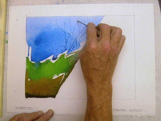
You can use old credit cards to scrape off the paint. With a smooth side card, you can sweep away paint residue.

Many brushes have a pointed edge. You can use these brushes to create thin lines.
It is very important to understand after what interval you need to start scraping. Practice on a separate sheet of the same paper and with the same paints.

A stamp is the application of paint by pressing other objects onto paper. You can choose any material in order to create stamps. Try everything that comes your way.
On the this example we use face wipes. Fill them with paint and apply stamps on upper part paper.

You can also use a sponge. With its help, we will depict the grass.
You can play with textures using various materials. Experiment!

Don't be afraid to use body parts for stamps. Everything has its own use!

Washout
Relatively simple technique will help you create unusual and interesting textures.
First, cover the top of the paper with blue paint.

Then quickly paint over the rest of the canvas with red. This is what our drawing will look like at this stage.

Now rinse the brush well and refill it with clean water. With light movements of the brush, sprinkle drops of water on the still wet paint.

Keep splashing water until you are satisfied with the result.
The extent to which the paint has dried can be understood by the strength of the effect of water on it. Note that what more water fell on the same area, the lighter the shade of paint became there.

Don't get frustrated if you can't control the blur. You, most likely, will not succeed, since it is quite difficult to influence this process.

Experiment with the amount of water, colors, and how dry the paint is. This technique can help you create interesting and textured backgrounds.

We use alcohol
You will need cotton swabs and alcohol.

Thickly paint over your sheet with paint.

Create the background shade you want and get ready for the fun.

dip cotton swab into alcohol and start dripping it onto the paint.
Alcohol, falling on the paint, repels it, as it were, creating a bright spot.

Try dripping rubbing alcohol onto the paint as it dries to see the effect.
It turns out pretty nice, doesn't it?

This interesting technique allows you to create unusual textures.

We use salt
Obviously, we will need salt for this technique.

Let's draw the sky and the hill.

The second hill we will have is crimson, mix it a little with the first hill to get an interesting transition.

Now take the salt and sprinkle our drawing with it. After a few minutes, add some more salt. She pushes the paint away from herself, creating an unusual texture.

Let's wait for it all to dry and see what happens next.

After the drawing has dried, the effect that the salt has given becomes more visible.
Shake the salt off the drawing and enjoy the result.

It is better to use a sponge to brush off the salt. This way you don't damage the paint. Lightly clean the drawing, try not to rub it.

Salt absorbed the paint, creating great amount star-like spots.
It is worth noting that coarse salt will leave larger spots, and small, respectively, smaller ones.

Follow the steps in this tutorial to achieve this awesome text effect. Using a series of Photoshop brushes, we will create an effect that looks like printed text water fell, the drops scattered and there were streaks of ink.
I recently went to a clothing store and saw a cool t-shirt from Disel. The design of the T-shirt had good typography, which, after some manipulation, looked like it had been splashed with water and the ink had flowed.

I remembered and initially looked at a similar design by Craig Ward, his amazing lyrics "Ink and water don't mix". I'm not sure if Craig had anything to do with this t-shirt design, but I decided to give it a try myself, downloaded Photoshop and started experimenting.

Get started in Photoshop by creating new document. I have created a canvas with a horizontal focus. Use a cool and slightly sophisticated font like Bodoni.

Break the words into separate layers and move them around to balance the image and position the words towards the bottom of the image.

We could get our hands dirty and splatter some ink on the paper and then scan the result, but instead we'll go more the easy way using the resources of various designers and artists. Search the web for collections of ink streak Photoshop brushes. Here are the brushes I chose to work with:

Download and upload the ABR files (Photoshop ? Presets ? Brushes, or just unzip to any location). Open Photoshop and in the Brush palette click on the little arrow then select Preset Manager to install all downloaded brushes.

Choose the most interesting brushes with different sets and add the first streaks under the text on a new layer. You can adjust the brush size using square brackets on your keyboard.

When creating inkblots, focus on similar areas of letters, so, for example, if it is a long inkblot, smooth areas of letters are suitable for shading.

Give some of the letters more significant distortion by adding lots of ink areas, but keep the words legible when viewed at 100% scale.

Some of the brushes in the set are created from drawings. And these brushes are naturally splattered drops of water with subtle smudges all around.

You can adjust the brush by rotating it in the Brush palette to avoid any repetition of the brush. To do this, use a cross in a circle to indicate the angle.

Download some spraypaint brushes to use small drops for the finishing touch.

Download the grungy paper texture to make the background more visually interesting. Desaturate the texture (Image > Abjustments > Desaturate) and lower the Opacity to 15% to leave only a few background shades.
In this tutorial, we'll create a smudged text effect in Photoshop. Instead of text, there can be any other graphic object. To begin with, with the help of custom shapes, we will create smudges themselves, then with the help of layer styles we will make the text voluminous and viscous. And finally, you will learn how to easily and quickly give text any color using an adjustment layer.

paper background
Create a new 900x600px PSD document. Add this paper texture to it and name the layer paper background.

Add an Adjustment Layer Gradient Map from color #000000 (slider position - 9%) to color #ececec (slider position - 90%).

Working with the text layer
Create a new text layer and choose the font you like. The example uses the League Spartant Font . Enter your text.

In the palette Character/Symbol set tracking to 100.

Right click on the text layer and select Rasterize Type.
Hold down the CTRL key and click on the text layer to create a selection along its outline.

Click on the icon Add Layer Mask / Add a layer mask.

Select from the menu Select > Refine mask and enter the following parameters:

Hold down CTRL and click on the layer mask to create a selection.

Make the text layer itself active and select from the menu Edit > Fill / Edit> Fill.

Right click on the layer mask and select Apply Layer Mask / Apply layer mask.

This example imitates text written in paint (or blood) that has not dried yet, so smudges have formed.
So, create a new document in Photoshop and enter the desired text. Please note that the background must be set to black and the font color to white. Center the text. Using the command Layer>FIatten Image(Layer>Flatten), merge the text layer with the background layer.
Rice. 212. After typing the original text, center it with the command Layer> Flatten Image
team Image>Rotate Canvas>90°CCW(Image>Rotate Canvas>90° CCW) rotate the original image 90° counterclockwise. So we get an image in which the text is read from bottom to top. This rotation is necessary to apply the wind styling filter: FiIter>Styleize>Wind(Filter> Stylization> Wind).
Parameter method set equal Wind, direction (Direction) - From the Left(Left). This way we get the effect of wind blowing from the left side. To enhance the real effect, repeat the whole procedure twice more. And return the image to its original horizontal state.

Fig.213.

Rice. 214.
With the command Image>Adjust>Invert invert the image. Then we apply a filter to the inverted image Filter>Torn Edges.

Rice. 215. Apply Filter>Torn Edges to the inverted image
Here we can not advise anything specific. Try to choose the necessary parameters for your taste. The type of smudges of letters will depend on these parameters. Parameter value contrast set in the range of 14-17. since larger or smaller values of this parameter will significantly affect the density of letters filled with black. Parameter Image Balance it is better to set in the initial values. The main thing is that the letters themselves are still visible, but “do not go numb”. Parameter Smoothness you can safely set it to the maximum value - 15.
Don't be too zealous. Everything should be natural!
However, our text is still black. If we want to create text written in blood, then it needs to be given an appropriate red color.
Using a tool from the tool palette eyedropper("Pipette") (<1>) , set the main color to red or red-burgundy. Now a tool with the same palette Magic Wond("Magic wand") (
To add more believability, you can slightly blur the edges of the image by applying a filter. Filter>Blur>Gaussian Blur.
Blur radius value Radius it is quite enough to set within 0.3-0,> pixel. All!

Rice. 216. Filter panel Filter>Blur>Gaussian Blur

Rice. 217. Final image - smudged text