A combination of pink and blue. How pink became a "feminine" color. Why is pink not really a color?
How to combine pink and blue colors in interior design?
Pink and blue... These two colors are still considered classic in interior design. True, not in the best sense of the word. Opening specialized magazines ten years ago, I saw the dominance of pink and blue interiors, which really looked quite attractive. But then came a long period of oblivion. Pink-blue is increasingly being used in children's design, but the design of "adult" premises began to develop new directions. This, in turn, led to the fact that the combination of pink and blue in the heads modern man is associated with something childish, as a result of which it is rather problematic to take the corresponding interior seriously. And yet I want to introduce you to such interiors that should arouse your keen interest. At least I really hope so.
Virgo blue color. In most of the old photographs of Mary, such as Albrecht Dürer or Stefan Lochner, Mary wears a blue veil or blue dress. “Even in the days of Queen Victoria, no viewer would have thought of a pink dressed baby for a girl,” explains psychologist Eva Heller in her book How Colors Affect Feeling and Understanding. She demonstrates that blue was, in fact, female color, and red was the age-old masculine color.
Eva Heller also points out that the surname Roth is very common, while the surname Blau is very rare. The rarity of the surname "blue" explains Heller precisely by the fact that she was always considered a female color, but the surnames were transferred by male line. The combination of the color red and masculine characteristics also indicates that red was once one of the predominant military colors when soldiers were still going to fight in colorful uniforms. The troops wanted to be clearly visible to the enemy. After all, he wanted to impress him with the size of his army.
Faithful shades of blue and pink
Too many designers make the unforgivable mistake of mixing with blue color exceptionally cold pink shades. Like, so the overall picture will look more harmonious. In fact, warm pink background in modern conditions looks even more preferable than cold. I would even recommend using Coral color, which, in addition to compatibility, will give the interior more activity and cheerfulness. But remember that blue and pink in our case act in pairs, that is, in close relationship with each other. And the degree of saturation of one color must necessarily be supported by the saturation of another. Bright pink and pale blue is a combination that makes no sense. It would be logical to either saturate the blue or reduce the intensity of the pink.
In the First World War, the range of projectiles increased, so that it now became reasonable to shield the weapon from a protected place: the uniform became gray. After the First World War, the red that was still present in civilian manners finally disappeared. Now it occurred to me that the sailors were wearing blue color like the workers. Blue appeared more and more often, as the male color and light blue color corresponded to the color of the boys. At this time, bodysuits were invented. Meanwhile, washing machine was invented, and the colors became resistant to cooking.
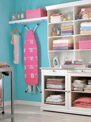
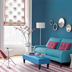
There is such a design concept as the colors of water. That is, the main colors of the palette are taken, and, as it were, diluted with water. Blue and pink are one of the best colors water, which simply dissolve perfectly to the desired state. At the same time, soft blue alone may seem too cold, but soft pink will compensate for it, as a result of which perfect harmony will be created. The summer palette will be more interesting for active young girls who deliberately refuse romantic lyrics in favor of cheerfulness. Dense and rich tones of pink and blue will not make you bored, so I recommend using them in functional areas. In one example, I saw a bright pink ironing board hanging from a bright blue wall. It looked simply stunning.
The coloring of children's clothes in the bourgeoisie no longer interfered. The colors were assigned to the floors as they felt at the time - and to this day. Pink dress for girls, blue jumpsuits for boys. Rose is the color of girls, blue is mostly for boys.
Red fighters, blue Virgo figures. At that time, girls were dressed in blue because that was the color of the Virgin Mary. Rose was a typical boyish color, also called "little red". And red is the color of blood and therefore war. Fighters are painted red, until the end Heller writes that red is a man in all cultures and is considered the color of strength, activity and aggressiveness.
Nice combination of pink and blue
When designers talk about color combination, then we are talking about two or three dominant colors, among which it is impossible to single out the dominant one. The combination of pink and blue is no exception. But only if these two colors have the same saturation. Recently on one site I came across interesting interior, in which the combination of pink and blue was not a combination in the above sense of the word. The main color in this interior saturated blue acted, and pale pink was used as an additional one. Accessories were pink, as well as some decorative elements and decorations. And it all looked pretty interesting.
The social scientist describes paintings from past times in which the little sons wear pink silk suits, the baby Jesus also has a pink dress in many of the paintings. Often, however, children's clothing was neutral anyway, namely white and with red ribbons for boys and blue ribbons for girls.
From the twenties. Over time, pink, which until then was considered masculine, slowly became the color of the girl: one moved away from the symbolism of the religious color, blue was no longer the color of the figure of the Virgin, but of the naval uniform, and industrial workers also wore blue suits. Blue thus became the color of boys, the traditional contrasting color of light blue was pink, so she became the color of a girl.
Finally, I would like to draw your attention to a situation where neither pink nor blue are primary colors, but are used in the same interior at the same time. In this case, you can operate varying degrees saturation, depending on what you want to achieve using this combination. For accents, it is better to use saturation, but as decorative frame calmer colors are also suitable.
Irritation environment affects behavior. Rose today is associated with such terms as sweet, delicate and feminine, the blue color of sympathy, harmony, kindness and friendship. Are there any kids with pink or blue dress from the start? Education also plays a role. But mostly it has to do with the unconscious environmental stimuli that characterize children's behavior. Girls learn to make themselves beautiful - for example, with pink dresses- because they receive positive signals from the outside.
Tambourine gets a little more recognition when they pass, do something. Single nursery. Stereotypes of this kind have nothing to do with the gender-neutral children's school in Vienna-Meidling: “It starts with gender-appropriate language and stops with spatial design,” explains Inge Kugler. The rooms are gender-neutral, so there's no girls' pink puppet corner or blue-painted building blocks for boys. “We have multifunctional areas that have neutral toys, such as hospital or hair salon with accessories for women and gentlemen,” Kugler explains.
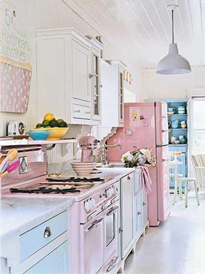
Pink and blue is a combination long time was iconic in design. Then came a period of oblivion, associated with the fact that pink and blue “gone” into kids design, and adult design at that time was actively mastering other colors.
Until now, we do not often turn to the combination of blue and pink, subconsciously perceiving it as something childish. So today I'm going to show you some great examples of pink and blue combinations that I hope you enjoy.
There is no fixation of roles, children are free to choose what they play, girls follow the typical activity of a boy and vice versa. "Boys can wear princess dresses here and girls' police uniforms," the nursery leader said. When planning, the colors of the rooms, neutrals, transparency, glass, wood and natural shades were taken into account. "The color concept was intentionally without blue and pink," the nursery said.
The pedagogical concept is also focused on gender neutrality. We're looking for puzzles building blocks and picture books in such a way that it depicts both women and men. It's about managing life in general and building self-confidence.
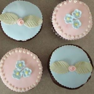
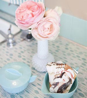 One of the common myths about the combination of pink and blue is the myth that only cool shades of pink go well with blue. This is absolutely not the case - you can use arbitrarily warm shades of pink, even turning into coral. In the photo on the right you can see good example- the top rosette is cold pink, and the bottom one is warm, with a creamy tint. And both look great on a blue background.
Lack of group education based on gender. Of course, boys are sometimes blue and girls are in pink. "It's also linked to fashion store deals, but we're not evaluating that," says Kugler. It is especially important that children are practically attracted to develop as freely as possible.
How does the omission of cliches affect the children themselves? “I notice that they are much more open, that there is no debate about whether only boys or girls can participate in the game,” says Kugler. There were no groups of girls or boys. Young and young parents of little girls are already struggling with the threat of pinkness before birth.
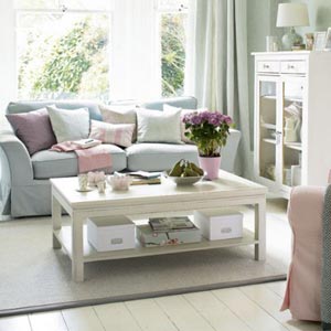
But what is important is that blue and pink are from the same color palette. Again, the photo on the right is a good example - both blue and pink are here from pastel palette so they match well.
Let me explain the idea of pink and blue from the same palette. Compare three pictures:
Who is pregnant and the baby of the baby knows, in fact, only before the choice: pink or blue? There are many shops for children's clothing and toys. Gender marketing has been successful. Dresses with tulle and crowns with glitter battling blue excavators and cool cars. Whoever gets the girl and does not want to immerse the child in pink and pink from the beginning, shows the gender always with the addition: "It does not like pink and pink" - in the hope that friends and relatives with their gifts to this Save the specification.
But finding something in red, yellow or green is not so easy, first you get to the appropriate stores. From birth, one is already full of stereotypes, already personalized books in the clinic are gender-based. Very long look or sewing because you have the choice of fabric in hand. Boys used to wear dresses. But why is it really pink for girls and blue for guys? Even after the First World War, it was even the other way around: boys wore pink, girls blue. Pink is a more determined and powerful color derived from blood, blue is more subtle and elegant, and the color of the Virgin Mary is justified.
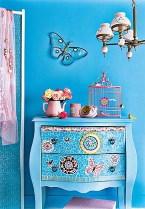
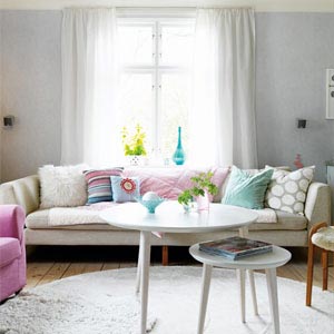
 The interior in the photo at the top left is made in water colors- both pink and blue icy-cold, glossy, watery. The combination is not for everyone, but it looks amazing. In the photo above on the right - pink and blue from summer palette- bright, saturated, dense. Bright, of course, but fun. The interiors are very different, but each is harmonious.
Century was White color small children, even boys wore up to six or seven years old clothes. Terrible captivity Later, when the parents of the current generation of parents were expecting a new generation, everything was bought in white, pastel yellow and as neutral as possible - because the parents knew the sex of the parents of the 70s or 80s often remain after birth. Today the first question as soon as someone announces that they are pregnant is: "Will it be a girl or a boy?" And already in the head of some pregnant women, growth was frightened.
Experienced parents of little girls, by the way, often smile at the thoughts of such parents and give advice such as "Wait until the child decides what to wear." Well, there is still a little time for this, and the taste of the offspring, I hope, has had a positive effect. Hope is dying. A claim that is especially popular in gender circles is that the purpose of color and gender should be different.
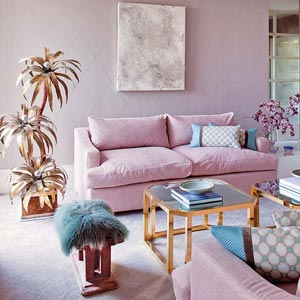
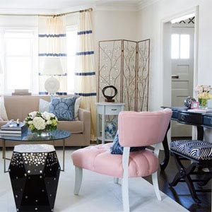
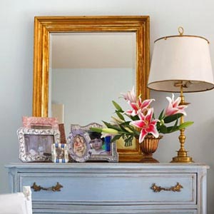
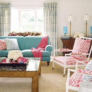
In the photo on the left - dusted turquoise blue and the same languid dusted dark pink from the boudoir palette. These elegant colors are perfectly combined with each other and with beautiful shade cocoa (chair upholstery). Notice that there is nothing childish in this combination, it is very elegant.
 So, when pink and blue are from the same palette, there are no problems in combining them. But if blue and pink are from different palettes, then it’s more difficult - then you need to be more careful when choosing which color will be the base and which accent. Let me explain with examples.
Previously, Rose was considered the color of a child. Red has an association of passion, blood, active eroticism and struggle. So it's been a long time as a "masculine" color and Rose, "little red" has been given to boys. Blue, on the other hand, is the color of Mary in the Christian tradition. Thus light blue, "light blue", was reserved for girls. It was more important in upper class. "Faded" pastel shades were suitable for frequently washed children's clothing. At that time washed by hand, textile colors could not withstand boiling.
Often washed baby clothes were mostly neutral white and you only used colored ribbons. After the First World War, there was a change of opinion, blue became a symbol for the working and male world. blue tone Navy uniforms, blue suits, Blaumann promoted the symbolism of light blue boys. Boys wore fashionable sailor suits at the turn of the century. For female babies, pink remained a traditional contrast. At present, children's clothing is becoming more and more colorful, the speed and variety of textile dyes are increasing, and classification for children's clothing is becoming less important.
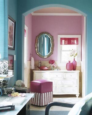
In the photo on the right you can see unique interior, in which the base color is bright bright blue from catchy palette, which is called "pull out the eye." Each element of this interior is made professionally, so everything looks very beautiful and good (catchy colors have such a feature, but read more in the article at the link). Pink is an accent color here, and it is from the water palette - cold, shiny, flowing. This is very bold combination, but thanks to the professionalism of the designers, everything turned out well.
The color adjective pink still has a clear function, such as in toys and even in Food Industry. This division into pink and blue is also weakening in the adult world. For adult women, Rose is the fourth most beautiful and seventh most intense color, for men the eighth and third most unsurpassed. For men, this color usually means helplessness, naivety and weakness.
The search results are shown in the figure. However, all gender color associations are found in the database. A similar search for the British English Corpus showed the same pattern. In other words, this massive database of books contains no trace of the supposed pink-blue reversal, on the contrary, the results show color associations became progressively more significant during the twentieth century.
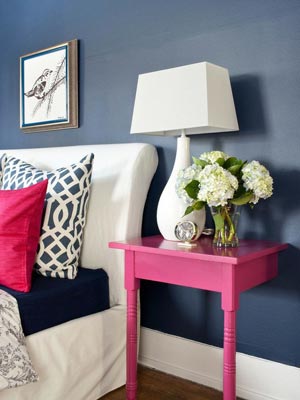
 In the photo on the left - reverse example. Here, the base color is pastel blue - blurry, soft, calm. And the accent is a bright “pull out your eyes” fuchsia color from a catchy palette. I would not say that the decision turned out to be successful - on a delicate pastel background bright pillow and the lampshade of the lamp stands out very much, attracting all the attention.
Intriguingly, the pink-blue convention may ultimately depend on the perception of bias towards different areas. color spectrum in two sexes. Starting at age 2 and continuing through preschool, girls are the same color. In addition to social learning, these developmental trajectories may reflect the activation of disparate sex differences in color processing.
Therefore, he did not find a change in color after his research. Indeed, it can be assumed that such a change in color would have left its mark, and in some form would have been lost in the search for books. It may be necessary to listen to the factual arguments of the other side and examine what they are based on.
In my opinion, it would be more humane to use the clover-pink color from the summer palette (like the ironing board in photo 11) - it is also quite bright, but still softer.
 For example, as in the photo on the right, where the base pastel light blue is accented with clover pink (almost all accessories) and coral (table lamp).
All pink accessories stand out beautifully against a pastel background, create the right contrast, but at the same time do not create the “pull out the eye” effect and are built into the interior much softer than in the previous photo. If you have one color (pink or blue) as a base color and another accent color, it is better if they do not differ too much in brightness.
 In general, the best partners for pastel colors – pastel colors as you can see in the photo on the right. Here, pastel pink and pastel light blue complement each other perfectly, creating a very light and not boring picture at all. Please note that in this basic combination both dark and light furniture look equally good.
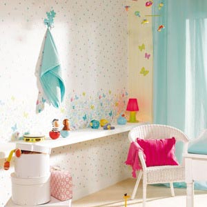
 Pastel pinks and blues are ideal for creating a relaxing, calm, but at the same time not boring interior. The photo on the right is a great example. Vanishingly light pastel pinks, blues, turquoises and grays plus white are used here. The interior is very bright, incredibly calm, but at the same time it does not look boring and is quite original.
Pastel pinks and blues, as in this photo, are suitable for sunny rooms if the goal is to “calm” them.
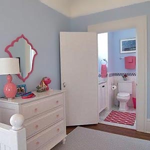
 Pink and blue (or blue) go great with white, a very popular choice in Western design. It is used in modern, as in the photo on the left, and in classic (photo below left), and in country interiors (photo below right). White perfectly accentuates the combination of blue and pink, gives it a “frame”.
The interior in the photo on the left is the base colors of blue and pink with a lilac tint, and white is an accent. In the photo on the right - on the contrary - the base color is white, and blue and pink are accents. In both cases, very impressive, harmonious.
In general, blue and pink definitely need a third accent color.
The interiors in the photo above look strange, because the combination of blue and pink is not accented by anything. In the photo on the left, a bright blue sofa with pink pillows does not play against the background of a dark blue wall, it disappears. In the photo on the right is a pink sofa against the background pink wall– the interior is smeared, blue accessories are not visible. Do not repeat these mistakes - the combination of pink and blue should be accentuated.
In addition to white, it is perfect for accenting blue and pink. cream. It is combined with calm pink and blue hues, as in the photo below on the right, and with bright ones, as in the photo below on the left.
Equally well suited cold and warm gray shades like the photo below.
 Good accent colors for blues and pinks are dark chocolate and black. There is a subtlety - for cold shades of pink and blue, as in the photo on the left, black or dark gray is more suitable. For warm colors- dark chocolate.
 _______________________
Gold is also combined with blue and pink. In my opinion, dull gold in cold tones works better than bright “coppery” gold, even if the shade of pink is warm. Compare two pictures: 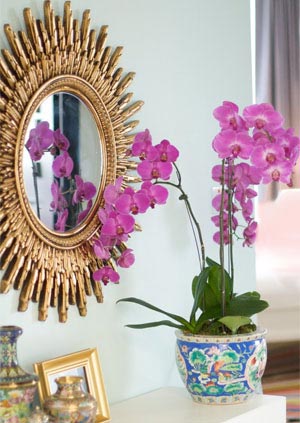
rich gold color in the photo on the right “hammers” delicate blue and pink colors, the frame looks too rough on a light background; in the photo on the left, dull gold looks better
 but ideal partner for pink and blue, I still count silver.
Gold next to blue and pink, even with such saturated ones as in the photo at the top left, still looks too bright, “rich”.
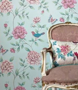
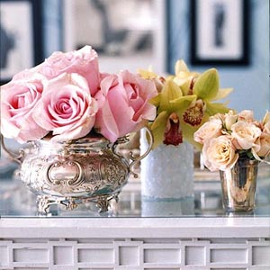
Silver, with its seeming modesty, gives the whole picture that tone and gloss, which accurately indicates the taste of the owners. In the photo on the right you see silverware that fits perfectly into classic style interior and blends perfectly with pink roses and blue walls.
Very good for pink and blue green color, as you may have noticed in the previous photos, and colors from the same palette are best combined.
Pure shades of pink and blue, like the one on the left, need green accents of the same purity and saturation. If you are using muted, pastel (photo on the right) or very bright hues, then the green accents should be the same.
Furniture of any color, except for red, is suitable for a combination of blue and pink.
chocolate, caramel, yellow-brown, red-brown - these most common “furniture” colors go well with blue and pink
 Personally, I like the combination of blue, pink and natural yellow-brown oak most of all, as in the photo above on the right. Very good combination with golden sand color, straw color, bleached oak and milk oak (photo on the right).
Similarly, with the floor - the same types of wood are suitable for the floor as for furniture. And with red varieties (Milan walnut, anegri, cherry, pear), pink does not go well.
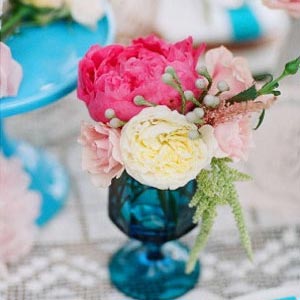
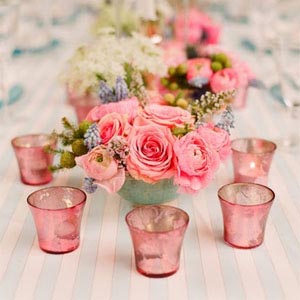
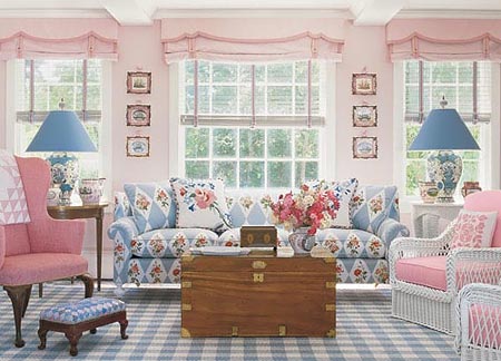
 Pink and blue are often used in western design to decorate the table - most often for wedding tables in the Biedermeier style, as in the photo above.
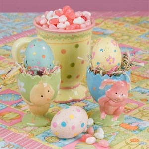
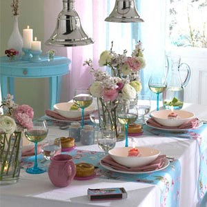
In addition, pink and blue is popular in the decoration of Easter and children's table. In other cases, these colors for festive serving rarely used.
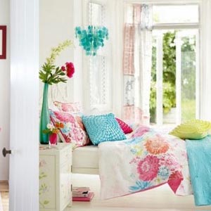
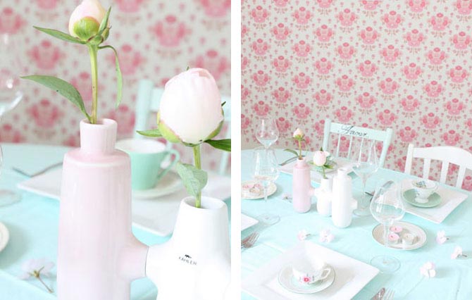
Most Popular light shades pink and blue - pastel and water, as in the photo on the left and in the photo below.
I hope this article was helpful to you - if so, click the “+1″, “I like” button or your icon social network. Thanks!
Catherine says:
12/21/2012 at 12:54 am
Hello. Thank you very much for the article with such photo examples.
My kitchen “accidentally” turned out pink. Coincidentally, because the color of the walls, which was conceived as a muted ash-violet color (from the boudoir color palette), turned out to be pink. This got me baffled.
Now the lower facades of furniture and countertops gray color, but wall cabinets pale pink. Choosing between green and blue, I decided to add blue. I hope that the final version will be harmonious and calm in its shades.
Thanks again for the tips.