Decorating the kitchen with red not expensive sets. Red and black kitchen design, photo
Our tips for creating a kitchen in bold, vibrant colors will help you make the right choice of complementary shades. Read and see photos!
The selection of colors for the interior of the room is very important and requires certain creative skills and knowledge. In the color palette, red occupies a special place, being one of the brightest, exciting and joyful. However, its use as a base shade in the interior has not been so popular until now. Recently, designers have begun to use bold decisions when decorating the interior. Red color in the interior of the kitchen has become very popular.
The kitchen is one of the most visited and important rooms in the house. When developing its design and content, it is important to observe the following parameters: functionality, originality of design, space saving (in the case of a small area of the room). When using red, it is very important not to cross a certain line that can make the room unattractive and even repulsive, which is unacceptable for the kitchen. Achieving coziness and comfort is the main thing to focus on.
If you are developing a kitchen design on your own and decide to include red in it, then a gallery of photos with already finished projects red kitchens. We have selected the most attractive photos of red kitchens.
Red in kitchen design: pros and cons

Coloring is a multifaceted science, acquaintance with its basics will allow you to understand the language of color, the combination of colors, their influence on the psychological state of a person. It is known that specific color may be perceived differently by each person. Someone closest to warm colors, someone loves contrast and cold shades that make you feel invigorated, excite imagination and emotions.
Experts who study the effect of color on the psyche and physiology of people note that the choice of interior colors should be based not only on fashion trends, but also on the state of a person under the influence of one or another shade. Previously, red was considered annoying and was not used in the design of the kitchen. It was believed that it negatively affects the psyche and can even cause headaches. Receptive people, introverts can really feel causeless anxiety, panic and discomfort in a red room. However, creative energetic natures find in him a source of inspiration and optimism, good mood and cheerfulness. The abundance of red in the interior of the kitchen where you drink Morning coffee after waking up, it is able to set up for an active continuation of the day.

However, it is impossible not to pay attention to the proven fact, which indicates that red color increases appetite. The advantage of its influence on human physiology is that red helps to improve digestion, accelerate the digestion of food. But still, those who are in the eternal pursuit of losing weight should not take risks and make the kitchen red, but choose more neutral tones.
Therefore, based on all the pros and cons of decorating the kitchen in red, you should listen to your own feelings, analyze how this color affects you. If it causes only pleasant sensations, then feel free to get down to business: paint the walls red, buy a red set, textiles and furniture, though the main thing is not to overdo it!
Distinctive features of red in the interior of the kitchen

If you want to save on designer services and are going to do repairs on your own, then you should remember that red kitchens are different houses or apartments can look completely different. Therefore, when designing the interior, it is important to consider the following factors:
- kitchen area;
- the location of the room relative to the sun (the kitchen is light or dark);
- location and size of windows and doorways.
These factors will allow you to choose the right shade of red, the most optimal for your kitchen. So, when decorating a small room, it is better to use the lightest, lightest shade of this color, since excessive brightness will contribute to the visual reduction of the room.
The choice of complementary colors is very important. Warm tones go well with red: beige, vanilla, cream and cream shades. Red goes well with black. It is better not to use white and gray colors - in combination with red they give a cold effect.
Kitchen in red - bringing to life

The choice of red as the main color in the interior palette does not necessarily mean that everything should be exclusively red or its shades. The abundance of one color can spoil the design of the room, so the measure is very important.
When designing, emphasis should be placed on:
- furniture - kitchen set, dinner table, household appliances;
- textiles - tablecloths, towels, ;
- walls and floor;
- accessories and design elements.
Concerning household appliances, you can buy it in red, but it may require a long search. Therefore, it is not necessary to buy, a microwave and stove in red, can be purchased in standard white or black. You can add shades of red using dishes and textiles, which is the most simple and budget option. Add accessories and lighting and design elements that will add zest to the room. Curtains, cushions for chairs, tablecloths, kitchen towels, vases, figurines, floor mats of the appropriate color and design can work wonders.

If you are the proud owner of a spacious kitchen, but its windows face the north, non-sunny side, then it is better to use pink, light terracotta or light raspberry paint for the walls or. The red floor is an amateur business. For floor covering you can choose more dark colors: dark crimson, terracotta. As a coating for the kitchen, linoleum, laminate is perfect.
So, if you know with full confidence that a red kitchen is your option, then do not hesitate to choose the most suitable one. finished design and start making your dream come true! Good luck and happy renovation!
Photos of kitchens in red:


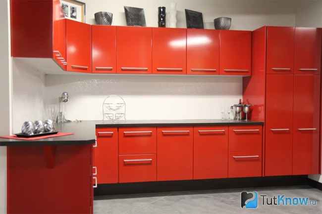
![]()
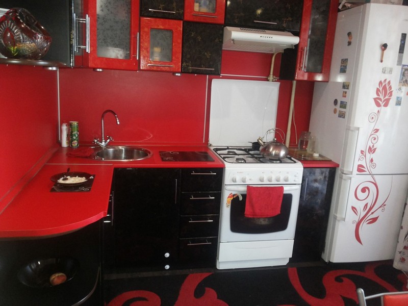
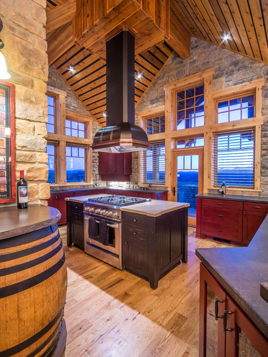
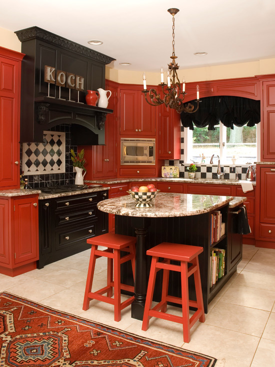
It is unlikely that the interior of the kitchen in red and black colors can be called ordinary. Only freedom-loving, self-confident and extraordinary personalities who keep up with the times can choose such a range for decorating this room.
Designing a kitchen in red and black begins with choosing a dominant tone. In the vast majority of cases, this role is assigned to red.
The dramatic and spectacular red tone is emphasized by the complementary black color, which gives the interior even more sophistication and originality.
When designing a kitchen in red and black, it is not necessary to use only these two colors, as it will look quite aggressive. The role of the third color in such an interior is to divert attention from rich and deep tones and balance the color scheme of the interior.
The perfect complement to the combination of red and black colors will be bright hues, visually expanding the space and relieving the tension caused by the red-black color. It is enough to apply them when decorating the floors, ceilings and walls of the room, and the drama of the kitchen will be diluted.
Warmth and comfort will give such a room warm shades white color a: pearl, creamy, beige colors, tea rose and ivory.
A deep gray color will also perfectly complement the black and red interior, which will emphasize its style and originality. But the pure white color of the ceiling, walls or floor will give the room excessive rigor and formality, so it is undesirable to use it.


![]()


Tip: to soften the black and red colors when decorating such a room, use frosted glass, mirror surfaces, as well as marble texture.
There are many options for color combinations of red and black kitchen sets: you can use a combination of a black bottom and a red top, and vice versa, or a checkerboard combination, or you can make only the countertop black or a few details in the interior, which will give some restraint to the room.
by the most ideal option a combination of a black bottom and a red top is considered.


A kitchen in such colors does not need pretentiousness, additional decor and extra details. Everything should be concise and simple: the clarity and severity of the lines of the facades, fittings made of chrome steel, a minimum of decorative finishes.
In the design of a black and red kitchen, you can combine various textures. For example, if you choose glossy red facades, they will beautifully reflect the black elements of the interior, and vice versa, the reflection of red details of a different texture in the black glossy facade will add even more originality and drama to the interior.
Lighting also plays an important role in such an interior: the better the room is lit, the more restrained and comfortable the room will look.
Kitchen accessories should be selected in a design and color that will complement and harmonize with other interior elements. It will look best kitchenware, which has a strict design and color as close as possible to the main tones in the room.
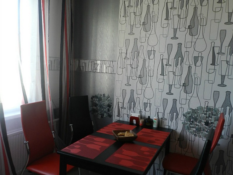
Wallpaper in black and red kitchen
In the decoration of the walls, light neutral tones should be used, which will balance the aggression of red and black. For such a kitchen, plain textured ones in gray or beige tones are ideal, which will emphasize the dignity of the main background and its dominant place in the interior.
To make the kitchen look more comfortable, the contrast of colors in it must be minimized, using a muted shade of red and calm tones of white when decorating the walls of the room: the color of baked milk, pearl, cream, caramel.
This combination is perfect for laconic interior in the styles of minimalism and hi-tech, and in styles, hallmarks which is looseness and freedom (for example, avant-garde and retro).
Wall coverings with wallpaper should be avoided. large pattern or ornaments: in this case, tackiness and excessive design congestion cannot be avoided.
To divide the room into zones, which is most important for kitchen studios, you can use a combination of wallpaper different colors.
Also in such a kitchen, the design of the walls looks original, which combines wallpaper and textured decorative plaster.


Tip: remember what less room kitchen, the more light colors should be present in the interior. Since red and black colors visually reduce the space, try to use calm light colors as much as possible when decorating the walls.
Apron for red and black kitchen
The color scheme of curtains for rooms in red and black colors is selected based on how saturated these tones are in the interior.
Too bright and aggressive colors should be slightly smoothed out with curtains in calm light colors. And if the tones of the black and red kitchen are not too aggressive and saturated, you can choose red curtains.
Monochromatic light curtains will look best in such a kitchen, the color of which will be in harmony with other elements of the interior and the decoration of the walls, floor and ceiling.
These can be curtains of milky, beige, pearl, light gray colors, which can be complemented with light tulle to match the curtains.
Textiles in neutral colors will make the room in red and black colors more comfortable and sophisticated. Thanks to him, the kitchen space will visually increase and the room will not look heavy and cramped.
To give the interior of the room a finished look and correctly place accents in it, pick up other textiles to match the curtains.
For example, soft seats for kitchen chairs, as well as kitchen towels in light colors will make the interior so cuisine easy and harmonious.


A kitchen in red tones is, without a doubt, always a success. Red is one of the most “powerful” colors in terms of its impact, which is why designers love to play with it. However, when choosing it, it is worth remembering that red obliges a lot - in order for the kitchen to look stylish, and not clumsy, you must very carefully and carefully approach the selection of colors in the interior.
Red kitchen - pros and cons
 Red color excites nervous system, uplifting, toning, energizing. This is the color of life and passion - in such interiors there is no place for depression and loss of strength. At the same time, an abundance of red can cause fatigue and irritation, because it raises blood pressure, increases the release of adrenaline and can cause aggression. In addition, the red color awakens the appetite, which does not satisfy everyone. Therefore, it must be used in a dosed manner, balancing with calm cold tones.
There is always too much red - it has the ability to dominate and fill the entire space. Therefore, you should not use pure red shades in small kitchens up to 6 m in size. In this case, you should give preference to slightly calmer shades - cherry, pomegranate, burgundy, burgundy. In the same way, you should not choose red if the windows of the room face south and it is always hot in it.
Interior options with red
The interior in the kitchen in red colors can be solved in several ways:
- red furniture is combined with neutral shades of the rest of the decor;
- walls are solved in red;
- red is an accent - curtains, dishes, interior items are chosen in this color.


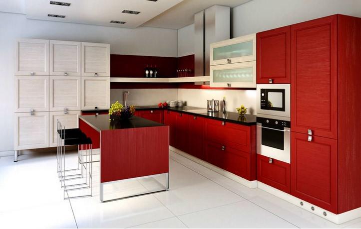
Red furniture and its surroundings

A red kitchen set will look advantageous in the interior if it is the only dominant. Here it is especially important to consider the design of the room.
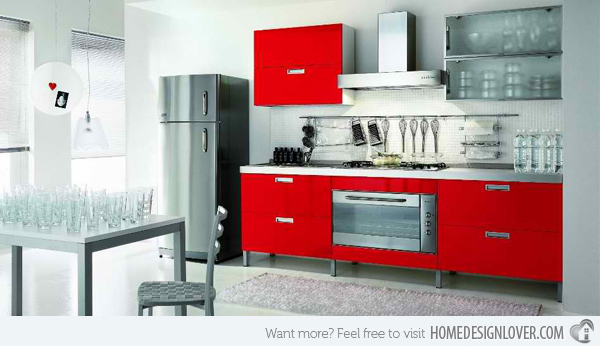
As a rule, red kitchens are made from chipboard or MDF with a glossy polyurethane enamel, laminated, lacquered coating. They look the most impressive glossy kitchens. Choosing a similar option, you need to use the game in contrast. You should not decorate the rest of the interior in radiant colors - if the furniture is glossy, then all other surfaces, including walls, floors, ceilings, should be matte. Then the design of the room will look stylish and respectable.
If the kitchen is small and you want to use red, then you should pay attention to sets in which red is combined with other colors. The question arises, what color is most suitable for red in this case? The best combinations The colors in the headsets are considered to be red-white, red-beige, red-brown, red-gray. Well suited red with light wood or wenge. Glass and chrome fittings emphasize the power of red.
Important: Best of all, the red kitchen looks in the interior of the combined kitchen-living rooms or dining rooms. In studio apartments, such furniture becomes the main focus - the main axis of interior design.

 If it seems to you that the red color will "crush" with its energy - dilute it with white, for example, using it on the upper cabinets
What color should the walls be? Again, these should be neutral colors - white is best, as well as warm and cold shades. It is worth considering that the combination of red and warm colors- beige, creamy creates a feeling of comfort. The combination of red with cold shades is official - for some, the design of such a room may seem uncomfortable and cold. But such an interior will look solemn. White and red is considered a win-win color combination - white balances the power of red and removes excessive intensity of aggressiveness. Provocative enough is the combination of red and black. She always looks stylish, catchy, strong. But this combination is not suitable for everyone - some are repelled by excessive drama and theatricality of design.
Red accents: highlight the style
 If the design of the kitchen relies on red, but the abundance of red is excluded, you can place accents. It does not matter what shade of red is used and in what quantity.
Strokes can be:
- photo printing on a set of red elements;
- red curtains;
- paintings;
- a couple of interior vases;
- lamps;
- Vinyl stickers will also help to revive the interior and add colors to it.
Surrounded by red: how to dilute kitchen design
The design of the kitchen can be solved in a different way - the surrounding furniture is made in the red key, the furnishings:
- walls;
- ceiling;
- apron.
It is not necessary that all the walls in the kitchen be red. This overloads the eyes and causes fatigue. In order to create an interior in a red key, you can paint 1-2 walls in this color, or make a bright red apron along the sink-stove-desktop. It would be appropriate to combine wallpaper in two colors - red and neutral. It is best to avoid drawing on neutral wallpaper. The red wall solution visually reduces the kitchen, so it's best not to make all the walls red. But one wall in red will look stylish in the interior.


Important: In order for the interior not to get bored, it is best to use rich, but calm shades of red. Scarlet and bright crimson, as well as a combination of red and black, become boring very quickly.
The light wood set goes well with the red walls. For red wallpaper, it is best to choose wallpaper in white, beige, gray, pearl shade, metallic. Grey colour in combination with red makes the latter bright, but not tiring. In general, the combination of red and metal looks extraordinary and modern. Therefore, in high-tech interiors, an alloy of red wall surfaces and interior details from of stainless steel and chrome. In country-style interiors, warm red color goes well with warm wood - in this case, the furniture should be made of solid wood, or, in extreme cases, was made to look like wood.
Who will suit the kitchen in red
Red, as a rule, is chosen by active, independent, extraordinary people. More rosy caramel hues suit younger carefree wearers. In expensive interiors, the emphasis should be on deep red-brown tones. Such decisions are suitable for people who have taken place in life. Provocative color combinations are good for large rooms. In small kitchens, red is best used as accents. Otherwise, the kitchen will look even smaller.
The kitchen in red colors always looks stylish and original. The main thing is not to overdo it with flowers. And then everything in the kitchen will speak of the impeccable taste of the owners of the house.
Red kitchen interior design (photo gallery)


Attention, only TODAY!
It has firmly entered the list of favorite shades of fashion designers. Now no one will be surprised by a red-colored living room or a cherry-colored bedroom. Red kitchens are another way to make the interior of an apartment or house bright and memorable, and the kitchen itself a place for active work and noisy feasts.


And exactly kitchen room is considered the ideal option for using all shades of red, which fully fits the entire depth of this color.
The subtleties of using red for the interior of the kitchen
The ideal kitchen for everyone is their own, and the color perfect kitchen everyone has their own: someone likes calm beige, and for someone nicer bright orange. Designers note that the red color should be chosen especially carefully, since it is perceived differently by all people, and if such a kitchen inspires fear or aggression in one of the households, then no one will receive satisfaction from the updated design.

Fact! All shades of red stimulate appetite, so this interior should not be chosen by a family in which someone often goes on diets.

The design of the red kitchen is a wide scope of possibilities: it can create any mood and use any style.
The most common are two options for using red in the interior of the kitchen:
- Red in decoration is the use of any shades of this color for floors, walls or apron working area.

It should be remembered that if it is decided to make the walls red, then only one wall is recommended to be painted in order to leave room for calmer colors.
- Red in furniture is, as a rule, red facades of a kitchen set: glossy, matte, carved or combined.

Less common is a red table and chairs: for example, scarlet plastic bar chairs will be a great addition to a minimalist interior.

Designers note the strong influence of red interiors on the psyche and emotional condition people: for example, for calm and slow natures, a cherry kitchen can become an incentive and an engine, but for an easily excitable or expressive person, such an interior can induce excessive aggression.

Red kitchens: styles
In order for the interior design of the red kitchen to be harmonious and thoughtful, designers advise to fit it into a certain style.

Too lively and attention-grabbing red is not suitable for every style, there are only a few options:
- Modern Styles ( high tech or minimalism) are able to make red the center of the interior. Most often it is used for finishing the facades of a headset or in decor, so as not to overload the room with bright colors.

- Artsy classics (baroque or rococo) look great in dark cherry or burgundy shades. For bigger game its colors are often set off with gold and complemented by exquisite stucco on the facades.
![]()
- Art Deco or Empire is also good for red kitchen interiors, as this shade is able to convey the richness of luxury and sophistication of these styles.

All shades of red are suitable for use in kitchen interiors. The richness of color and variability, from raspberry to wine, are used by modern designers.

Tall windows to the ceiling in the kitchen with a brown-red facade
Of course, all color options are appropriate for spacious rooms, while on small kitchen it is better to use light colors or limit yourself to partial use of color (for example, as a decor or a bright color spot).
Colors - companions for red in the kitchen interior
Total red in the interior is a taboo. Too much of it cheerful color can produce the opposite impression - to crush and oppress.

It is in order to prevent such an effect from appearing that designers recommend using red in combination with another color, which will not only dilute the excessive aggressiveness of scarlet, but also create an ideal duet with it.
- Red and white kitchens are considered classic combination in which the vitality of scarlet should become soft and restrained against a snow-white background. This option is traditionally used: white walls and an apron are the background for a red headset.

Glossy light tiles and glossy facade suitable for small space
Designers say that there is no such color that could not be used in interior design. And it’s hard to argue with that, because looking at their professional portfolios, you are sometimes amazed at how well they matched color schemes from seemingly completely incompatible tones. And despite the fact that the rich red color seems to many to be quite “poisonous”, it is also successfully included in interior combinations. He has a place everywhere: in the bedroom and in the living room, in the bathroom and hallway, but of all the rooms in your house, the red kitchen will look especially unusual. It will certainly turn out to be spectacular and ultra-modern, because the red color tends to focus attention on itself and is able to make even inexpensive furniture elegant and beautiful. In addition, this color has a great effect on the emotional state of people, improving performance, activating the internal reserves of the body and improving mood. But isn't this the best help to the hostess, who spends a lot of time cooking? Yes, and for family members gathering at the table after a difficult day, such color therapy will be useful.
Rules for creating a bright interior
This kitchen will become a symbol vital energy, courage and self-affirmation
Having decided on your desires and starting to create a red kitchen, you need to remember that it will turn out to be original and stylish if the canons of using this color are followed, one of which is a sense of proportion in its quantity. Such a kitchen will really become a highlight in the interior of your home, and you can be proud of it if you remember one more rule: small rooms should contain a minimum amount of red in their decor. Otherwise, the effect of “pressure” will appear in the kitchen and it will become completely uncomfortable to be in it.

AT spacious kitchens, in addition to the red headset, you can and even need to focus on the walls. This is best done by adding a couple of stripes of bright red. In combination with neutral curtains, such an interior will receive an unusual harmony.
Have you thought about making a high-tech red kitchen? Fine! This kitchen will become a symbol of vitality, courage and self-affirmation. But even in this progressive style, it is not necessary to paint all the walls in red, it is quite enough to decorate one or two of them in bright colors.

Furniture for a bright kitchen
Furnish original cuisine also need to certain rules. If possible, it is better to install headsets made of MDF with veneer or plastic cladding. Furniture with so-called curved or radiused facades will look truly luxurious in the interior of a red kitchen. For those who prefer to use and more economical options furniture, designs assembled from laminated chipboard. But no matter what furniture you choose, the main thing for kitchen sets will be the presence of a facade covered with various shades of red enamel or varnished. The surface can be either matte or glossy, but from an aesthetic point of view, the latter are especially spectacular. To give the kitchen elegance, designers often introduce a red metallic sheen into the interior.

No desire or opportunity to change the kitchen set? Take advantage of photography! Paste the facades with images of flowers, juicy fruits, or any other reproduction in red tones that suits the theme. There are no restrictions here. The main thing is that the image that you have chosen for your red kitchen is pleasing to your eye.
From point of view classic design bright figured sets fit best into the interiors of studio apartments, which are distinguished by an open layout. In a combined kitchen and living space, red furniture can serve as the main accent around which the rest of the decor will line up.

How to choose colors
Undoubtedly, the red color has the richest design possibilities and a bright effect on the surrounding space, but it is these qualities of a luxurious shade that make it be used in a dosed manner, without fail balancing the riot of red with cool neutral tones. In an effort to get unique interior think carefully color combination, especially since red has no problems with this. It is wise to make large surfaces such as walls or furniture facade in soft, pleasing to the eye, shades of burgundy, cherry, burgundy, garnet or ruby. Do not try to combine the same bright yellow, blue and green in the red kitchen.. This can create an intimidating environment. But with soft pastel shades combinations can be incredibly successful.

The following variations will look nice:
- Red wallpaper combined with a small amount of red decorative items.
- Red floor with the same or slightly lighter backsplash.
- Deep wine-red set with monogram gilding on the facade and the same rich fittings.
- Juicy red furniture with bright red decor elements.
- Red walls with a set of lemon, beige, cream or white.
The design of a color-saturated kitchen requires a careful approach, so it is simply necessary to consider absolutely everything, even minor details, even before they are reproduced, so to speak, in the project, so as not to be disappointed by unforeseen effects later.

Ways to emphasize expressive cuisine
In a situation where for some reason it is impossible to recreate the true bright interior red kitchen, and the desire to bring a holiday into the environment stubbornly does not leave you, focus on decor accents
In a situation where, for some reason, it is impossible to recreate a truly bright interior of a red kitchen, and the desire to bring a holiday into the environment stubbornly does not leave you, focus on decor accents. Lamps with red lampshades, the same curtains or other textiles that have a place here can save the situation. Bottles and vases, decorative plates and cushions - this is only a hundredth part simple solutions. The use of these trinkets can radically transform even the most dull interior. Cover a dining table with a red tablecloth in white daisies, cover stools with the same covers and summer and warmth will forever settle in your kitchen. Lay out a panel with ladybugs lost in the green grass. There will be a minimum of red here, but the charge Have a good mood from being in such a kitchen, you will get the maximum.

Red cuisine - pros and cons
Psychologists are unanimous - red is the color of positive. By stimulating the nervous system, it brightens emotions, stimulates blood circulation, sexual desire and appetite. But the presence of red, especially in excessive amounts, can cause fatigue and irritation, so its use in interiors is very metered. It is sad, but the red color can also have a negative impact, so before ordering such bright kitchen interiors check if you can stay there without compromising your health.

And who and why can be uncomfortable in such a cheerful red kitchen?
- Staying in a room with red trim is contraindicated for hypertensive patients. This is where the pressure can rise. Such people should not abuse this color in small kitchen accessories.
- People who are constantly in stressful situations and are too tired at work will have to order furniture for the kitchen in calmer colors. The brightness of the color of the finish in this case will only increase the tension.
- Do not use red and those who follow the figure. This tone serves as an excellent appetite stimulant, and if you are constantly on diets or regularly arrange fasting days for your body, then the idea of \u200b\u200bdecorating the kitchen in tones of the red spectrum should be simply forgotten.
- Another reason to abandon red furniture, tiles or wallpaper will be an already hot room facing south and east. abundance bright color in the interior will only enhance the feeling of stuffiness and heat. If it seems to you that this is a far-fetched motivation and your decision to acquire a red kitchen does not change this, then at least install an air conditioner in it, so you will be somewhat more comfortable in the room.
- Kitchens of modest dimensions should be furnished with facades neutral color, since active red will narrow the already meager space even more, provoking the birth of a feeling of lack of air. And in such an atmosphere, it’s not far from a heart attack.

Conclusion
Red color is perhaps the most complex and controversial representative color palette, but it always wins. It looks undeniably impressive, but only strong personalities who are accustomed not to defend, but to attack, not to smolder, to burn desperately, not to wait for better times, but to solve problems here and now, can withstand the energy of such an interior. But a red kitchen is not always something outrageously shocking and defiantly catchy. The presence of a mass of shades of this spectrum allows you to convey a fairly wide range of moods and feelings. And if you think about it, red is primarily associated with wine and tomatoes, bell pepper and watermelon, cherries and strawberries! And in what other room can there be only associates of the red, if not in the kitchen?
Photo gallery - red kitchen:


![]()


![]()


Video: