The color of lavender in the interior. White and purple kitchen: the embodiment of creative ideas
After this year's Pantone shade of purple Radiant orchid was voted the most trendy color, he began to actively win the hearts of designers and homeowners. With its help, they decorate living rooms and bedrooms, produce various collections of sofas and kitchen sets. Here is just such bright color not suitable for all apartments, for example, a small kitchen in light purple shades will look much more comfortable and homely.
Unfortunately, this means that high-tech lovers will have to abandon the idea of decorating the room in a light purple hue, because 100% high-tech, as you know, does not tolerate halftones and muted colors. Delicate lilac and lavender shades will become a real decoration of the interior in classical style, and for minimalism they need to be heavily diluted with white.

A kitchen in light purple shades is a faithful assistant in the difficult task of getting rid of extra pounds. These tones muffle the feeling of hunger, which has a positive effect on weight, waist size and mood. Can't lose weight at all? Try a new remedy - paint the walls in lilac or lavender!


Light purple shades are so airy and transparent that they need either a kitchen overlooking sunny side, or good system lighting. Moreover, such tones are a godsend for owners. small apartments because they visually expand the space. If you want the kitchen to be brighter, then enter more dark shades purple with accessories.

This requires very careful thought. color scheme. Light purple shades look very cozy in combination with pink, light wood shades, light gray, olive, cream, milky, beige, light blue and white.


The paler and nobler the color, the more it can be in the kitchen. In light lilac or lavender, you can paint all the walls, such shades will be barely guessed. A little darker is suitable for kitchen textiles, lamps, curtains, chairs with laconic lines. Even darker - for facades kitchen set, work apron, household appliances and rug. By the way, it is better not to choose the fronts of the same color for the top and bottom drawers. It is much more interesting to choose a light purple shade of a neutral "companion": white, beige, silver. If you really want to introduce a bright color, then you can take a combination of lavender-purple, lilac-purple.


![]()
A kitchen in light purple hues should be balanced in color. If you decide on a lilac work apron (ceramic tiles, mosaics or skins) with neutral facades, then be sure to support it with chair upholstery, a rug, and a lamp.


If you want to introduce only a slight hint of light purple into the interior of the kitchen, then do it with the help of accessories: towels, dishes, flower pots, vinyl stickers on the refrigerator, vases or dried bunches of lavender. Hang a picture or picture of Tuscany's lush lavender fields in your dining area. If you prepare a sachet with lavender, then enjoying the smell will be added to the enjoyment of color.


The kitchen in light purple shades is very cozy and so homely. Only here you can relax, drink tea with cookies, and still not get better.
When making kitchen space more and more often there is a breaking of stereotypes that have migrated to the present from times when the options for offering furniture and finishing materials were extremely limited. Tired of traditional design solutions, many today prefer the unexpected and. It is this exclusive combination that surprises the white-purple kitchen.
White and purple kitchen- a combination of purity and luxuryViolet color features
Shades of violet represent the most incomprehensible part of the spectrum. They manage to combine the incompatible: icy indifference and the depth of ultramarine, plus a fiery temperament and pressure of cinnabar. Incredibly far from the classic shade, soft purple tones. The purple kitchen that combines them in a pair is perceived as contrasting and fresh.
Fans of esoteric teachings perceive purple as the color of spiritual enlightenment. Some religions believe that it adds greatness, others tend to give it the meaning of respectful humility. It is believed that the violet part of the spectrum affects the work of the right hemisphere of the brain, awakening intuition, emotions and creativity. It is no coincidence that gifted natures are addicted to this color. Even Leonardo da Vinci noted its beneficial effect on the ability to concentrate and think. Wagner created his brilliant creations in a room where purple curtains hung on the windows.
chic curtains complement and embellish general form premisesWhat shade to choose
This darkest of chromatic colors on large surfaces makes an all-purple kitchen look menacing. But the catastrophes lurking in it give way to calmness and contemplation as soon as purple is highlighted. A positive message is felt in those spaces where, for example, lavender or light purple is present.
Juicy shades are impressive only in spacious rooms with the right scenario for day and evening lighting. For a headset and walls in small kitchens, choose calm bright hues because the abundance rich colors will create an oppressive atmosphere.
Advice! If your choice is a purple kitchen, do not rush to stop at the first option that comes up. Treat the process thoughtfully and responsibly, because this color is incredibly capricious.
A huge palette of purple shades is conventionally divided into two groups. Feel whether the tone you have chosen radiates cold or heat, and choose a pair for it, taking into account this factor.
The palette with a predominance of blue blows cold, for example:
- plum;
- heliotrope;
- violet;
- dark purple color;
- lavender color;
- indigo;
- mallow;
- wisteria.
They are best combined with the same cool colors: white, pink, azure and others.
They bring warm colors, where red dominates, for example:
- eggplant;
- mauve;
- orchid;
- blackberry;
- purple;
- amethyst.
They are successfully combined with a hot range: yellow, ocher, carrot, chocolate, and so on.
There are neutral shades that do not have their own temperature:
- purple colour;
- bright purple;
- thistle.
Important! Remember that the neighborhood of cool shades will make the purple color cozy, and next to warm shades it looks cooler.
Violet shades create a classic harmony with neutral colors. Purple and white kitchen will become the right choice if you create both a calm and extraordinary interior.
Furniture selection
When choosing furniture, adhere to several important principles.
wall decoration
- When choosing a color scheme for the walls, start from the size of the room and the shade of the furniture. No matter what material you choose (wallpaper, paint, decorative plaster), you should not resort to dark purple tones. If you wish to shade in this way white headset- add white accents on the walls in the form of stripes, floral patterns or curtains.
- In the company of a white or two-tone headset against the background of fuchsia or amethyst walls, add a white floor or ceiling so that the room does not seem closed.
- To create a contrasting background for the bright purple headset, choose white for the walls, floor, and ceiling. Maintain the active color of the furniture by adding an apron and dining group with splashes of the same shade.
- If the cramped space of the kitchen does not allow you to choose the much-desired purple tone for the walls and cabinets, do not despair. Give the room space and lightness with the help of white, and “delicious” blackberry, purple or amethyst decor elements will create the mood: dishes, textiles, lamps, kitchen utensils.
Purple in the interior of the kitchen can be found infrequently. Its impact on a person is ambiguous and largely depends on the percentage of presence in the room. But with proper use, various shades of purple can create a feeling of exclusive luxury or spring tenderness, peace and tranquility.
It is advisable to use purple in the kitchen in doses, “diluting” it with additional shades. The best "companion" flowers are:
- white;
- silver grey;
- lettuce;
- blue;
- golden;
- beige;
- turquoise;
- coral.
Composite color is obtained by mixing red and blue flowers. Their ratio allows you to create a wide palette of shades. If red dominates, then the main shade approaches a warm color scheme, if blue - to a cold one.

When choosing one or another shade, one should take into account the orientation of the room according to the cardinal points. For a room with windows to the north, where there is a lack of sun rays, you need warm and delicate colors:
- purple;
- fuchsia;
- mauve;
- soft plum;
- amethyst.

In a room that overlooks south side, cold shades are more appropriate:
- purple;
- lilac;
- lavender;
- ripe eggplant;
- violet;
- blackberry.
Colors can be bright, because the abundance of light will still soften them and slightly "whiten".
You should avoid combining several shades of purple in one interior - this negatively affects the psyche.
Saturated color variations are used for small accents, or diluted with contrasting patterns and decorative elements.
Purple looks great in kitchens classical direction or interiors decorated in Art Deco, Provence and Art Nouveau styles.

Purple kitchen
Complementary colors used in the interior make you perceive the main color differently. Against the background of warm shades, it seems colder and vice versa. This must be taken into account when choosing the overall color range of the room.


White-purple kitchen: photo
This version has two options:
White and its shades are used for walls, and purple - for cabinet furniture.


Plum, lilac or lavender colors are used in decoration and serve as a spectacular background for a light headset.


In any case, a home galley with this design will look very elegant and stylish.

Furniture in rich colors should have a laconic modern form and, preferably, glossy finish. Large shiny surfaces will allow you to avoid some gloom, which is characteristic of kitchens in bright cold colors.

It is desirable to diversify white walls with either wallpaper with a pattern or photographs. Interesting solution- an apron with a 3D image in purple or violet tones.

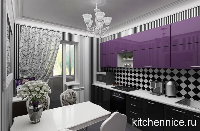
Black and purple kitchen in the interior: photo
This combination is quite possible if the purple shades are pastel, and the number of black elements is strictly limited. A duet of two ambiguous colors that you rarely see together in residential interiors, should be diluted with neutral gray or white.

Light furniture natural wood will also soften the dramatic atmosphere that inevitably arises when using these two basic saturated shades at the same time.

"Chess" tiles on the floor or in working area in this case, it will be an excellent decorative solution. Black and white looks bright and elegant. And the lilac or pale lilac facades of the furniture set will add brightness to this achromatic world.

Black and purple kitchen - an inappropriate solution for small spaces problem lighting. Having decided to use such a combination, you need to think through every detail, balancing on the verge between an atmosphere that is comfortable and difficult for the human psyche.


So, for example, a black ceiling can cause shock. But if it's mirrored stretch fabric with spotlights reminiscent of the starry sky, the atmosphere is by no means tense, but mysterious and romantic. This option is suitable for a young couple with a creative vision of the world.
Gray-purple kitchen: photo
Gray-purple kitchen - looks elegant and presentable not only in the photo. Shades of steel in combination with the color of lavender or ripe plums soothe, relieve nervous tension.

An important rule: the more saturated purple, the less its share in general gamut premises.

Gray can be used both in wall decoration and for floors, and as a companion color in a furniture set.

Chrome-plated fittings and accessories are suitable as interesting accents, Appliances"under the metal" or furniture for dining area with steel frame.


Green-purple kitchen: photo
positive and bright combination, immediately reminiscent of spring and the flowering of nature.
It is preferable to combine salad and warm purple shades.

In spacious rooms, both colors are used in equal proportions, but if the dimensions are not pleasing in scope, then only one of them should dominate.

Green and purple are made different in tone, then the space seems “airy”.
Complement this color scheme with milky white, beige, chocolate or sand shades.


As a rule, a combination of green and purple is chosen for the interior. modern kitchen. However, this duet will look no less advantageous in rooms decorated in the Provence style. True, the shades are chosen a little different: lavender and light mint or olive on a milky white background.

Do not forget about plant motifs. They perfectly "reconcile" two opposite spectral colors: magenta and green.

Small purple kitchen: pros and cons
Shades of lavender and lilac are quite appropriate in a small kitchen. So that the room does not seem cramped and gloomy, it is necessary to use pastel shades, combining them with white, in a ratio of 1: 2, respectively.


In decoration, it is better to avoid purple wallpaper with a pattern or use them on small area for zoning space. It is best to cover the walls with plain paint, making accents with bright accessories, curtains and textiles.


It is undesirable to choose a set with local purple facades for a small kitchen. Let some of them be bright, close to white shade. This solution, combined with open shelves and glazing will make the furniture “lighter”, and the room as a whole will be more comfortable.


Bright colours cold range in small rooms look heavy, visually "narrow" the space. The exception is fuchsia or Persian lilac accessories, they will refresh the interior, charge it with positive energy.


Purple in the design of a large kitchen: photo
If for a spacious kitchen choose warm shades magenta, she will become more chamber and friendly. Cold lilacs “push apart” the walls of the room even more, add sophistication and aristocracy to it.

Rooms with a large area allow you to combine types of finishes that are different in texture, pattern, tone and shade, which greatly expands decorative possibilities purple.

For example, the dining area should be allocated bright wallpaper with a small white or golden pattern, paint part of the adjoining walls in the same color scheme, only “whitened”, and make the rest of it light beige. In such an interior, furniture made of natural wood in warm shades will be especially appropriate.

Headsets in the color of ripe eggplant, blackberry or plum are well suited for spacious rooms. Against the background of light walls, purple cabinets and cabinets modern design will not seem bulky or too gloomy.


For the Provence style, namely, it is most often found in spacious kitchens country houses, wallpaper with a delicate lavender pattern on a milky white background is suitable in combination with pale purple furniture upholstery, textiles and decorative elements.

Purple curtains in the kitchen: photo
Purple, especially its cold shades, reduce appetite. This will please those who are on a diet, but even they should not get carried away. Bright purple or plum in the kitchen should not be much.

For kitchen area with purple furniture set and light walls it is better to choose transparent, white or curtains approaching this color. This will increase the illumination of the room, which will have a beneficial effect on the people dining in it.

If purple is used only in upholstery of chairs or seating and accessories, it must be supported with a similar shade of curtains. This technique is typical for the Art Deco or Provence style.
Purple curtains for the kitchen should not be sewn from dense fabrics, such as velor or velvet. Even silk is appropriate only in spacious kitchens, where there is a lot of natural light. Best Choice there will be translucent Roman blinds or asymmetrical curtains that only partially cover the window.

Purple curtains should have a laconic design: no abundance of ruffles, multi-layered scallops and lush folds. Pickups, if necessary, choose silver or gold.
Great option for not large kitchen- graceful curtains-threads of lilac, lilac or amethyst shades.

Purple is a color for creative people who are not afraid of experiments and are open to everything new. If you are exactly this type, feel free to use all the shades of magenta for your kitchen and get a truly unique, noble, stylish interior where you feel comfortable.

Purple wallpaper in the kitchen
A very unusual decorative solution, which in last years is becoming more and more popular.
Wallpaper occupy large area and have a decisive influence on the overall atmosphere of the room. Having opted for the decoration of the walls of this color scheme, you must follow the following rules.
Suitable for a small kitchen plain wallpaper pastel shades: lavender, wisteria, Persian lilac.

Canvases with a pattern are used fragmentarily, for example, to highlight the dining area. The pattern should be in contrast to the main tone of the wallpaper.

For a spacious bright kitchen, you can choose Decoration Materials rich lilac shade, but paste them over only part of the walls. Ideal option: the use of companion wallpapers: plain and with a print, preferably floral.

Pictures of plants give the kitchen a cozy look. A combination of three canvases is possible different colors and invoices:
- dark with a pattern;
- the same shade, but in a light version;
- neutral - white, silver, creamy.

It must be taken into account that dark wallpaper fade under the bright sun. Therefore, it is necessary to choose a material with high light fastness.
Provence-style wallpapers are very beautiful in the kitchen - a lavender floral pattern on a light background. The room looks refined, delicate and airy.

Purple is a color for creative people who are not afraid of experiments and are open to everything new. If you belong to this type, feel free to use all the shades of magenta for your kitchen and get a truly unique, noble, stylish interior in which you will feel comfortable.

Purple kitchen: photo of interior solutions
(all photos are enlarged)


Purple kitchen, lilac or purple is suitable for lovers of non-standard color solutions. The owners of the purple dwelling, as a rule, are creative people who do not tolerate stereotyped and monotonous. In terms of design, purple can be called with full confidence the most controversial and ambiguous color that can become both a highlight of the interior and an irreparable mistake. Purple or lilac cuisine is more of a curiosity than the norm. In the view of most people, such a kitchen is not at all associated with comfort and warmth. But how can it blow cold from a pale lilac or purple color with light reddish notes? Violet color is extremely versatile, whimsical and capricious. Deciding to decorate the kitchen in purple tones, it is paramount not to make a mistake with the shade and companion colors.
Kitchen design in purple tones: a spectacular, but infrequent sight
The psychology of purple in the interior
Violet color represents the unity of opposites, because it combines cold and calm blue with hot and passionate red, ice and flame, yin and yang, feminine and masculine. Balancing the two ends color spectrum, violet color unites the body with the mind, material needs with spiritual ones, and in the human body - male and female energies. It symbolizes spirituality, wisdom, mysticism, artistry, inspiration, nobility, power and wealth.

Choice of purple or lilac color for the design of the kitchen requires compliance with a number of conditions
Purple is the color of mystics, philosophers and poets. In Eastern medicine and in color therapy, purple is associated with the work of the right hemisphere of the brain and the pineal gland, which are responsible for our emotions, intuition and creativity. It is no coincidence that it is the purple color that is recommended for spiritual practices and meditations. It is believed that people whose aura is dominated by violet tones are not only creative natures, but also have healing abilities.

The rich purple color looks very elegant, but it can have a depressing impression on those present.
Majestic purple has always been present in the clothes of kings and clergy, remember at least the "papal purple". Purple was once the color of the chosen. So, Julius Caesar firmly believed that he was the only person worthy of wearing purple clothes. Today it is available to everyone and everyone. Having decided to use it to decorate the kitchen, do not rush to grab the first option that comes across. Take a closer look at the variety of shades, and having decided, think over the interior in the smallest details: regal purple enters any room, but not every neighborhood will be nice to him.

Light purple or lilac color creates a romantic atmosphere even in a high-tech kitchen
Calm, gentle, muted shades of purple help with such negative mental conditions as neurosis, despair, loss of self-esteem and faith in the future, relieve mental fatigue and stress. They also have a positive effect on the condition of patients with epilepsy, concussion, neuralgia and multiple sclerosis. Shades of purple, according to psychologists, can suppress appetite, so lilac or purple kitchen can be an excellent assistant in the fight for the beauty and harmony of the figure.

Careful selection decorative elements and color combinations make this kitchen bright and inviting
It is not recommended to use purple, especially its deep shades, in the interior of rooms where there may be people suffering from alcoholism or severe mental disorders. And in general, rich purple tones in the interior should be used with great care. An excess of violet can inspire melancholy, instill a feeling of anxiety in the soul, cause depression and debilitate. In such a room, you are directly and in figuratively everything can turn purple.

The negative impact of deep purple easily compensates for the abundance of white in the interior.
Violet cuisine - from amethyst to purple
Having opted for a purple or lilac kitchen, do not be too lazy to pay due attention to the selection of the most harmonious and comfortable shade. Looking at the world through purple lenses, you will understand that it will not be easy at all. What do you prefer: exquisite amethyst, mysterious indigo, majestic purple, juicy blackberries, mouth-watering plums, fancy eggplants, delicate wisteria, mountain lavender, modest forest violets, extravagant fuchsias or flowering bushes lilacs?

Correct placement lighting fixtures in purple kitchen- one of the conditions for the attractiveness of the interior
A rich purple-lilac range in the design of the interior of the kitchen requires delicate attitude. One has only to overdo it a little and the space covered with magic will turn into an inhospitable environment, taking away strength and causing irritation.

The owners of the purple dwelling, as a rule, are creative people who do not tolerate stereotyped and monotonous
The psychological effect is directly related to the chosen shade. Cool shades of purple with blue and blue nuances have a relaxing and calming effect. Violet with red or scarlet notes (amethyst, blackberry) activates, invigorates, excites.

The abundance of lilac in this kitchen can cause those present to feel an unpleasant pressure.
So that the kitchen in purple tones does not look kitsch, preference should be given to restrained and laconic design furniture with strict geometric shapes.

The combination of white-purple or white-purple-metallic - perfect option for the kitchen in the style of hi-tech and minimalism
It is advisable to use bright saturated shades of purple in large quantities in well-lit spacious rooms. In a small kitchen, they will “put pressure on the psyche” and, moreover, they will visually “eat up” part of the already missing space. Just a few steps are enough to transform your kitchen. bright accents or strokes!

Violet colors are best combined with calm, light, neutral colors, such as gray or white.
Calm muted tones from pale lilac to gray-lavender and ash gray-violet look very advantageous and unobtrusive in the interior of the kitchen.

light shades lilac in combination with pink or pale blue will bring a feeling of fresh early morning to the kitchen
Delicate lilac and lilac shades with a subtle pink undertone will give the kitchen a kind of fabulousness and ephemeralism, from which it breathes magic. Looking at such a kitchen, it’s hard to even imagine that someone here can simply fry potatoes or cook meat ... well, except to brew teas from violets, cook dandelion salads and bake pancakes from pollen and star dust.

Wallpaper with different shades of purple, Roman blinds matched to the tone, light furniture in this kitchen create a single harmonious composition
A successful combination of colors for the kitchen in purple tones
Designers do not recommend overloading the room with purple or combining several shades of purple in the interior at once. Violet colors are best combined with calm, light, neutral colors, such as gray or white. The combination of white-purple or white-purple-metallic is ideal for a high-tech and minimalist kitchen.

Purple in combination with the cold sheen of metal fits well into the high-tech interior
A combination of lilac shades with cream or sage green will help create a cozy homely atmosphere. Lilac kitchen will also look great with brown, pale gray and pink. Light shades of lilac in combination with pink or pale blue will bring a feeling of fresh early morning to the kitchen.

A simple division of the kitchen into a "light top - dark bottom» allows you to avoid the negative emotional impact of purple
To add glamor to the kitchen, a combination of lilac with pearl white, pink, black and silver will help. Pale lilac kitchen can be safely diluted with blue, light blue, green, light yellow, cream and silver. But mauve will look great with dark red, emerald green and brown shades.

Calm muted tones from pale lilac to gray-lavender and ash gray-violet look very advantageous and unobtrusive in the interior of the kitchen.
Bright purple in the interior of the kitchen always looks extravagant. Do not forget that this is a chameleon color, which, in combination with other colors, can change beyond recognition: In the vicinity of blue, it approaches indigo, and next to red it seems purple.
Photo examples of exquisite kitchen design in purple tones

Shades of purple, according to psychologists, can suppress appetite

Delicate lilac and lilac shades with a subtle pink undertone will give the kitchen a kind of fabulousness and ephemeralism, from which it breathes magic.

A bold silhouette of the kitchen combined with a bold colors give excellent results

Purple will not look gloomy if there are more dark colors

Saturated purple color in a modern kitchen looks appropriate and harmonious.

With natural and artificial lighting purple kitchen looks different

The use of additional decorative elements will make the situation in the purple kitchen luxurious and sophisticated.

The combination of purple and natural wood is optimal for a respectable modern kitchen.

Purple color is good for creating unusual interior in spacious kitchen

AT dark kitchen a bright purple apron and a yellow countertop play the role of frivolous decorative details

For such a super-modern and multifunctional kitchen deep purple - best option

To avoid an abundance of rich purple in this kitchen, a romantic landscape print was applied to the fronts of the furniture.

Combination different shades lilac creates interesting game colors in this kitchen

The amount of purple in this interior is small, so the color from the background turns into an original accent.

On a dark background, the combination of beige and purple flowers

A bright purple color in a bright, spacious kitchen can surprise with new effects and sensations.

A little bit of purple in this kitchen immediately catches the eye, making the black and white setting less formal.