Top quality kitchen wallpaper. What wallpaper to choose for the kitchen?
Beige, vanilla color remains the most popular kitchen color. There are many reasons for this:
- 1 Beige color - perfect solution for a small kitchen, as it light palette works great on visual extension space.
- 2 Beige is a neutral color and is perfect for recreating any style - from sophisticated classics to chic modern, from romantic shabby chic to textbook loft.
- 3 For those who think beige is boring, we advise you to pay attention to its shades such as caramel, cappuccino, creme brulee. These delicious colors will make your kitchen not only cozy, but also homely in a special way.
- 4 Beige is a universal color and is not capricious in choosing a pair. On the contrary, choosing one or another wallpaper color for a beige set, you can charge your kitchen with a holiday atmosphere, give it sophistication or create a harmony of comfort.
Wallpaper color for beige kitchen:
Beige and sand shades create a very delicate and sophisticated interior.


White - perfect couple. The kitchen is bright and cheerful. But avoid boiling white, otherwise the interior will turn out faded and "dirty".


Beige brown- an original combination, if only beige dominates. It is better to choose white wallpaper with a dark pattern.


Purple or lilac- bold and bold. The interior is dynamic and rich. Better choose plain wallpaper without picture.


Muted red, burgundy, terracotta - harmonious couple, provided that the decor is minimal.


Gray - the kitchen will turn out cozy and tender. It is only important that both gray and beige are as light as possible.

Green - it turns out an interior that is close in spirit to eco-style or country style. In such a kitchen, abundance is appropriate indoor plants and floral patterns.


Important: if you have a beige kitchen, avoid luminescent, cold light. It will make the interior dirty. The same applies to technology - a beige refrigerator and a stove against a beige headset - this is too much. It is better to choose a metallic color technique.
For white headset

You can pair with light green facades to pick up wallpaper in the color of moss or olives. But be sure to balance the pair with splashes of white. light green furniture will look organically against the background of light, natural shades: brown, pink, blue, sand. Light green categorically does not accept neighborhoods with purple and purple.


Cold shades of green (with an admixture of blue, gray or blue): mint, turquoise, coniferous, emerald are in harmony with cold colors - blue, cobalt, steel, boiled white.
Black and white headset
The duet of black and white is considered a classic - strict, but impeccably elegant.
The combination of black and white facades always looks spectacular, elegant and fits perfectly into the concepts of avant-garde, art deco, minimalism, retro.
Combinations black and white headset and wallpaper colors.
White wallpaper or white with black graphics. Such a tandem creates a monochrome atmosphere. The feeling that I got into the newsreel of the beginning of the last century. The perfect combination to create a retro style - you can add posters with graphic drawings, retro accessories.


Good option for small kitchen- paste over the accent wall with black wallpaper with a white pattern, and the rest with white wallpaper with the same black patterns.


If the facades of the furniture are glossy, then it is good to choose for the walls warm shades white: cream, beige, milky.


Gray, or "wet asphalt" color wallpapers are appropriate in modern interior. Goes well with metallic sheen kitchen appliances. But the interior requires bright lighting.


Blue wallpapers will dilute the interior with colors, and blue ones will add black and white kitchen softness and tenderness. yellow wallpaper look good in combination with a black and white headset, if the yellow is more like the color of dull gold.


For yellow furniture
Yellow color for a kitchen set is very insidious in terms of psychological impact.
The brighter the shade of yellow, the more sunlight and joy in your kitchen. But an excess of yellow surfaces causes fatigue and irritation.


Neutral shades are considered optimal - golden, sandy, mustard, gray-yellow. Juicy, acidic shades of yellow are appropriate for modern kitchen. For classics, it is better to choose muted tones. Tip: If you like multiple shades of yellow, always choose the lighter one.


Yellow furniture goes well with white, milky, green (any shades), blue, pink wallpaper. Golden yellow plus red is a great pair for an oriental style.
Yellow and blue are a royal combination, provided that the yellow has a hint of gold. Yellow and brown - a combination taken from nature. Add green accessories to such an interior - and you will get an interior that is close to eco-style.
For blue and blue furniture
Depending on the combination of shades of blue and the color of the wallpaper, you can significantly affect the visual perception of the interior. It all depends on what kind of atmosphere you want to create in your kitchen.


If the furniture is saturated of blue color add white, light green or sky blue wallpapers, the interior will turn out to be cool.


"Raise the temperature" peach-colored wallpaper will help. Do you want to add cheerfulness to the blue kitchen? You can combine blue with yellow, grass green or orange.
Blue furniture and wallpaper with red and white stripes - bold decision, which will emphasize the retro style. But such decoration looks good in a spacious kitchen.


If the furniture is cornflower blue, pick up wallpaper for it in a sunny yellow or straw shade. This color pair is reminiscent of summer, a field of flowers, a sunny sky and is perfect for country style.


The combination of blue furniture and gray walls- option for spacious kitchen in modern style. But such an interior necessarily requires bright lighting. And do not forget about the tonality of the color - the same cold shades of gray are suitable for cold blue.
For purple and lilac furniture
Purple is perhaps the most controversial color in the palette, as it combines the coldness of blue and the fieryness of red. It is generally believed that purple is not the most good choice to furnish the kitchen.
But this color has so many shades that, for sure, there is one that will appeal to you. Choose from: lilac, violet, lavender, plum, blackberry, amethyst.


Intense purple is a chameleon color. Depending on the background, it can change its tone.
So, purple facades against the background of red walls will appear purple, and against the background blue wallpaper take on an indigo hue.
In any case, these combinations necessarily require blotches of white (to balance the contrast) and bright kitchen lighting.


Various shades of purple are combined with different colors:
- For a purple kitchen, green, blue, light yellow, cream wallpapers are well suited.
- Pinkish-lilac facades look most advantageous against the background of emerald green or white walls.
- The combination of a purple headset with white or light gray walls is a win-win. The interior is rich, but not dark. You can add black - as a decor.
- The soft lilac color of the kitchen set looks especially attractive against the background. light wallpaper, especially if the facades are glossy. Wallpaper is better to choose conservative colors: white, beige, milky, cream.
- Want to add romance? Choose wallpapers with a light background and discreet patterns of lilac and pink flowers.


For modern style you can choose wallpaper with stripes of white and lilac color. But such bright wallpaper better to use for accent wall, leaving the general background of the walls light.
For black headset
Black furniture always looks luxurious. But the abundance of black surfaces can cause a depressing mood, especially if the facades of the headset are made in matte shades.
Black color requires bright lighting and the most neutral background - white is best.


It is no coincidence that black and white gamma has long become a classic design. white wallpaper and grey colour for the floor are perfectly combined with the black color of the headset. Add a few juicy shades in the decor, and you get a wonderful kitchen in a modern style.


Black can be combined with ash gray, smoke color or steel - they will successfully fit into such an interior. Appliances steel shade.


Black furniture and red wallpaper are the solution for a spacious kitchen. Designers advise only to avoid flashy shades of red. Coral, burgundy, cardinal color are best suited. With such a palette, the addition of white decor is mandatory.
The kitchen is the heart of the house, it is practically the most important place in the house. Here the whole family gathers in the evenings, friendly gatherings with a cup of coffee are arranged here, close and dear people are met here. That is why, when making repairs, many are wondering how to choose wallpaper for the kitchen so that it is not only beautiful and comfortable, but also functional.
Choosing a wallpaper

In order to decide how to choose wallpaper in the kitchen, you need to consider several different factors:
- The volume of the room (area and height).
- The geometry of the room (ledges and niches).
- The style of the room (or theme).
- Room colors (furniture and textiles).
- Room lighting (day and evening).
- Tastes (yours and families).
- Financial opportunities.
Of course, do not forget that the kitchen is the place where there is a frequent temperature drop, humidity and periodic pollution.
Therefore, the wallpaper should be:
- Moisture resistant.
- Wear resistant.
- Fire resistant.
- Breathable.
- Beautiful.
- Harmonious.
Advice! Be sure to consult with experts on the quality of the wallpaper you like, they will also tell you how to choose the wallpaper for the kitchen.
Varieties of wallpaper

Let's briefly consider what types of wallpaper are:
- paper wallpaper.
Paper wallpapers have a very large assortment and they have the most low price. They are environmentally friendly and breathable, but they tear quite easily and do not tolerate moisture.
Paper wallpaper with water-repellent impregnation. You can pick up such wallpapers for the kitchen, but they will last no more than three years, as they quickly fade from sunlight.
- Vinyl wallpapers.
Vinyl wallpapers are divided into several subspecies: foam, flat, solid and kitchen. Depending on how they are made, they different thickness and quality. But almost all are distinguished by good wear resistance and can be easily washed and cleaned.
They can be textured, textured and paintable. Their big disadvantage is the impermeability of air, which is why this type of wallpaper is not suitable for a bedroom or a children's room. But for the kitchen perfect option wallpaper.
- Non-woven wallpaper.
Such wallpapers consist of pressed cellulose fibers and are natural material. They have great multitude diverse positive qualities. They are environmentally friendly, moisture resistant, wear-resistant, fireproof, breathable and distinguishable in texture and texture. Their only drawback can be considered a rather high price, but it's worth it.
- fiberglass wallpaper.
This is a very strong and durable type of wallpaper. They are fireproof and completely not afraid of moisture, so they are very easy to care for. They are environmentally friendly and “breathe” well, which prevents the appearance of fungus under them. For their application (see) no instructions are needed.
The disadvantages of this type of wallpaper include a not very rich assortment of patterns, but they are very suitable for painting, and they can be safely repainted up to ten times. They are quite easy to care for, without spending a lot of time and effort.
- Liquid wallpaper.
It's pretty the new kind wallpaper, which is sold in powder form. easy to apply with your own hands, they look very original. Their lack of fear of moisture, since they are diluted with water, they can be washed off with water. To prevent this from happening, they can be varnished.
- metallic wallpaper.
This is a completely new type of wallpaper and few people know about them yet. Their top layer consists of multi-colored foil, which gives the effect of metal. The disadvantages of such wallpapers include their impermeability to air, and a flat wall for gluing.
- Woven wallpaper.
This type of wallpaper looks like fabric on the wall, very impressive, expensive and stylish. But such wallpapers, consisting of woven fibers, strongly attract dust and odors. That is why this type of wallpaper is not suitable for the kitchen.
Advice! To find out if the wallpaper can be washed, pay attention to the packaging, an icon with two or three wavy lines means that the wallpaper can be washed. If a brush is also indicated, then they can also be cleaned.
Varieties of appearance

Textured wallpapers are very popular, as they look very original and natural.
They can mimic:
- A rock.
- Brick.
- Skin.
- Textile.
- Marble.
- Tree bark.
- Wood.
A variety of textures can amaze any consumer, which allows you to choose a wallpaper for any style of kitchen, at a low cost. Most often, texture wallpapers are very strong and moisture resistant.
Advice! After choosing a wallpaper, consult the sales consultants about their quality, pros and cons.
Choose a color

To pick up correct color wallpaper for the kitchen, it is necessary to take into account all the surrounding factors, such as the color of the furniture and kitchen set (see), the color of the textiles and the illumination of the room, as well as the size of the room.
For example: light colors can visually make the kitchen larger if it is not very large; dark colors make the room visually smaller, so they are not suitable for small rooms, but large kitchen The dark color of the wallpaper can make it cozier.
Also with lighting dark room you should not choose dark wallpaper colors, otherwise it will look like a cave. Light colors are suitable here, which will add brightness to the room. Also with very bright colors that will hide the light of the room on themselves.
Influence and color combination

It has long been known that colors have a great influence on the emotional and mental state of people, so you should be responsible in choosing colors.
Consider a few popular colors often chosen for the kitchen:
- White.
This is a universal color that can be combined with any colors and shades. Purely white kitchen- this is a sterile hospital ward, only people obsessed with cleanliness and sterility can choose this.
Most often, white is diluted with bright colors or rich shades, in the form of accents and accessories. White color looks great, both as a primary color and as an additional one. It will add light and air to the room.
- Grey.
Most often, this color is used to create a modern interior style in the kitchen. Gray will add style and nobility to the room. It is just as versatile and goes well with any color scheme.
- Orange.
It is often chosen for the kitchen, as it not only gives a sunny good mood, it also increases appetite well and sets up a friendly atmosphere. It goes well with green, warm blue and even black.
- Yellow.
This sunny color will give a summer mood even in cloudy winter. It will help if there is no appetite, and friends will come to visit more often. But you should carefully choose the shade yellow color, as bright colours can tire quickly.
- Blue.
This color can be both cold and warm. Cold shades are suitable for those who are on a diet, as it reduces appetite and does not like friendly gatherings in the kitchen. But it is good to relax after a working day.
Warm shades of blue will create an atmosphere of romance and dreaminess in the kitchen. This color goes well with yellow and more saturated blue. Blue also pairs well with most of the colors on the color spectrum.
- Blue.
It can also be both warm and cold. For warm kitchens, you can choose cold shades of blue, and for cold ones, you should choose its warm shades. Blue in the kitchen is freshness and relaxation, as it relaxes. It goes well with yellow, orange, red and green.
- Green.
The most soothing color, reminiscent of nature. By choosing shades, you can create a "dense forest" or "summer clearing". It goes well with brown, orange, beige, gray and even black will look good next to each other.
Psychologists do not advise choosing black, red, brown and purple colors, but designers believe that there are no forbidden colors, you just need to choose the right shades and neighbor colors.
To understand what colors are combined on the light spectrum, the diagram will help:
- Select a sector with a color.
- Two neighbors are friends.
- The color opposite is an addition for contrast.
Advice! If you doubt the compatibility of colors, consult a designer who will help you choose harmonious colors for your kitchen.
Blue for the kitchen

Many people ask if the kitchen is a blue kitchen and what kind of wallpaper to choose for it?
Let's look at a few examples:
- Blue with white. This is classic combination which will always be in fashion. It's like a sky with clouds or sea wave with foam, bringing a good mood and a relaxing effect.
- Blue with beige. This is good combination, warm beige color perfect complement to cold blue shades. But in such an interior it is worth adding bright accents.
- Blue with green. They are neighbors who complement each other. These are the colors of nature itself, which will create a cozy atmosphere.
- Blue with blue. Blue is the progenitor blue color, so they blend well with each other, creating coolness and freshness.
- Blue with yellow. This is a game of contrasts, as they are opposite to each other. But they match perfectly, like the sun in the sky.
- Blue with pink. This is very interesting and unusual combination, which creates a different atmosphere, depending on the selected shades.
Now you know what wallpaper to choose for the kitchen to the blue set. Of course, you can choose other colors, the main thing is not to be afraid to experiment. See the video for some examples of combinations. different colors with different shades blue.
Choose a picture

Drawing on the wallpaper is the very exclusive highlight of the entire interior.
Designers give some tips to choose the right wallpaper pattern for the kitchen:
- If you have simple furniture in the kitchen, choose unusual patterns and patterns that will attract attention.
- If you have a small kitchen, choose wallpaper with an inconspicuous small pattern or even no pattern at all.
- If you have low ceilings in the kitchen, choose wallpaper with diagonal or vertical stripes, they will visually lift it, but reduce the area of the room.
- If you have a small narrow kitchen, choose wallpaper with longitudinal lines or patterns that visually push the walls apart.
Wallpaper prints

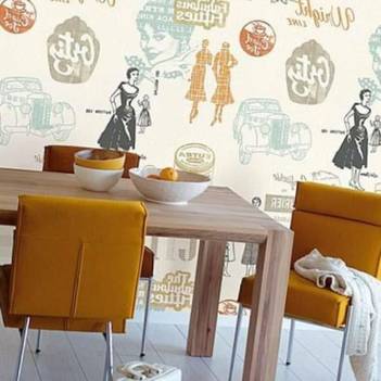
Consider the most common prints that are on the wallpaper:
- Classic with flowers.
- Plant patterns.
- Animals.
- Birds.
- Butterflies.
- Insects.
- Painting of different peoples.
- Antique frescoes.
- Fashion geometry.
- Geometric figures.
- Cell.
- Strip.
- With imitation of rocks.
- With shiny elements.
A wide variety will allow you to choose something original for any style of interior of your kitchen. The main thing when choosing, do not be afraid to experiment and choose what you like best.
- classic with flowers
- plant patterns,
- ancient frescoes
- chinese painting,
- with funny animals
- birds,
- insects
- butterflies,
- with abstract
- geometric prints,
- in a cage
- striped,
- with an interesting texture
- shiny elements.
Requirements for wallpaper for the kitchen
The most important place in the house can rightfully be called the kitchen. It is in the kitchen that the keeper of the hearth spends most of her time, here the whole family gathers for dinner, guests meet. Wallpaper for walls sets the general tone for the entire kitchen, harmonizes the space, makes it beautiful and complete. If you decide to update old kitchen or are engaged in the renovation of a brand new room and do not know where to start - it's time to pay attention to the choice of "clothes" for the walls. How to choose wallpaper for the kitchen? Where to start searching?

First of all, you need to decide for what purpose you are choosing kitchen wallpaper:
- complement the interior and find wallpaper to match the kitchen set
- in the presence of bright kitchen furniture, choose neutral wallpaper pastel color to get the right accents
- look for wallpapers to make the kitchen space visually larger and larger
- want to create a kitchen in a certain style and select wallpapers of a specific series, for example, Provence.


Having decided on the main purpose of wallpaper for the kitchen, you should think about what this wallpaper should be in terms of operation and maintenance:
- Kitchen wallpaper should be durable, wear-resistant
- They should not be afraid of moisture and steam, be such as to be able to clean them with any detergent without fear for the safety of color and pattern
- You should choose such types of kitchen wallpaper that do not absorb odors.
- It is advisable to choose fire-resistant wallpaper for the kitchen, because the kitchen is a place of increased fire danger.
![]()
You can of course combine different materials in the interior of the kitchen - ceramic tiles, Wall panels, wallpaper different types, paint and decorative plaster. In this case, it is necessary to choose wallpaper, taking into account the specific place of their application.
The choice of wallpaper for the kitchen also depends on the illumination of the room - if available artificial lighting as the main light source, it is better to stay at light shades with an interesting texture. When buying wallpaper, do not forget about protruding niches, door and window openings, etc. And, of course, the purchased wallpaper should reflect the individuality of each family member, be the subject of a general choice.

Types of wallpaper
What wallpapers exist and what types of them are more suitable for the kitchen? Let's try to figure it out.
Paper wallpaper. This type of wallpaper can be considered the pioneers of the wallpaper market. They are environmentally friendly, as they are made from pure cellulose. Paper wallpapers are relatively inexpensive and come in a wide range of colors and patterns. Such wallpapers are unlikely to be an ideal option for decorating a kitchen, because they are short-lived and will not withstand wet cleaning.
Modern style application solution paper wallpaper in the interior of the kitchen began to use them in the apron area. You can pick up wallpapers of any pattern and paste over the work area with them by placing paper wallpapers under a sheet of refractory glass right size. This design option looks very unusual, but at the same time practical, and definitely will not go unnoticed by guests. Besides, kitchen apron from paper wallpaper under heat-resistant glass - inexpensive option, in contrast to the design ceramic tiles or similar glass with photo printing.


Another option for using paper wallpapers in the kitchen is to use them in areas of the least pollution (for example, in the dining room). Places around the sink, refrigerator, stove can be tiled. Such repairs will look decent and cost quite economically for the family budget.
Non-woven wallpaper. This is the so-called non-woven substrate based on cellulose for touch-up. Non-woven wallpaper is more durable than paper wallpaper and surpasses them in terms of performance.
This type of wallpaper has the following positive properties:
- They are easy to glue: you can apply glue only on the wall, you do not need to cover the wallpaper, which is very convenient;
- Non-woven wallpaper is not afraid of water - they can be washed;
- They are breathable, which means that mold and fungus are not terrible for your kitchen;
- This type of wallpaper is considered fire resistant;
- In addition, they are thick enough, so they can be applied even on rough walls;
- This type of wallpaper does not fade in the sun for a long time;
- Yes, and paint non-woven wallpaper can be several times.

The disadvantages include the relief surface of such wallpaper, so dust can often accumulate there. Upper layer non-woven wallpaper is easy to damage, they are hardly suitable for families with small children and pets.
Vinyl wallpapers. These are wallpapers that also contain cellulose, but differ in a special top vinyl layer. There are several varieties of vinyl wallpaper: foam vinyl, smooth vinyl, silkscreen and hard vinyl. For repairs in the kitchen, only foamed vinyl is not suitable due to the lack of such properties as moisture resistance, other types of vinyl wallpaper are quite applicable for the kitchen interior.
Vinyl wallpapers have many advantages: they are very durable - they can be rubbed without fear of damage. Such wallpapers will hide the unevenness of the walls, and they will not fade in the sun. The range of vinyl wallpapers is very wide: you can choose wallpapers for every taste, even types that imitate wood and snake skin.

Unfortunately, vinyl wallpapers not devoid of shortcomings. They demand additional processing walls with antifungal compounds before wallpapering, as they do not let air through at all. Vinyl wallpaper is quite difficult to glue - it is necessary to apply glue both to the wall and to the canvas itself, which is fraught with excessive wetting of the wallpaper, and they can easily tear. If you are new to wallpapering, it is better to use the services of professionals. In addition, vinyl wallpapers have a high cost.
Glass fiber. Glass wallpapers are recognized as a better, "breathable" type of wallpaper. This is the most durable wallpaper, well masking small cracks. Glass fiber is refractory and moisture resistant. They are hypoallergenic. Glass fiber is a variant of wallpaper for painting. They can be painted up to 15 times with paint on water based or acrylic. And thanks to the relief texture in the form of diamonds, twigs, all kinds of patterns, you can choose the perfect option for any kitchen.

Liquid wallpaper. A relatively recent type of wallpaper that has appeared on the construction market, which can hardly be called wallpaper. On the wall, liquid wallpaper looks more like fabric or wood, and they are even applied like plaster.

Liquid wallpaper is easy to “glue”, does not require additional preparation of the walls, and can hide significant surface defects. This type of wall decoration allows you to lay the coating without joints.

In the kitchen, liquid wallpaper should be used with caution - they are afraid of moisture, so you should not use them in working area, next to the sink.

Fabric wallpaper. This type of wallpaper is very beautiful and looks, of course, luxurious. Only in the kitchen should they be used in the design of the dining area and as decorative element in limited quantities, since such wallpapers cannot be washed and they absorb odors.

Among modern models can be identified metallic wallpaper. The basis for this type of wallpaper is porous paper and aluminium foil. These wallpapers look unusual and stylish.

Relatively recently, the market of building and finishing materials appeared cork wallpaper. Their basis, as a rule, is paper or non-woven. You can take care of cork wallpaper with a sponge and water with any detergent. According to the manufacturer, such wallpapers will last about 20 years. The only problem cork wallpaper- their disparate color palette from dark brown to light brown. Moreover, the cost of this type of wallpaper is very high.

More and more wallpaper manufacturers are recommending for the kitchen to choose washable options on a non-woven basis or fiberglass based. Thus, in the presence of a huge species diversity wallpaper everyone can choose the option to their liking and afford.

What color wallpaper will look good in a small kitchen? What wallpaper to choose for a light green headset? How to harmoniously choose two colors for wall decor? A million questions arise in the head of a person who has conceived a renovation in the kitchen. Having decided on the type of wallpaper, you should start choosing the color and texture of the material.

When choosing wallpaper, you should be guided by the following basic rules:
- It is not recommended to combine wallpapers of different prices. Choose wallpaper from the material of the same price segment
- Wallpaper should be in harmony with kitchen furniture– with kitchen fronts, color household appliances
- It is better to choose wallpapers of the same width, so it is much better to minimize the joints.

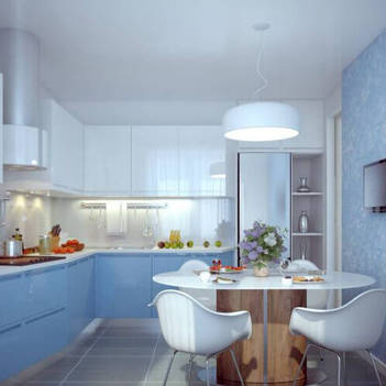
One of the main features when choosing the color of wallpaper for the kitchen is their combination with the kitchen set. So, for the kitchen of today's fashionable green color, wallpapers that are neutral in color are ideal: milky, beige, light gray. Of course, the choice directly depends on the shade of green that you have chosen for the kitchen set - the color of young greens, mint, pistachio or rich light green color.
Dining room- not only a food zone, but a common territory of all households, filled with warmth and comfort. Therefore, when furnishing this room, it is important to keep in mind all the details of interior design. In particular, determine which wallpaper is best suited for the kitchen, and which for the dining room.
rules
When choosing wallpaper for a small kitchen in Khrushchev, you need to answer the following questions:
- What properties do they have, what parameters should be based on when determining and choosing a color, texture, type of coating?
- Is there a large or small kitchen in Khrushchev? What is the best way to increase or decrease space?
To choose the right kitchen wallpaper, you also need to focus on your preferences and ideas.
Wallpaper Properties
The best wallpapers for the dining room are non-woven, vinyl, fiberglass coatings. In the kitchen, they are subject to a number of physical, mechanical influences and rapid wear. Therefore, you need to pay attention to the labeling and do not buy quality wallpaper for walls.
How to choose wallpaper for the kitchen? You need to select canvases that meet the following criteria:
- Moisture resistance. In the kitchen for several square meters something is constantly steaming and frying. Here you need to choose a wallpaper that can only be wiped with a soft damp cloth or sponge without powders and gels. You can choose washable canvases that are cleaned with special products.
- High density. The choice of canvases for the kitchen should be based not only on aesthetic criteria, but also on their technical specifications. On the wallpaper high density less accumulation of grease and dirt.
- Steam resistance. The walls in Khrushchev should dry quickly after cooking.
- Burnout protection. Burnt spots have no place in an ideal interior.

coloring
New dining room It's not always a huge investment. Sometimes it is better to replace the old coating in order to completely change the design and freshen up the atmosphere. To make it pleasant to admire the wallpaper in Khrushchev or the house, you need to choose a color based on the following criteria:
- big or small kitchen in Khrushchev;
- ceiling height of apartments;
- sufficient light in the room;
- general style of the interior.

A small white kitchen will look better than. Pastel shades visually expand the space. It can be not only white and beige, but also green, blue and other light shades.
It is worth taking into account the psychological component of shades. When there is an overabundance of bright and flashy color (in a black-and-red, black-and-white palette, etc.), a tense atmosphere is created. Another thing is if there is enough space in the room. Then you can combine dark and contrasting colors (black and white, black and purple, black and yellow paint will do).

Important! It is not advisable to oversaturate the design with cold compositions, as such a kitchen will be deprived of comfort and warmth.
If there is not enough sunlight in the room, then you should make a choice in favor of warm beige tones of finishing materials. Interior design ideas for apartments in soothing shades of light paint, such as brown, orange and yellow, will look good.
If there is an excess of sun in the room, then from bright colors better to refuse. They will only become more saturated and will burden the atmosphere and interior of the kitchen. The same goes for white paint. Beige is suitable. brown, blue paint.
Green tones are considered the best option. They will not only harmoniously fit into the decor of the room, but also improve the digestion process and appetite. Soft salad, mint, and pistachio are ideal.

Important! Modern design interior design involves the use of red and orange glossy furniture. In this case, for walls it is better to use White color that will fit into any style and design.
Texture and patterns on the wallpaper
The choice of wallpaper for the kitchen should be carried out not only in color, but also in texture and pattern. Figure meanings:
- if you make a choice in favor of horizontal lines, the room will visually expand;
- to increase the height of the room, you should consider wallpaper design ideas with vertical lines;
- a large kitchen in Khrushchev will visually decrease if large black drawings prevail in its design; on the contrary, small drawings will make the room more spacious;
- if you make a choice in favor of geometric patterns in the form of intersecting stripes, then an illusionary optical illusion will appear - a continuous space;
- the choice of diagonal lines will bring movement and dynamics to the interior.

If you glue texture beige wallpaper, then they will add zest to the design of dining rooms of ordinary apartments, because they look extraordinary. They are able to give the room a new quality, add originality, visually create additional dimensions, as well as the light play of shades, shadows, texture overflows and other unusual effects.
Finishing materials to match the furniture
Much better when picking wall material in the kitchen, consider the color and style of the furniture. Before you think about the design of the room, you need to figure out how these two components fit together:
- Almost any color can be matched to white furniture finishing material: green, red, yellow, blue, brown, peach. They always add dynamism.

- Classic brown set(including those made “under the tree”) looks great against the background of a white, peach or beige wall.

- orange furniture the design in muted colors (white, beige, gray and green color). lucky shade white paint, perfectly combined with delicate orange paint - a milky scale. Tranquility and nobility are distinguished by kitchens in this design.

- Green kitchen set is based on the simplest compositional rules: bright furnishings - muted wall decoration, calm tone of the facade - juicy details in the wallpaper. In such a palette, white, beige color is perfectly combined.

- Black and white furnishings involves the selection of coverage in light colors. You can choose a coating with a finished pattern. Preference can be given to a black pattern with a soft ornament, but not for the entire perimeter, but only in certain areas. Then black and white furniture will look advantageous.

Modern furniture in white, green and orange palettes are often presented in a glossy design, so they are not suitable here. additional elements decor. It is better to stick a plain neutral coating on the walls, for example, beige wallpaper. This is great option for a bright headset.
Wallpaper for tiny kitchens
The following wall decor ideas will help you understand how to choose the right one:
- It is better to stick light pastel paint material on the walls(pink, blue, light green, mint or pale purple). Do not use black, black-blue, black-brown, marsh and other gloomy colors.
- Need to exclude large drawings and patterns vertical stripes . Such techniques can compress the space, even if the kitchen is white.
- If used bright colors, then they should be secondary, by no means dominant. With a black-pink or black-orange version of dark paint, you need less, light and white - more.
