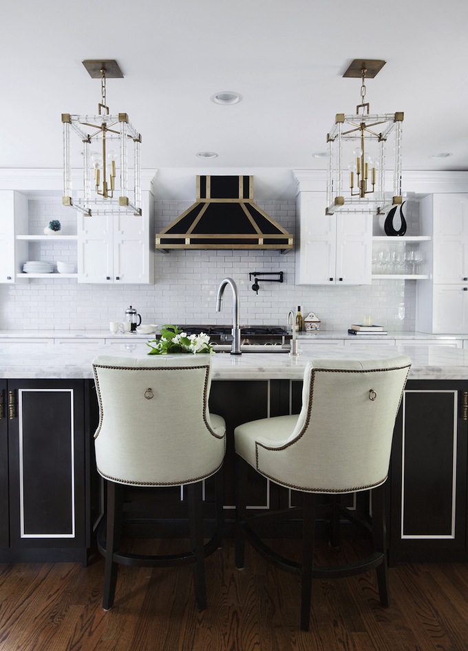
Black and red kitchen. Kitchen design with a dark top combined with a light bottom: performance features
Not everyone likes monochromatic light kitchens: they can seem boring. Color combinations expand design possibilities. By choosing the right colors, you can create a dynamic, energetic design and zone the space. Aggressive contrasts often look spectacular, but can be annoying, so it is better to use soft combinations and color transitions to optically change the proportions of the room. We offer photos of kitchens with light bottom and dark riding.
Pastel colors are best for tight spaces. This is a good choice for non-symmetrical rooms. It also makes sense to design a kitchen in pastel colors if the windows face north side and lack of natural light. dim monophonic design universal, hides planning flaws. The main thing is to choose all the elements of the interior in a single style.
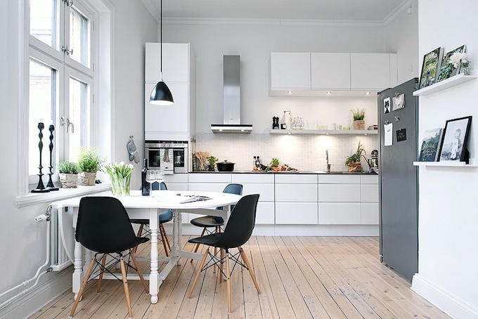
Photo of a kitchen with white bottom, dark top
light and dark tones in the interior - it is far from always only a contrasting white and black gamma. There are many options, and it all depends on the personal preferences of the owners of the premises. However, there are some color rules that should be followed so that the design is not only aesthetic, but also psychologically comfortable:
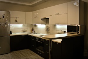
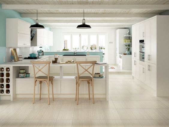
Light tone in kitchen design
- If a light tone prevails in the design of the kitchen, you need to focus on bright details. An option is to add elements that differ in color. This will give expressiveness to the interior, help to highlight the desired areas. We offer photo:
Light design with contrasting elements
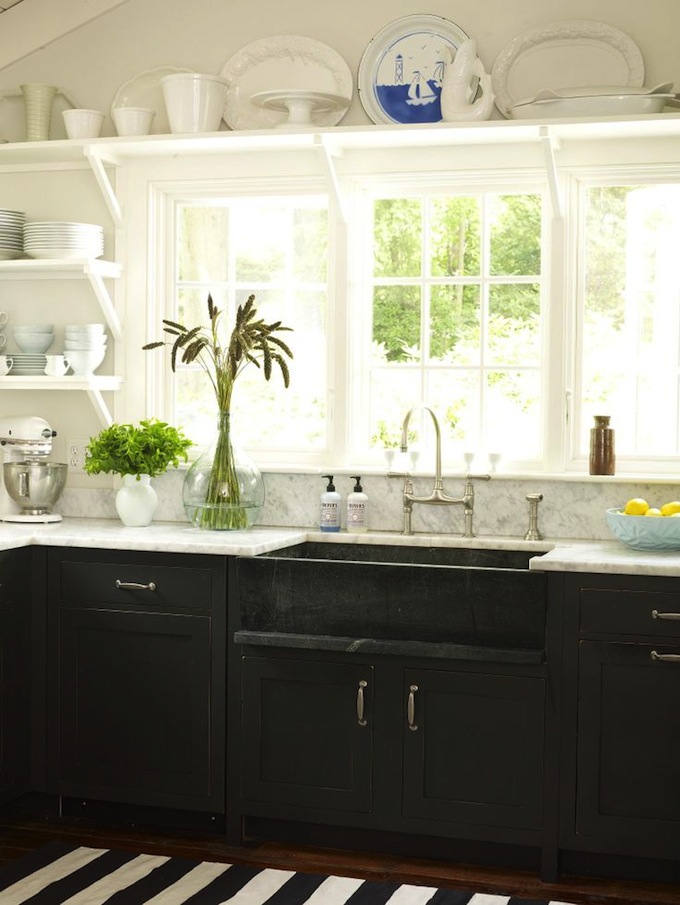
- If dark is chosen as the main color, then the lighting of the room should be carefully considered. Dark is perfect for large kitchen with windows facing south. So, the design "under the tree" of dark shades creates an atmosphere of stability, peace and even some conservatism. And yet, so that it does not seem gloomy, it is advisable to add 1-2 light surfaces.
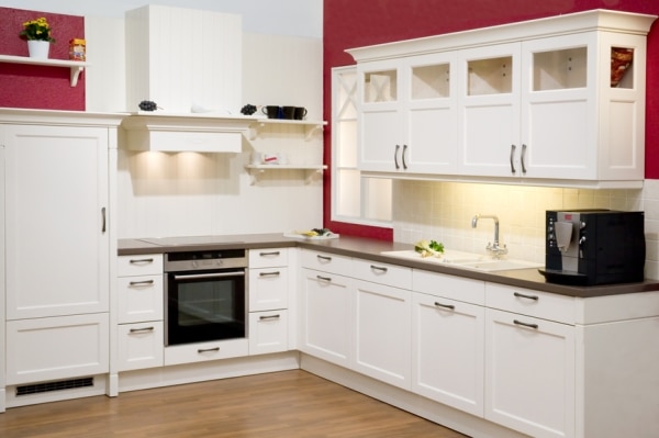
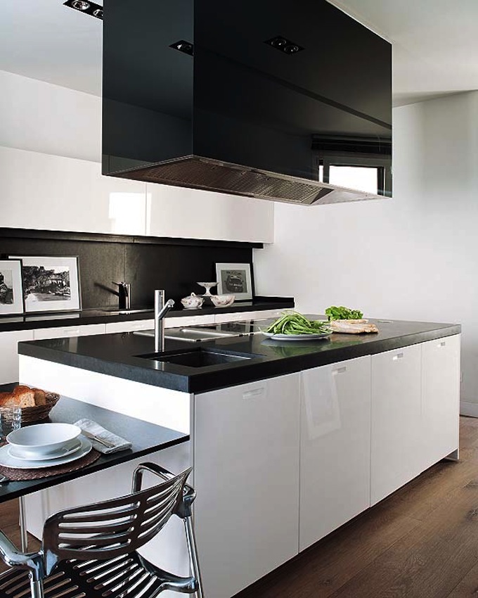
Brown top and white bottom - combination options
- Not only the color scheme is important, but also the proportions and shades. Excess pastel colors"blurs" contours, borders, and dark ones - visually narrows the space, which makes the room seem more cramped.
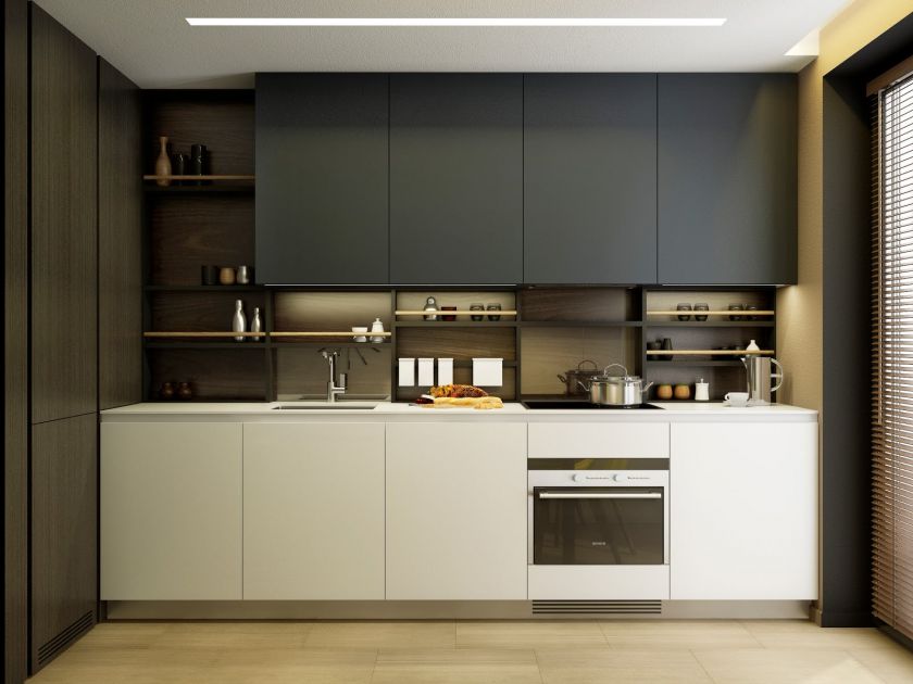
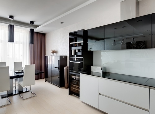
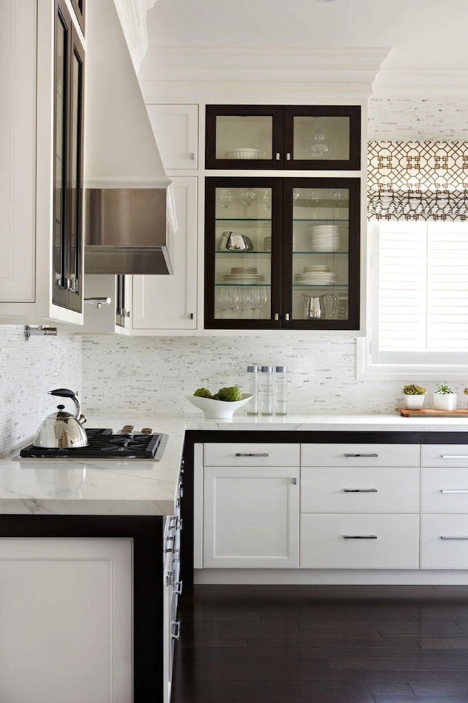
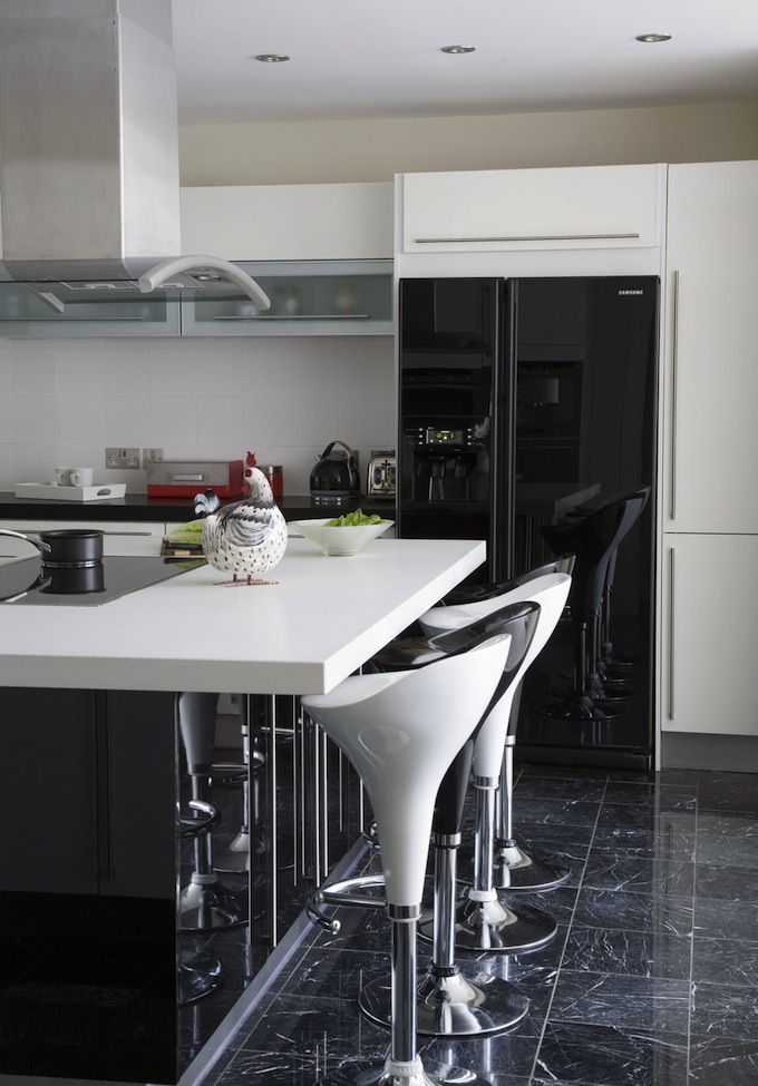
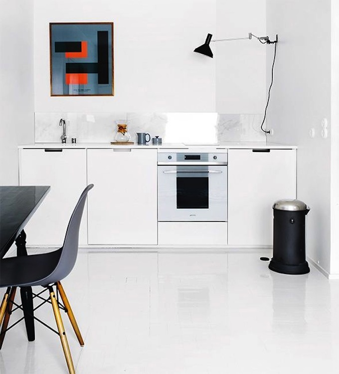
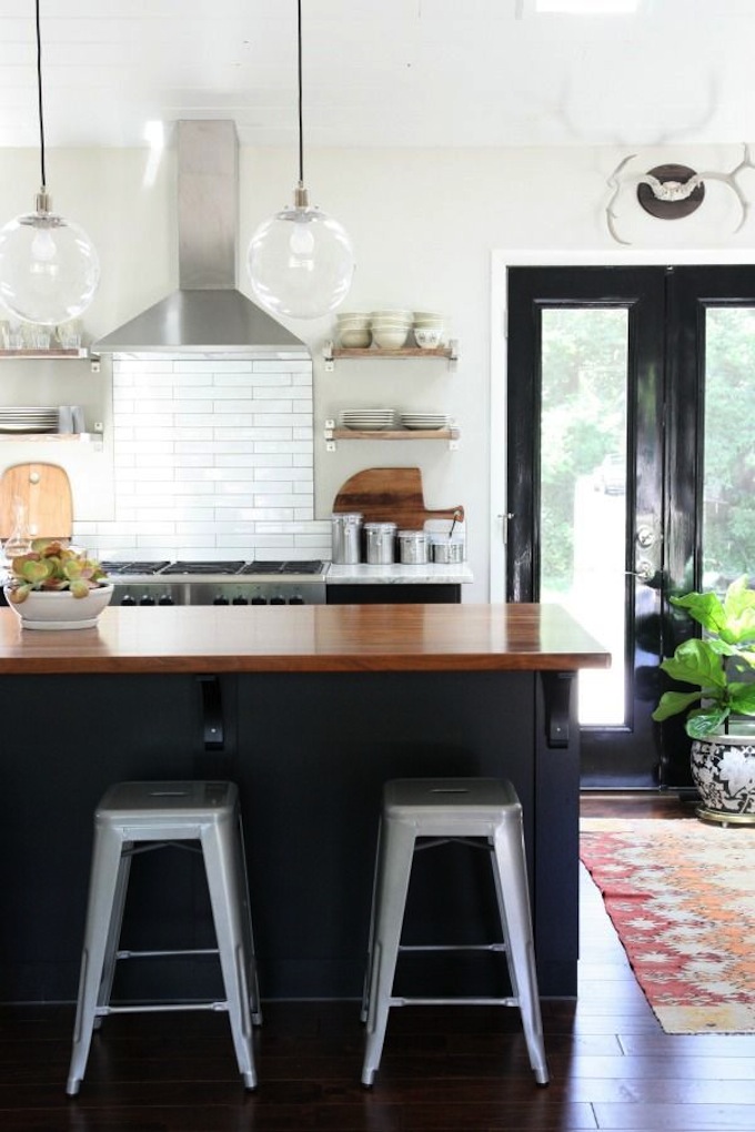
Photo of a minimalist interior: graphite top, milky bottom
- There are practically no restrictions in the selection of colors. Any color scheme can look great if you choose the right combinations. Traditionally, they make the top light and the bottom dark, but there is always room for diversity: the reverse combination has its advantages and looks no less impressive.
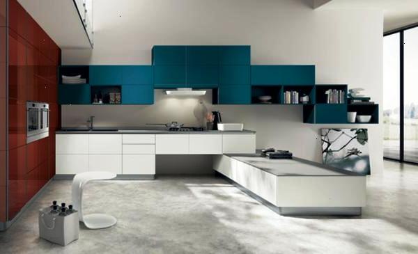
Spectacular combinations - bright top and neutral bottom
- White and black in the interior coexist perfectly with each other. You can use only these two colors, or you can add a third. All options are good if accents are carefully thought out.
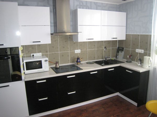
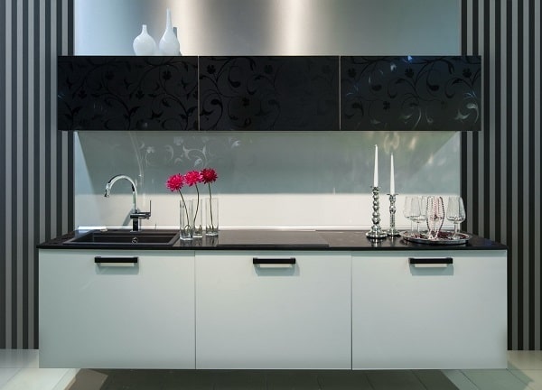
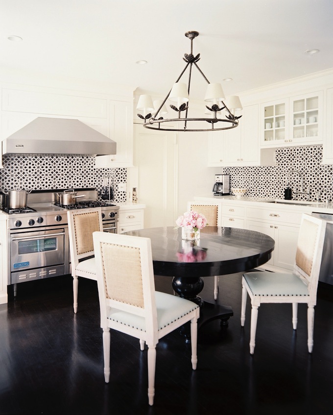
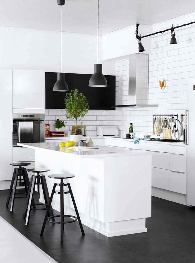
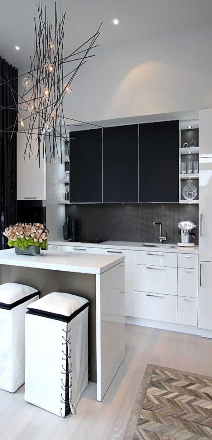
Photo of a small black and white kitchen
Techniques for performing the kitchen in bright colors
The influence of color on human mood has long been known. Psychologists even recommend using chromotherapy to regulate the internal state - calming down, activating thinking, or feeling a rush. vital energy. When decorating a room, you can choose classic shades and dilute them with elements of suitable tones.
White, beige, shades of coffee with milk, ivory go well with any color. Focus on separate zones and you can achieve the effect of chromotherapy using other tones.
So, burgundy will look elegant and increase tone, improve appetite, and speed up metabolism. Orange will set you in an optimistic mood, help in creative activity. Yellow calms, activates the intellectual potential. Blue and green contribute to the control of emotions, and purple helps to tune in to learning, reflection.
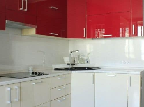
Photo of a red and white headset on a light background
To achieve the desired effect, you should follow a few rules for designing a bright kitchen:
- Wall decoration. Walls in pastel colors great option for those who want to hide the flaws of the room. To avoid monotony, you can add dark or bright details - an apron, pieces of furniture, accessories.
- Furniture. In a bright kitchen, sets with the top row of cabinets made in burgundy, yellow, orange, blue, green, gray and even black will look luxurious.
- Appliances. If a Appliances will stand in sight, it is better to choose the technique of gray, black, with a metallic sheen. Bright accents are appropriate.
Light wall decoration plus brown and bright details
Black and white contrast in the interior
Black and white design- This is a win-win option for connoisseurs of the classics. White symbolizes purity, openness, freshness, novelty. It has a positive effect on mood and well-being, promotes the disclosure of creative potential. Black is the color of restraint, reflection, relaxation, but its excess can cause blues, a state of depression and even depression. It is important to correctly distribute the colors.
Determine the dominant color. If it is white, then it will expand the space, add air and light. In this case, black details will help to delimit the room, divide it into functional areas Or just highlight.
Decide what colors you use for finishing the ceiling, walls, backsplash, countertops and headset. Often for the top and bottom row of cabinets choose different facades. Usually hanging cabinets are made white, and floor cabinets- black, but no one forbids turning the ideas about aesthetics upside down by swapping them.
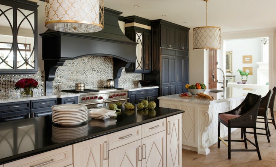
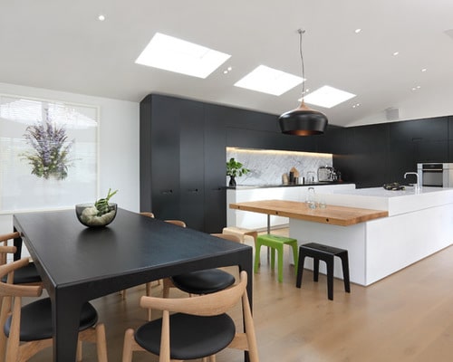
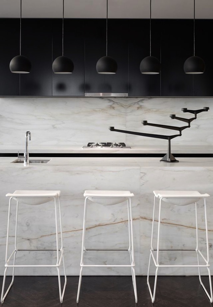
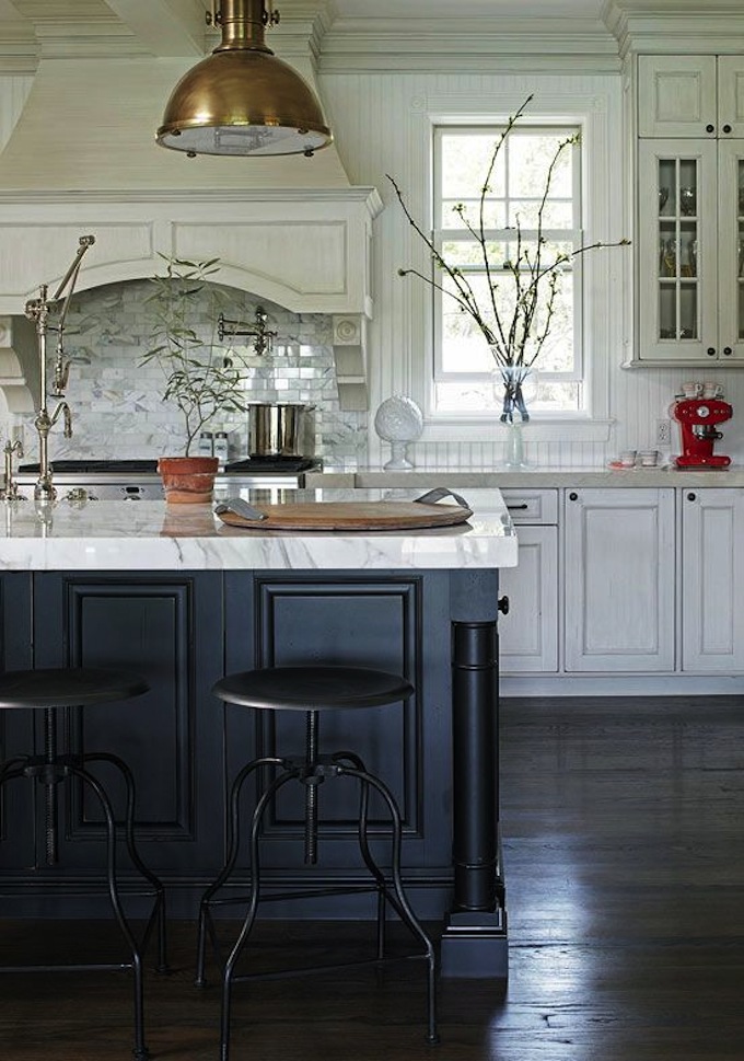
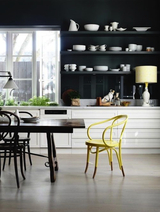
Black wall cabinets and white pedestals - contrasting bottom and top
When developing a design project, our photos and simple rules:
- The main color for a small kitchen is white. It is best used to decorate the ceiling, walls, window openings. It is very risky to make a white floor. This can create unusual effects, but taking into account the soiling of coatings, it is still better to choose a finish either black or light, but in a different shade.
- A black set with glossy surfaces looks luxurious against a light floor. Design can be added glass table, white chairs, patterned textile elements. Decor will be appropriate - vases, paintings, flowers, as in the photo below.
- White headset and a black apron - what you need for people who want to individualize the interior within the framework of the classical tradition. You can complement the image with the help of black household appliances, chairs. So that the set does not visually merge with the floor finish, you should choose a dark, but not black floor covering. A good option- under the tree.
- The reverse option is a black headset and white apron in a bright kitchen - it also looks good. You can complement the design with elements "under the tree." An example is in the photo.
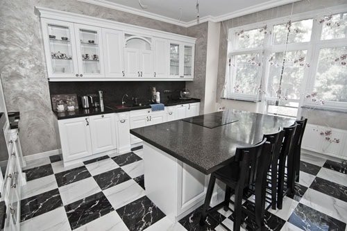
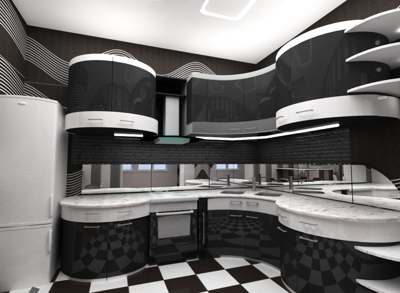
- « Chess board» on the floor - common design technique but its popularity does not make it less relevant. This is a great option if the headset is completely made in white. Black elements in furniture are acceptable, but there should not be too many of them. The photo below suggests a risky option, which is not suitable for every room.
- The dominant black color will be appropriate in a spacious room with good lighting. However, completely painting the walls black is dangerous: you can create the effect of a closed, too cramped and gloomy space. But dark gray good decision. Take a look at how it looks in the photo.
Gray walls, black and white furniture
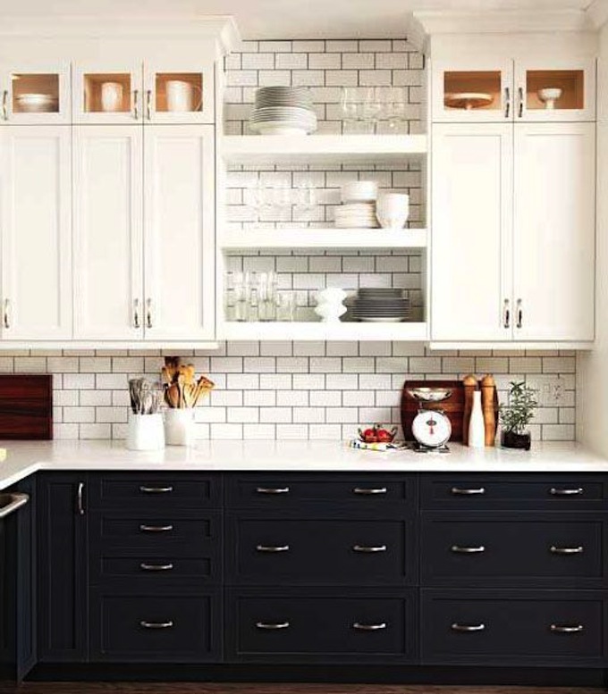
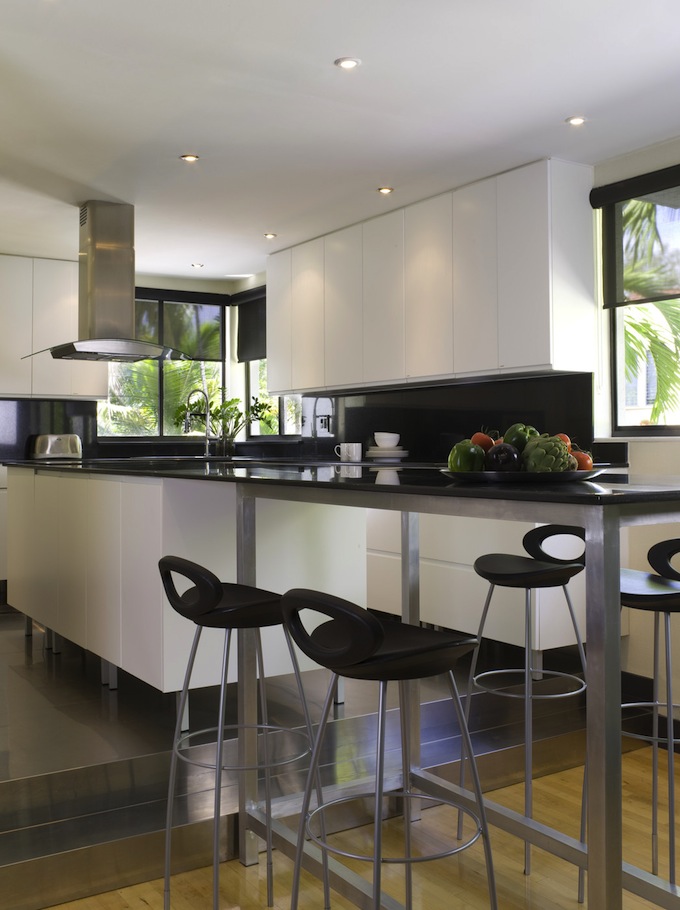
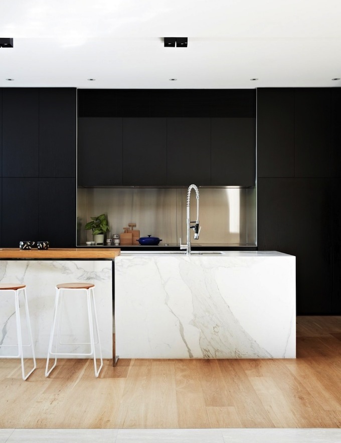
- White top and black bottom - refined, elegant and ... banal. Why not experiment with combinations? This will help make the interior less conservative, but still sophisticated.
Bright accents for a light background
In a light kitchen, dark and bright details are appropriate. They help set the accents and avoid the effect of a hospital ward. The ceiling and walls can be made in white, milky, beige. This will optically enlarge the kitchen, make it more comfortable.
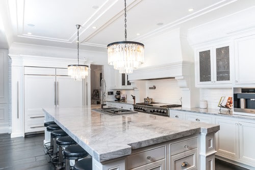
Photo of a kitchen with dark and translucent details
The bright decoration of the walls looks impressive in combination with a snow-white set, light bottom and black household appliances. Red, white, black are in perfect harmony with each other, and the interior as a whole looks beautiful and elegant. For the floor, it is better to choose a flooring "under the tree." We offer a photo good design.
Red top and light bottom
If for walls and ceilings are selected pastel shades, you should carefully consider the lighting and dilute the interior with other colors. It can be household appliances, metal-like furniture fittings, decorative elements. This kitchen design big windows will create a feeling of boundless space, peace, peace of mind. The main thing is to avoid oversaturation of the interior with contrasting details.
Bright accents for bright kitchen
A snow-white kitchen with contrasting details can be a source of inspiration for fans unusual combinations. To achieve the effect of "technological" interior, you can use the illumination of work surfaces, accessories, color accents. The bottom should be made "warmer". The woody tones of the floor finish are a little “grounded”, soothing. A marble effect countertop will add a sense of stability. How it looks can be seen in the photo.
Photo design of a bright kitchen
If the walls, floor, backsplash, floor cabinets are made in pastel colors, it makes sense to make the top of the headset dark and add one, but expressive contrasting accent. The decoration of part of the wall with wallpaper with black stripes looks gorgeous, and the facades of wall cabinets can be decorated with a light pattern. The interior will seem strict, but harmonious.
Bright detail on a black and white background
The bright kitchen looks great, the top of which is made in bright colors. This effect is achieved by using different colors for wall decoration. wall above the headset and kitchen apron make it bright, and the rest of the details are white. Dark elements are appropriate in such a design. An example is in the photo.
Contrast wall - darker top
Dark top and light bottom are relevant for interiors made in the "Russian style". The white facades of the set will optically push the walls of the cramped kitchen apart, and the dark surfaces will balance the space and add dynamism. The top can be supplemented with a bright Gzhel pattern, and the bottom can be left light, as in the photo.
Small kitchen in "Russian style"
Classic kitchens in bright colors
Classics in interior design is a rather vague concept, but if you wish, you can always design a linear or corner kitchen in classical style, in which the gloss of plastic and glass will be organically combined with a sophisticated pattern natural wood. There are not so many restrictions.
Dark top and light bottom: ceiling decor
To classic interiors gravitate people committed to family values. This is a great option for balanced people seeking stability and peace. Depending on personal preference, you can always add elements of other styles. The main thing is to avoid sharp contrasts and flashy shades.
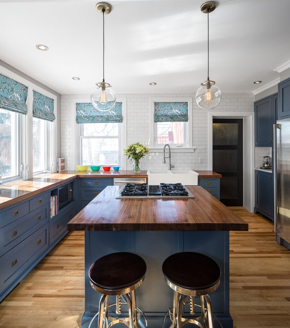
A classic with Mediterranean elements: a solid dark blue bottom and a weightless snow-white top
The basic principles for creating a design project for a room in a classic style:
- Materials. Classic is automatically associated with wood, stone, heavy textiles. All this looks luxurious, but it is too expensive. To reduce the cost of kitchen design, you can choose composite and synthetic materials imitating natural ones. The main thing is presentable appearance.
- Basic color scheme. To classic tones include white, black, beige, burgundy, dark green. But this does not mean at all that the owner of the premises is limited in choice. You can use any restrained shades. It is important to observe the measure so that the top and bottom of the kitchen seem balanced.
- Companion colors. Monochromatic interiors must be diluted with colored parts. For white classical cuisine well suited elements of golden, bronze, silver colors. Gilding looks too pretentious, so it is better to use it sparingly. But for bronze there are no restrictions. It is used to decorate plumbing, furniture, lamps.
Companion colors: silver top
- Decor. Wood carving, stucco and artistic forging always in fashion. But every year the prices for artsy decor handmade only grow, so here, too, imitation will save the day. You can complement the design with curtains and textiles with stylized embroidery and decorative tassels, fringe.
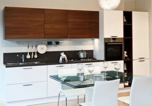
Classic kitchen: white bottom and darker top
Kitchen furniture in shades of white
White is most often associated with freshly fallen snow. However, blinding sterile whiteness is far from the only option. There are many shades:
- porcelain - slightly grayish with a glossy sheen;
- frosty - the color of ice with a bluish sheen;
- snowy - close to frosty, but lighter;
- opal - matte white;
- ivory - light with a slight yellowness;
- "lunar" - a little lighter than ivory;
- milky - with a slightly noticeable beige tint;
- white chocolate - a darker shade of milk;
- coconut - matte shade, reminiscent of inner surface coconut fruit;
- alabaster - grayish;
- flour - with a slight grayish tinge.
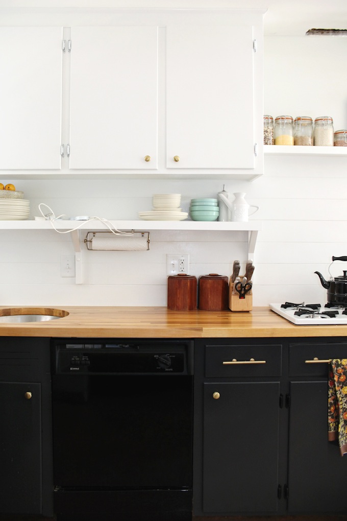
Creamy set with dark top and light bottom
For the design of the kitchen, you can choose any soft shade, as long as it looks harmoniously against the background of the floor, ceiling and walls. The whiteness of the furniture is well emphasized by a darker top - a chandelier, stucco, hood or part of the wall decoration. You can also highlight the bottom by laying a contrasting floor covering or laying tiles.
Light top and dark bottom
Aside from aesthetic preferences, there are several other reasons to choose a shade of white for kitchen furniture:
- Space expansion. This is the best choice for elongated narrow kitchens, rooms with low ceilings.
- Stylistic versatility. There is no style that white does not fit into.
- Practicality. Light surfaces get dirty quickly - a fact, however furniture facades and you have to wash it often. The white top is even more comfortable than the glossy dark one. it does not leave fingerprints and stains are less visible.
- Cheapness. Furniture and decoration white color usually cost less than colored ones.
- Flawless basic tone. Any bright details will fit into such a design.
There have already been separate articles. This post is about black and white kitchens– the optimal compromise between style and practicality, between freshness and elegance. Many people are not ready for a black kitchen, speaking of its gloom and excessive solemnity, while white kitchens seem to many to be too sterile and boring. Combine these two most popular colors to create a sophisticated design.
stylemepretty.com
glucksteinhome.com
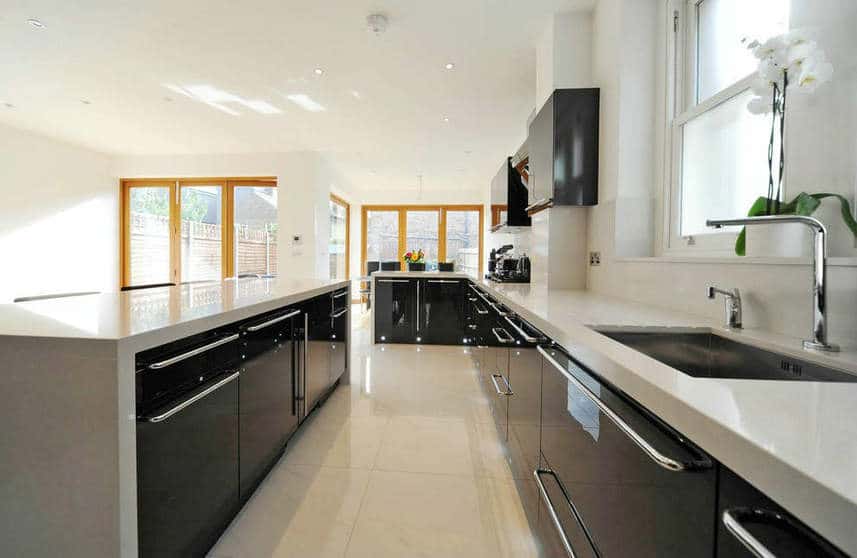
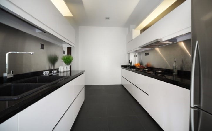
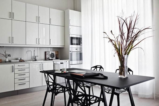
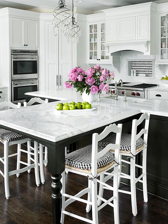
White top black bottom
A classic combination not only for office dress code, but also in kitchen design. snow white upper cabinets perfect couple for black floor cabinets.
delhuxe.tumblr.com
kristakeltanenblog.com
stacystyle.wordpress.com
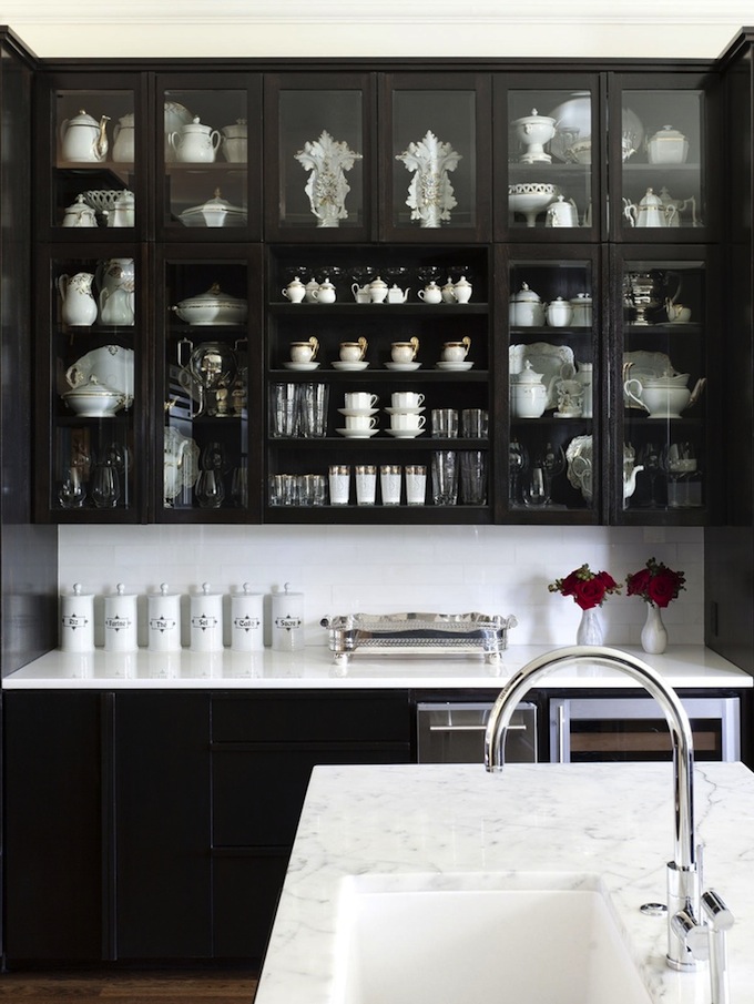
Black and white kitchen: non-standard combinations
Want a more original and dynamic combination? Play with the arrangement of black and white: upper wall cabinets and white cabinets on the floor; the main part of the kitchen is white, the island is black; a black tall cabinet and appliances in a snow-white kitchen.
looklingerlove.com

by Fertility Design
by Isabel Lopez Quesada
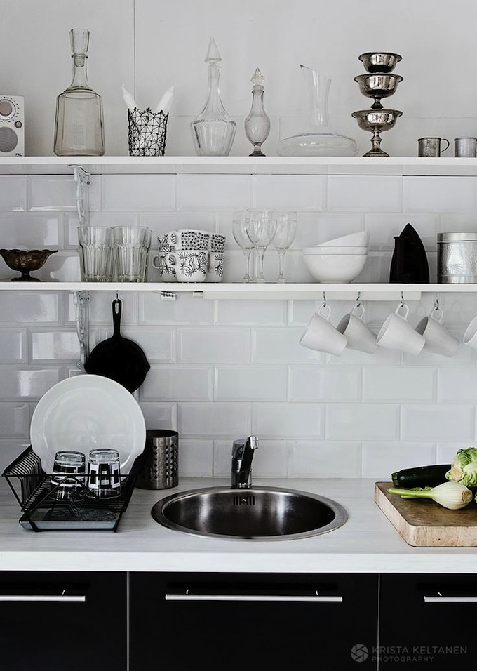
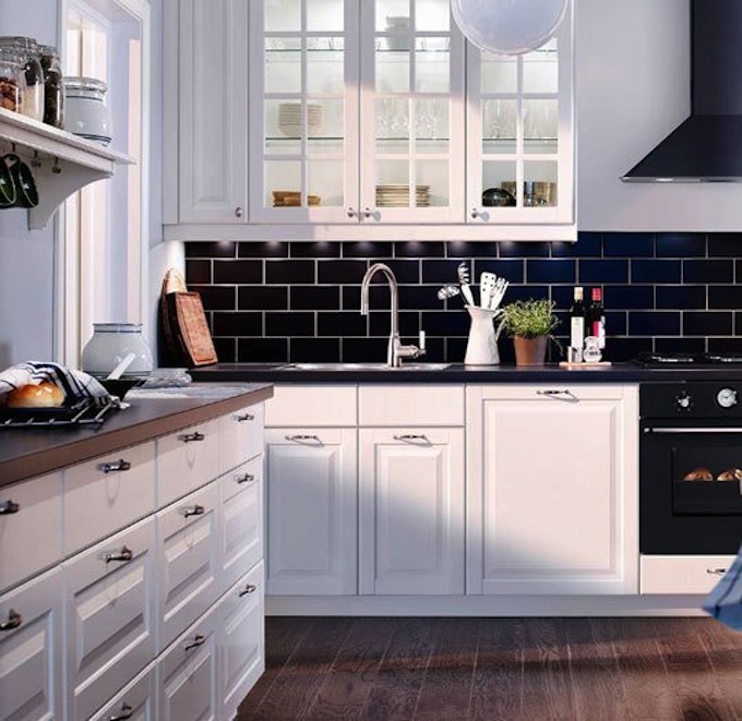
Don't want to order black cabinets? Complement white kitchen black apron, countertop, lunch group, accessories.
cocolapine.wordpress.com
nordicdays.blogspot.nl
nordicdays.blogspot.nl
How to complement a black and white kitchen?
My sympathy definitely goes to two materials: wood of a natural shade and marble. Wood warm, natural cozy material- perfectly dilute the graphics of black and white, refresh and decorate your kitchen. The best option: wooden kitchen countertop. Marble will emphasize the elegance of the monochrome range, add dynamics and chic. By the way, both of these materials are included in the list of the main trends in interior design this year. I wrote about them in
By Elenberg Fraser
contemporist.com
by Mary McDonald
abeautifulmess.com
How to freshen up a black and white kitchen?
A couple of bright spots, for example, such sunny chairs, will breathe life and dilute the monochrome interior.
draumesider.blogspot.ca
ministryofdeco.blogspot.com
And, of course, nothing decorates the interior like!

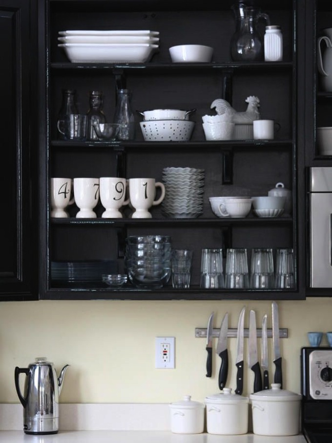
When decorating the kitchen in black and white, be careful about the choice of dishes and decor. There should not be extra flowers and objects. White or black porcelain is the best solution.
Black and white kitchens are perhaps one of my favorites. And what color in the design of the kitchen are you leaning?
Interior design in contrast is one of the most better ways get a stylish look of the room. The light bottom helps to make the space unusual and unified. When designing the look of the kitchen, your task is to get a place where it will be pleasant to cook and eat. Let's figure out how to get an interior that combines practicality and elegance.
How to choose a color solution
The kitchen should encourage eating. When repairing and choosing a situation for it, it is necessary to choose the right color. Here you can turn to the psychology of color or make a choice to your taste. Photos of finished kitchens will help you a lot when developing an interior project.
Before considering palettes, decide on a shade:
- Cool colors promote weight loss. However, if you have children, then you should dilute cold tone bright elements in warm shades. Such colors will look appropriate if the kitchen windows are located on sunny side. lucky color solution for contrasting interior in this case, the combination of a white bottom and a dark blue top will become. You will not have any difficulties in choosing furniture, as modern kitchen sets often have bright laminated facades of different shades.
- Warm tones excite the appetite and make the room more comfortable. A kitchen with their use is suitable for families with children and those who often receive guests. In this case, it’s good to make the top saturated red, orange, and the bottom traditionally white. An interesting solution can be an ombre effect. In this case, the top is made out in a rich shade, and the bottom will have a lighter tone. This solution can only be realized by choosing warm colors, cold - look favorably in contrasting interiors.
Choice color palette depends on many factors, primarily on the size of the room. A small kitchen will lose its coziness if bright and dark colors are used on it, while a large one will acquire its own charm and style from this.
Decide on dominant color- if it is light, then the space will visually become much larger. For example, one of the well-thought-out solutions is the kitchen, where the walls are painted in neutral beige, and the bottom of the facades of the suites are finished with light green laminated panels. Unusually, you can make the top of such furniture - choose cabinets for it with doors made of dark wood and glass. This option should be used if needed. corner furniture with the most spacious work surface.
Arranging color accents
 The dark shade of the upper part of the kitchen requires special attention. It is necessary to professionally approach the selection of trifles and main parts of the kitchen:
- countertops;
- facades;
- skirting boards;
- apron;
- curtains;
- paintings;
- decorative elements;
- household appliances.
In options where the kitchen as a whole is done in bright and active shades, the color of the walls, floors and ceiling should be neutral. If you have chosen timeless classic: black top and white bottom, then you can choose gray floor tiles, steel household appliances and an apron with contrast geometric pattern. To add bright spots, you can choose plain dishes of any color, for example, rich red or orange, and make one of the walls to match it.
To maintain the interior, it is a good idea to decorate the walls with black and white photographs. This option will successfully fit a dark shade of gray for working surface marble or porcelain stoneware. These countertop materials are different increased strength. As a result, the kitchen will turn out stylish and thought out to the smallest detail.
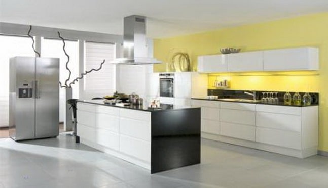
Modern trends in interior design gravitate towards minimalism and functionality. The classic lines and shapes are being replaced by simple and precise, smooth and angular, and main focus shifts from form to tone and composition. Kitchens light bottom - dark top - one of the most popular color solutions, which has many advantages. Universality, variability and harmony are the main advantages of such a design solution. It is not necessary to make a kitchen design in strict black and white: you can take several shades of light and dark as a basis, which are successfully combined with each other. As companion colors, you can take any bright and calm tones.
When and where is it best to use dark top kitchens?
While darker shades are traditionally placed at the bottom of a furniture ensemble, inversion can also create interesting visual effects. Dark color has the ability to land and usually plays the role of a foundation, base and support on which the interior is built. Therefore, kitchens with a light bottom and a dark top should be chosen for rooms with high ceilings, because otherwise dark shades in the upper plane will somewhat make the interior heavier.
To balance and balance the predominance of dark over light, the inclusion of an additional tone in the ensemble in the central part of the headset will help. Perfect option- use a countertop of the third shade. For example, if the bottom of the kitchen is made in beige, and the top is in dark brown, then the countertop can be chosen in gray, black, silver, tones eggshell and other neutral shades.
Other good decision, which avoids the oppressive feeling of the dominance of the dark top over the bottom, is the asymmetric arrangement of the modules of the upper part. Hanging cabinets of dark color can be placed in a checkerboard pattern on the camp, making some higher, others lower. So you will be able to create a feeling of air and space. But this solution is suitable for high ceilings.
What colors can be chosen as base?
A dark-light kitchen is a lot of opportunities for implementing the basics and subtleties of color in the interior. In addition to the classic neutral greys, whites, blacks and browns, almost every color of the rainbow can be used. It is important to complement the accent in the upper part of the headset with a third shade, which can become a link even with visually incompatible top and bottom combinations.
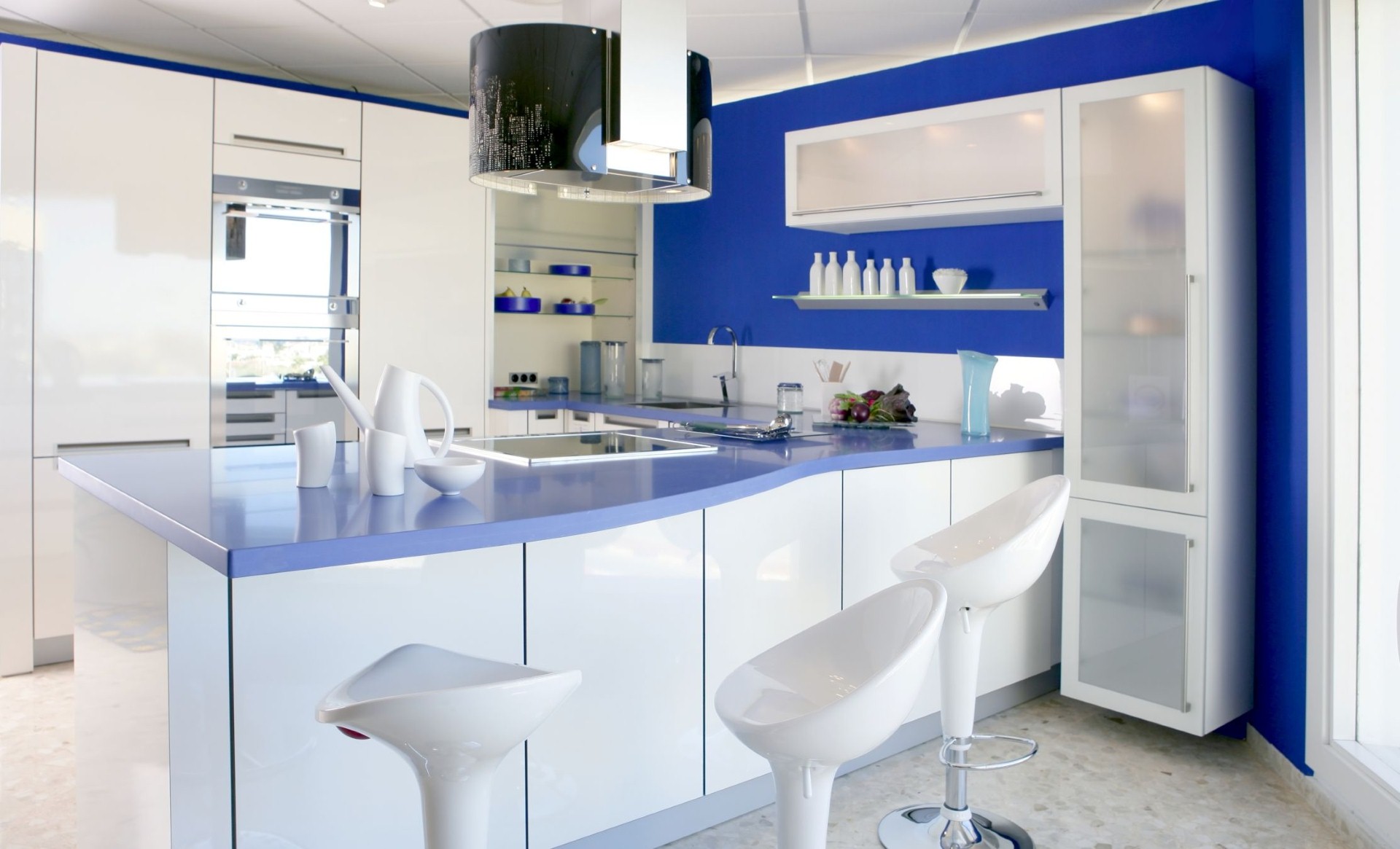
Blue top white bottom
It's popular design solution beloved by many maritime theme. The blue and blue hue at the top of the headset has a harmonizing and calming effect. Give space to working area volume can be done using the third additional tone. Brown looks great as the color of the front wall, on which lockers with blue facades are hung, as well as a dark apron of a similar color. In combination with a brown countertop, the ensemble acquires completeness and depth.
purple top lilac bottom
As a lower shade, you can use light muted shades of lilac, pinkish, iris, mother-of-pearl. Lilac (violet) as the main color belongs to the cold, calm scale, having a beneficial effect on the psyche.
As a game of color, you can use several options for the location:
- strict separation - all upper cabinets purple, lower - light;
- chess composition - alternation of facades of light and dark shades;
- use of lines, stripes, geometric shapes opposite color on facades and end parts products - for example, you can make white stripe on the upper border of purple facades, and purple - on white facades in the lower part.
As a color partner, you can use an apron on the wall in the work area and cold, and warm colors. The front wall and the apron of the tone of wet asphalt, brown, gray will look good. A bright yellow hue in combination with purple looks very bright and unusual. The yellow wall against the background of purple shiny facades creates great design modern style kitchens.
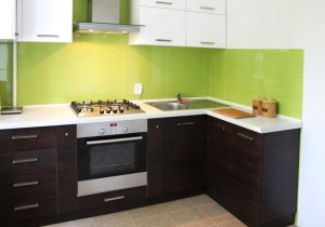
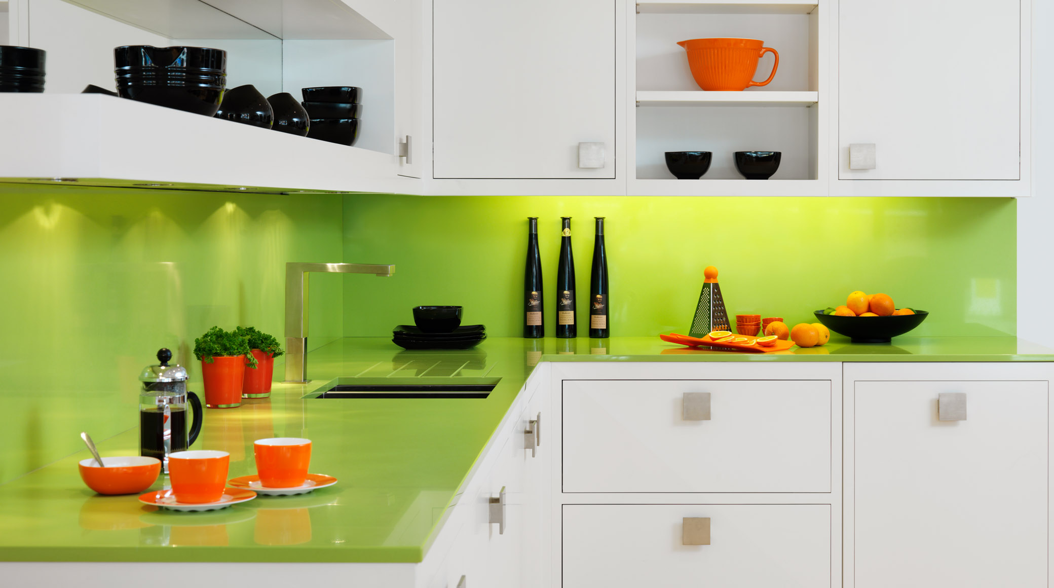
Green top white bottom
Green is another popular choice for kitchen interior designers. Saturated green tint facades allows you to beat it with additional shades and textures. as bottom light shade you can use either neutral white or beige, or a brighter and more contrasting yellow. The third companion shade can be chosen darker and richer. A kitchen with a light bottom and a dark top against a black front wall with a worktop in a similar shade looks very bright and fresh.
Tips for designing color contrast in a typeface
The design of a kitchen based on the contrast of light and dark colors requires right choice textures, shapes and design with accessories and decor items. Modern bright kitchens with dark countertops, made in bright, juicy and even somewhat acidic shades, are most often performed in glossy facades made of acrylic and smooth plastic. Easy mirror effect and light glare combined with bright and rich color looks incredibly stylish. But you can also choose matte textures that can be used in combination with glossy facades.
The second secret is how to arrange a contrast kitchen set- beat him with form. Standard rectangular facades, located in a block, look somewhat boring. You can choose a set with corner cabinets, the outer ends of which are rounded. Bright color, glossy sheen and streamlined shape of radius facades allow you to create an interesting futuristic style. For corner kitchens small size you can choose a countertop that seems to flow from one work surface to another with a smooth curve in the sink area.
Accessories and decor in a contrasting dark and light kitchen
In a light kitchen with a dark top, you can successfully arrange furniture in the dining area, as well as choose accessories in similar or complementary shades. The main decor and furniture items that can successfully complement a contrasting kitchen are:
- curtains and curtains - they can be chosen in one of two primary colors, as well as in an additional third shade;
- upholstered furniture - corner sofas, poufs, banquettes - according to the previous principle;
- lamps - hanging lamps with shades of the main dark color;
- dishes - a bright primary color.
In a bright kitchen, made using a bright saturated shade - purple, yellow, green, blue, you can successfully place upholstered furniture- sofas, armchairs in the dining area. The color of the upholstery should be chosen identical to the base dark color. On the background light wall and floor covering this kitchen design looks very modern, gravitating towards the lounge style. By arranging the decor items on the horizontal surfaces contrasting shades, you can achieve harmony and unity of the composition.
An example of using basic color accessories
For example, if we have a dark or light top in lilac, and a bottom / top in yellow, and the background wall and countertop are black or white, then we can do the following:
- on a black tabletop in the working area, put a flowerpot made of yellow heavy ceramics;
- on the dining table center a purple fruit vase;
- on the windows, use curtains of a banana or lemon shade with peas or a strip of purple;
- put in the dining area small sofa with plush purple upholstery;
- throw a few yellow pillows on the sofa.