The combination of colors in the kitchen with brown. kitchen color options. Kitchen color scheme
In design kitchen space you need a competent combination of colors in the interior of the kitchen, optimally mixed in terms of aesthetics, the use of contrasts, all kinds of accents, halftones. You should not immediately choose your favorite colors for the kitchen room, it is important to adhere to the measure, do not forget about the rule of the golden mean. Everything good, bright, contrasting, brilliant should be optimally balanced. And if you have a great desire to see in your kitchen, let's say red, complementary tones should be calculated as correctly as possible for a better visual perception.
It is important to understand that there are only 5 main, so-called clean ones:
- White;
- The black;
- Red;
- Yellow;
- Blue.
But there are a great many derivatives from them, in the color wheel, thanks to mixing, you can get almost any color scheme, cold or vice versa warm range. Blue alone gives designers a couple of dozen of its amazing undertones. Color can be explained not only from the physical side, but from psychology. Have you ever noticed that one or another tone makes you happy, while the other, on the contrary, sadness.

Color science, a science that studies color, its characteristics helps to form the right relationship, the atmosphere of the house. All designers know about it, they use it, offering their best work. We will definitely discuss such interesting properties of color schemes, with examples of their combinations, which mixtures are acceptable in the kitchen, and which ones are best avoided.
Color selection in the interior of the kitchen
Before you start remodeling your kitchen, decide on the color scheme. The main should not be a flashy, contrasting color, this is primarily fraught with rapid fatigue when in space, soft pastel colors are better.
![]()
Even sunny yellow, deep green, noble coffee or terracotta will look organic, stylish, but only in a matte finish. But accents, only one or two, can be bright, eye-catching, because they add the so-called zest to the interior, completing the image, style. To create the home of your dreams, you should follow certain rules.

Green and beige shades
Such a combination of colors in the interior of the kitchen, like beige and green, great option for those who want to see their kitchen soft. City dwellers, with a frantic pace of work, constant stress you just need to plunge into the "green" atmosphere. Calming, harmonious, helps to relax, rest not only mentally, but also physically.

It is recognized that green color beneficial effect on the organs of vision, relieves fatigue. Although it is worth considering that the same green color scheme has a large number of shades, and can be both warm and cold. For example, rich green or deep emerald should not be used for wall decor. small room.
![]()
It is better to give preference to pastel pistachio, especially the additional soft beige, which is more appropriate to use in furniture colors, will help to slightly reduce the weight of overall items. Light coloured kitchen set looks appropriate, from the point of view of ergonomics, they are most suitable for medium and small spaces.

Accents for the interior, what to choose
The combination with white helps to refresh the look of the apartment. Using white, you can not be afraid to overdo it, it will be appropriate for textile decor, decoration kitchen area, apron. Even large elements, decorative panels, glossy effect ceramics great opportunity create a stylish image, mirror, reflective surfaces are visual magnification usable kitchen area.

Sunny yellow, one of the most positive and uplifting colors, will transform your kitchen interior into a bright island at home, but don't forget about moderation when using accents. Let yellow undertones be used in prints, wall decor patterns, in small quantities.

Soft brown as an accent option, but also in the form wood flooring, most likely the most competent color scheme, just for those who want to get a soft, homely corner. Warmth and comfort are given here by the texture of wood, which has such an effect.

Gray color and its combination with other shades
If you see your kitchen in a strict, cold high-tech style, then you will be faced with the question of what shade it is combined with. grey colour in the interior of the kitchen, because it is he who is the main background of this style. gray tone it seems boring and dull to many, it is not in vain that they compare the dullness of everyday life with melancholy, mentioning this semitone. Therefore, it is necessary to find an accent. All cold undertones, neutral white are perfectly combined.

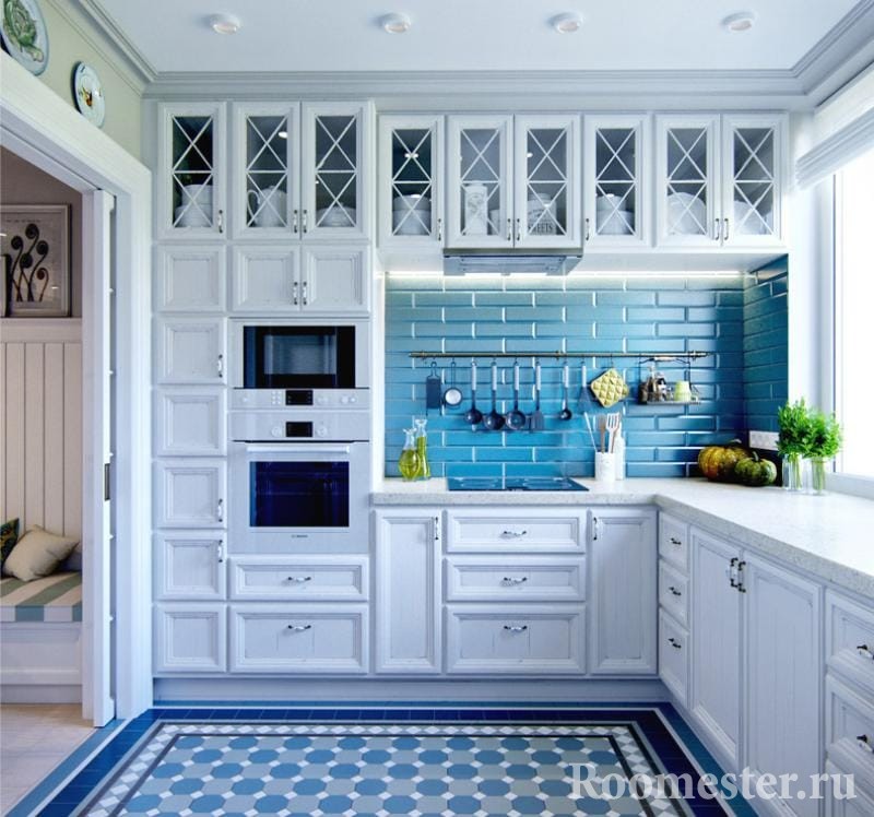
Blue, derivatives of it, when combined with gray, the solution is enough large rooms. If you take a rich blue, dark tone, as an additional color will be found in the interior textile decor, upholstery of chairs, and for symmetry, add a similar shade to the opposite zone, the cooking zone. A dark blue countertop, a mirrored apron, an example of a competent distribution of color in the design of the kitchen. But soft blue, pastel can be safely used for large areas, furnishings. Furniture, both a kitchen set and a dining group, you can safely choose blue, it will not put pressure on you, “eat up” free space kitchens, on the contrary, the combination of gray walls and blue and white furniture gives lightness.

You don’t want an interior that feels cold, especially if the kitchen has a location with access to the shady side of the house, feel free to add a warm range. To gray, as the main one, orange, red, shades of brown are suitable.
![]()
If you were faced with the question of what the orange color is combined with in the interior of the kitchen, then consider that you have found one of optimal solutions, grey, white. In such a neighborhood, this rather bright color will look harmonious, and besides, a simple, not expressive gray color will sparkle with new colors. Do not overdo it with orange, everything should be in moderation so as not to get fed up with contrasts.

Allowed in small details, drawings, prints on ceramic tiles or a border in the cooking area, bright paintings on the walls. Let it be two or three orange frames on a gray wall with calm photographs of the cityscape.

By the way, kitchen appliances, which has recently been increasingly presented to customers in various colors, will help diversify the design. Even such home flowers that are familiar to us in the interior of the kitchen will look new if you find bright orange pots for them.

Purple color in the interior of the kitchen
More difficult task, figure out what color purple colors are combined in the interior of the kitchen. purple tones for meditation, help to refresh the head, thoughts. Itself is quite characteristic, if you use it as the main one, give preference pastel colors, matte finishes. A relatively small kitchen with purple walls is a solution for bold, bright people.

An additional tone, to the main one, can be selected from both cold and warm scales. No wonder they say best designers that examples of ideal color solution can be found in nature, just look at this variety of different shades, halftones in flora. What beautiful, bright flowers we can meet both in the field and in the forest, even in the flowerbed of the city garden, you can choose for yourself not a bad option.

Feel free to add green shades to purple, but only two or three tones lighter than the main one. Textiles on the windows, light curtains or thick pastel green curtains will only improve the atmosphere.


It is important to remember and know that if you are planning to install a purple set in the kitchen space, then it should be darker in tone than the walls. This rule, of course, also applies to other contrasting colors, but it is better not to visually highlight the apron with ceramic tiles or panels with drawings and model prints. Another thing is if the kitchen set is light in color, white or beige, in this case, be sure to select the material for the apron of a different shade.

What colors go with green in the interior of the kitchen
The combination of green with other colors in the interior of the kitchen should not cause a lot of problems, these shades, as a rule, fit easily, harmoniously intertwined with others when decorating apartments.

- Mixing options in the kitchen space with beige, brown, white shades can be considered classic. But such as green and red, use blue with caution, and only in large rooms. As a rule, these contrasting combinations will bring nothing but discomfort.

- There is an option to search rational decision, for example, pastel and not bright green, herbal or pistachio, combined with indigo. Or, on the contrary, soft blue with bright and saturated green. The same applies to red, which does not need to be used in a pure range, only its shades, varied in their tonal saturation.
- Pay attention to such shades as stunning bright lilac, violet, calm gray, soft orange.

Brown color in the interior
Most likely, the simplest question about the selection of colors in the interior of the kitchen will be related to brown. And let it seem to many not quite beautiful, yet it is rightfully considered the most “homely”, giving a feeling of security, comfort. It is found in every kitchen in the form of a kitchen set.

And although now the problem with the color scheme is not so acute furniture production, the fashion for kitchens made of wood will never come out. And this is good, these shades are universal, and fit almost the entire spectrum of colors. You just need to choose the right shade and tone from the set, then the kitchen will play in front of you, it will truly become the heart of the house, its soul.

- Brown and red at first glance is not a particularly acceptable combination. But it is worth slightly changing the red to coral, carrot and terracotta, as we see the perfect symbiosis with brown shades.
- Brown, its shades will easily fit into the interior with the use of blue, deep saturated, for example, ultramarine and trendy indigo. There is a wonderful combination of green and brown, it is a peaceful interior, tranquility, only natural shades, closeness to nature.
- If you lack cheerfulness, fun, a share of mischief in brown interior, make orange shades. A fiery orange countertop in the cooking area, with the obligatory support of a color scheme in textile design or decorative utensils.

A creative option can be modular drawing on the wall. First you need to choose a suitable drawing, make a stencil out of it. A simple cutter can help in this tricky business, and a thick sheet of stencil paper should be replaced with thin plastic. It is quite another thing to mix and match the right color scheme suitable for the kitchen. Before painting on the wall, make a test version on cardboard or plain paper, such as a sheet of drawing paper. Some paints have such property as clarification after drying. When desired color selected, on a pre-marked wall we draw patterns using a stencil. This seemingly simple task can lead to unexpected results. The bright wall, accentuated with the help of a coating, a pattern, is practical, does not require high costs, and most importantly, absolutely individual. Don't be afraid to experiment, let one or two patterns stand out on the wall with a more saturated tone.

Soft brown, pastel tone can be used not only for walls, but also for ceilings! Yes, the solution is rather unusual, in such an interior the main thing is to keep a balance, remember that such a ceiling will gently “press” on the interior, and in no case should it suppress the main idea cozy corner to the house.

The chocolate-colored ceiling simply pushes its owners to make the interior design of the kitchen in beige colors, from soft sofa, a lot of pillows for a comfortable pastime. White color will become an integral part of creating the desired image.

Coffee rhymes perfectly in the kitchen space with shades such as lilac, purple. Trendy fridge decals or stencilled wall designs, a variant of which many interior designers resort to.

Remember, the textile design of the dining area deserves your attention. It's no secret that the kitchen space is a popular spot in the home, so use modern, stain-resistant, moisture-resistant upholstery fabric options.
![]()
Shades of blue in the interior
The blue tone, a symbol of purity, freedom, is unusually fresh. No less interesting is the question of what color blue is combined with in the interior of the kitchen.

- The first thing that comes to mind is the most delicate combination of blue, white, the color of baked milk. In the interior of such a kitchen, it is always light, calm, modest in size, the rooms will acquire amazing airiness.

- An extremely amazing option, a combination of soft gray, ocher, pastel blue. And of course, blue can be successfully combined with blue tones. Suppose, in the decoration of the walls we give preference to pastel blue, and blue shades will be able to help, create the necessary contrasts, using them in textiles, decoration elements, let it be borders on the walls or ceiling baguette, in any case, do not be afraid to add brightness, focus on details. Now we can afford a choice, a lot of decor elements for the interior, a variety of styles, techniques. Even a lamp or lamp, shelves, three-dimensional letters, paintings, panels and tiles, everything is created for the home. At home, where it will be cozy, calm, it remains only to decide which range to choose.

- Please note that with blue hues perfectly combined natural textures, wood, stone. Blue, yellow can give the space that zest, which will largely help to decorate the interior of the kitchen in a bright, relaxed design. Provided that yellow, it will be two or three tones darker than the main blue.

What colors match the light green color in the interior of the kitchen
The theme of colors that draw attention to themselves is complex, but it is possible to solve the question of what range the light green is combined with in the interior of the kitchen by the method of elimination. A complex color, communication with which for a long time can cause completely different positive feelings than from yellow. This color can only act as an additional one, due to the fact that it is too bright, involuntarily takes all the attention to itself. It is quite dangerous to use pure light green for decorating large elements, especially walls or furniture. The maximum that can be allowed is a dining table, upholstered chairs of the same color. Light curtains, but not thick curtains, with lambrequins in white or beige.

decorative ornaments, glass vases, bright light green dishes on a white table or tablecloth, look appropriate in an interior with pastel colors from beige to green, ocher. A good combination can be obtained using gray and black, but only in a room with a footage of at least eleven to twelve square meters. A black kitchen set will not look so strict, gloomy, if its asymmetric design is highlighted, for example, with light green. Pair of top and bottom cabinets it is in this color that will make simple-looking furniture creative.

Bright light green color looks great with purple hues, but only if they also act as additional ones in the design of the space. beautiful, practical option there will be a wall decoration above dining table paintings or voluminous decorative panels with the obligatory presence of purple, salad. It can be unusual, creative lamps or sconces in kitchen lighting.

It is advisable, especially when using such bright contrasting colors, not to add more than two or three items. If the desire is huge, but at the same time there is a fear of spoiling the interior, breaking it into bright spots, a great way out would be to use a clean color scheme, light green or any other that focuses attention on itself, in only one subject, and the same range, but already by three to four the tones are lighter in the same textile decor.

In the arsenal of designers there are always means to improve and ennoble spaces, with the help of decorative elements. It is worth noting such masters of style as Tiffany, her lamps made a splash and became timeless classics. multicolored glass details, collected in a fancy pattern on the lampshade, adorn more than one hundred the best interiors peace. Karim Rashid is not lacking in creativity, he has elevated the means of lighting, out of necessity, into real art objects. Simple lamps, in his hands, become the main details in the interior.

What to say about modular paintings and three-dimensional panels, these are truly versatile items that can enliven and embellish almost any home.
After buying a new home or before renovating, many people think about choosing a color for the kitchen. In order for this room to be associated with warmth and comfort, it is necessary to arrange it correctly. Before you start painting the walls and choosing furniture, you should find out what colors can be combined. Properly selected colors can not only affect the mood of a person, but also reduce or, conversely, increase the space.
The effect of color on space
The first thing to think about when choosing a color is the size of the room. Some shades help create the illusion of space expansion, while others reduce it. There are several rules for choosing shades that you need to know before creating a certain design in a room:

It is worth remembering the color of the furniture, as the combination of colors in the interior of the kitchen implies the harmony of the walls and ceiling.
Things to keep in mind when choosing a color
The color of the kitchen can not only decorate it, but also affect the mood of the people who use it. By choosing the wrong shade, you can long time deprive yourself of the feeling of cheerfulness in the morning, which will certainly affect the quality of life. The nature of family members and the way they live should also be taken into account. Someone like it bright interior capable of prompting action. Others value peace and comfort.

If sunlight in the room appears very rarely, then you should use warm-colored paint. With an abundance of light, you can choose shades of green and blue color. Cold tones are best used when the hostess spends a lot of time in this room. This is due to the fact that with constant cooking, the air temperature rises greatly, which creates the feeling of being in a "hot shop".

Color can also affect the attitude to food. This feature can be used by those who want to get rid of extra pounds. warm shades increase appetite, and cold, on the contrary, reduce. The combination of pink and gray colors also reduces food cravings.
Red kitchen decoration
Red color in the kitchen is usually dominated by active people who are constantly on the move. But it is worth remembering that with prolonged exposure, it leads to hyperexcitation and irritation. To choose the right design for this, you need:
- take account design features,
- choose the right wallpaper
- install suitable lighting
- pick up furniture.

Red color can use in most different styles interior, but it should be remembered that for a small room, "hi-tech" and "minimalism" are best suited. But what is the chosen shade combined with? Red is combined with black, golden, white and gray colors. When choosing, you should give preference to the one that will fit the design of the rest of the rooms.
Can be used for wall decoration mosaic tiles, wallpaper or paint, but it should be remembered that furniture and appliances should not be the same shade as the walls. The kitchen set can be white or black. If all the walls are red, then you need to install several light sources.

If we talk about the countertop for the red kitchen, then it is worth considering the material of dark silver color, which is universal. Black or white materials are also acceptable. To make the design more modern, you can purchase a durable glass countertop.
yellow kitchen
When making yellow kitchen you need to remember that this color goes well with white. At the same time, lemon shades look good along with dark ones. In order not to oversaturate the room yellow The walls should be painted in pastel colors. But not everyone strives to make the room bright. In such cases, black or dark furniture elements are selected. Yellow kitchen, the combination of colors in which has great importance, should be done in a modern style.

Advice ! When finding the kitchen windows on north side it is better to use yellow curtains. This will help create a feeling of warmth and comfort.
blue kitchen
Blue color in the design of the kitchen is rarely used, but contributes to the creation of a beautiful and original interior. For such a room, furniture should be selected with aluminum profiles And shiny surfaces. Those who hesitate to create so original interior, can purchase furniture, the lower part of which is painted blue, and the upper part is orange, milky or beige.

Before creating a specific design, you need to consider the most successful combinations flowers in the kitchen

Kitchen in blue colors- this perfect solution for a hot room in which there is always a lot sunlight. Such shades act relaxing and therefore create a feeling of comfort. To add warmth to the blue kitchen, you can use oak or walnut furniture.
gray kitchen
Despite the photo gray interior, many will say that it should be boring and uninteresting. But if we consider the work of various designers, it becomes clear that even such shades can look attractive when decorating a kitchen.

In combination with soft muted tones, gray creates a classic and comfortable atmosphere. If you choose bright elements as an addition, then the kitchen becomes more modern. At the same time, a variety of shades contributes to the choice of the most attractive option.
The floor in a room with gray walls and furniture is best made of wood. This combination is the most popular. For creating unusual interior you can paint the walls bright color or add some red items. Do not forget about the light sources, which should be a lot.
white kitchen
White kitchens are very popular because they look elegant and luxurious at the same time. The rooms made in this style are very bright and at the same time create an atmosphere of tranquility. Features of the white kitchen:
- The space of the room visually expands, so this option is ideal for small spaces
- Simplicity of design. When designing a white kitchen, you do not need to think about color compatibility.
- White color is suitable for almost any decor style.

Black and white kitchen
The combination of black and white is used quite rarely, but with the right selection of accessories and accents, you can create beautiful interior which will create an atmosphere of calm and tranquility.

The advantage of this option is that the room can be decorated in any style. But to create an attractive design, you should follow a few rules:
- One of the selected colors, when combined, should be the main one, and the second one should complement it. If black prevails, then it will give the space some depth, while white will visually expand the room.
- When using this combination, other shades will always be additional.
- To soften the contrast, you can use gray. For example, a refrigerator and countertop can have this shade.
- To create more attractive interior it is better to make the floor and walls white, and when choosing kitchen furniture stop your attention on black objects.
- If dark surfaces dominate, then they should be made shiny, and light ones - matte.
- If you want to make the kitchen bright, then ideal option to decorate the floor is a tile of black and white colors, arranged in a checkerboard pattern. Such a surface will be combined with other elements, regardless of how they are arranged.
Important ! It is worth considering that black and white kitchen it is better to design in the style of "minimalism" or "hi-tech".
Having considered the options described, you can choose what is suitable for a house made in almost any style.
kitchen color schemes
Kitchen interior colors can be achromatic (gray, white, black) or chromatic (having Color tone). Achromatic interiors in kitchen design are rarely taken as the basis for decorating a room.
It is believed that such an environment plunges the owner of the house into apathy, gives rise to color hunger (and can even cause depression!). There are several ways to get out of this situation:
- Creation of a dynamic achromatic pattern;
- Dilution with a bright contrast accent of achromaticity.
Having dealt with the basic tone, you need to clearly consider further options for combining colors. Your mood will also depend on the harmony of your environment. The color wheel includes primary, secondary and auxiliary colors. Now designers are busy developing a huge number of color schemes, but all of them, without exception, can be summarized under 4 basic groups:

Process colors
It combines three colors that are on the color wheel at the same distance from each other.

Thanks to this solution, an impressive effect is achieved. It is also recommended to adhere to the principle of dominance of one of the colors.


monochrome
Solid color schemes involve choosing one color in the interior. Various effects are achieved varying degrees base color intensity. The result will be even better if you use several shades (the more, the better). the right way by choosing shades and the necessary textured ensembles, you can achieve a stunning effect. To rhythmically diversify the design, dilute monochrome combination in white. Silver color are usually chosen for glamorous interiors.


For creating monochrome interior it is important to determine the base color, for the role of which your favorite shade is perfect. To give the interior harmonious look one of the colors should dominate, and the rest should be auxiliary.


Try to combine different textures in the interior. The most striking contrast can be obtained by combining glossy and matte surfaces(for example, matte tiles and smooth wallpapers).
You can use contrasting accents. Or play a little with plain interior, creating small bright and contrasting "islands" of color. A few catchy details are enough, optional big size.
Contrasting
A contrasting color combination scheme selects completely opposite shades according to color spectrum. The main color is balanced by a contrasting one.


Furniture with such a kitchen interior should be darker in tone than the walls (but lighter than the floor). Contrast is recommended to be limited to details that can be easily replaced.
Related
These colors are sometimes referred to as analog colors, since 2 or more colors are involved in the color scheme. The main difference is the proximity on the color wheel (for example, green and blue). One of the colors is dominant, and the second serves for accentuation. Through the use of adjacent colors, a relaxing atmosphere is achieved in the interior.
The best combinations:
- Those colors that are at the vertices of a triangle inscribed in color circle;
- Colors that are opposite each other perfectly harmonize (for example, orange with blue, yellow with purple);
- Neutral colors (for example, bluish-gray) are in harmony with all colors of the spectrum;
- You can use interspersed colors similar in tone;
- Use no more than 5 shades and colors so as not to overload the interior;
- The color of the furniture should be lighter than the floor, but darker than the walls. Now let's talk about different color schemes for your kitchen.

9 kitchen color options
In separate reviews, see galleries of white and black kitchens.
Gray kitchen: peace and comfort
A gray kitchen does not mean the dullness of your interior at all. Just imagine how many different interesting combinations of gray you get if you mix opposite colors in different proportions!


Any of the shades of gray will be the perfect backdrop for creating a really beautiful interior.


White and gray kitchen is one of the most popular options. White gray is classic version suitable for kitchen space. The specified combination quickly disposes to rest. And bright glassware or vases will “discharge” the atmosphere.


It is important to choose the right shades. They don't have to be gloomy; they should give the interior a sophisticated, elegant look. Gray color goes well with brown, black and white. gray walls should not be very dark, the room will seem cramped.
Red kitchen: love and passion
The most extravagant style aficionados will surely choose red color when decorating their kitchen, because red kitchens look so enchanting. This interior will never let you down. In general, the red color is very active.


But do not overdo it with color, otherwise you will constantly feel tired and stressed. It does not need to be combined with the same flashy colors. Maintain balance by using muted tones.


Many note garnet, cherry and ruby tones.


A bright selection of furniture complements the interior of red kitchens. Now available are kitchen sets with red facades. Used photo printing with images in red tones. At the moment, decorators in many well-known publications offer interesting option- combination light furniture on a red background. This method allows classic furniture"to play".
Yellow kitchen: the sun in your home
One of the most fashionable color combinations for the interior these days is a combination of juicy yellow and creamy (milky).


Yellow is successfully combined with many expressive shades. In the kitchen, yellow is perfectly complemented by pink, blue, black, green, gray or brown accents.


Golden yellow color with red will give the kitchen oriental motifs. Such an interior gives luxury and comfort. Yellow plus brown also look amazing. If you add green to them, a stylish eco-interior will come out.
Orange cuisine: hello to bright everyday life
Orange color traditionally considered an appetite stimulant. Now eminent designers strongly recommend diluting this shade with others in order to avoid feeling overworked.


But the orange color is compatible with blue, black, light yellow, beige, green, gray.


Orange has the property of crowding out all other colors. If you make several kitchen facades orange, you can achieve a spectacular contrast in the interior.


Combined with black orange interior get a very elegant look. Now it is so fashionable, if your kitchen is medium or large in size, then orange and black furniture will look dignified and rich. IN black and orange kitchens It is customary to use very light colors for walls and floors. But in small kitchens, which are still very common in the post-Soviet space, it is better to make orange the base color, and only emphasize it with black.
Beige kitchen: tenderness and warmth
For decoration in the kitchen beige colour you should choose some "delicious" jewelry and accessories. Perfect fit watch coffee cup, a vase painted with coffee beans, chocolate-colored dishes, a picture or a poster with cakes depicted on them.


For beige kitchen try to choose lamps with warm light. And it’s better not to buy equipment of the same color, better fit Appliances metallic colors.
Brown kitchen: "soldier station wagon"
Brown is versatile and goes well with many existing styles and decor elements. That is why dining groups made in a similar color scheme are multifaceted.


Brown color suggests use natural materials when decorating rooms. Looks great in brown kitchens glass surfaces, gilded handles, frosted stained-glass windows. A floor made of wood will look good. Perfect fit ceramic tile under parquet, walls sheathed wood veneer. Small inserts from natural stone, leather elements will add zest to the interior.
![]()


Classic furniture for brown kitchen is the use natural wood, from which, as a rule, they are made lunch group. But, unfortunately, such array headsets are expensive. more gentle to family budget there will be an option to use furniture made of MDF or chipboard.


Now some buyers choose economy kitchens, where plastic is actively used. Coatings often mimic the texture of natural wood.
Green kitchen: add freshness
Green is the most natural color. Forests, fields, meadows. Everything breathes greenery, especially in the spring. You can definitely combine green with cream, brown or beige. If you want some contrast, then combine green with white. Such white and green kitchen will look festive and cheer up every day! But yellow accents will add shine to the kitchen, add saturation. A combination of green and gray colors is also fashionable these days.


I must say that green accents will refresh kitchen interior will make it more expressive. You can decorate the kitchen with various textiles, for example, green curtains.
![]()


Decorating one of the walls is applied finishing material green color. This allows you to focus on a specific piece of furniture, such as a headset.
Blue kitchen: a piece of gentle coolness
Blue kitchen sets look fresh and original. And there is nothing unusual about this. After all, this color brings an atmosphere of some peaceful relaxation into the room. blue kitchens suggest the presence of an apron and countertops in warm light shades.


But not everyone dares to buy such a bold, exclusively blue kitchen set. Manufacturers are offering alternative routes these days. For example, the bottom line of the cabinet is made blue, and the top line is beige or milky.


If you want to keep the kitchen cool, then choose blue color. The “refreshing” effect should be especially actively used in those rooms whose windows overlook sunny side. Blue color is also ideal for relaxation and stress relief.

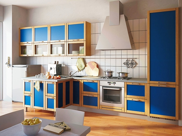

Shades of blue create the illusion of distant objects. Visually increase the available space, pushing the existing boundaries. Thanks to the blue color, the effect of cleanliness is achieved, as if the kitchen had recently been wet cleaning. Noble shades of blue will give the room dynamics.
Purple kitchen: luxury, chic and love
Psychologists highly appreciate the positive qualities of purple, as it is he who gives you strength, inspires optimism, and gives inspiration. But everything is good in moderation.


Do not overload the room with shades of purple. Otherwise, the output will be completely opposite result. It is recommended to "dilute" the interior with a natural palette for greater harmonization of the available space.


Kitchen sets can be made in purple completely, or they can include it partially. Naturally, a kitchen with purple facades will become the main accent spot in the whole room in one moment, which is why keep it in perfect cleanliness. Who is not ready for a completely monochromatic purple headset should not lose heart!


At the moment, designers advise two-tone solutions (purple-orange or white and purple kitchens). If you design a kitchen with a white top and a purple bottom, you can achieve visual expansion space. For purple cuisine perfect for white, yellow and beige wallpaper. White wallpaper will do purple in the kitchen more expressive, and beige - soften.
Create your unique interior cuisine!
In the next article, we will select and compare materials for kitchen facades.
Photo gallery (84 photos):
Color plays a very important role in our life. This is especially true for the interior. After all, it is the colors that surround us that affect our mood and well-being. In the kitchen, each of us spends different amount time. But this is exactly the place where we visit every day and spend more than one minute there. Therefore, the choice of colors should be taken with the utmost seriousness.
Playing with color
In the photo - light green as the main color of the kitchen
Anyone who has even the slightest understanding of the meaning and possibilities of color knows that it is thanks to him that you can turn modest meters into spacious chambers, bring the flow closer or further away, zone the space. In other words, you can completely change the geometry of the room. This, of course, is not a redevelopment in its full sense, but in the absence of the opportunity or desire to make drastic changes, it is with the help of color that you can profitably beat the interior.
For example, a white top and dark bottom. But if you do everything exactly the opposite - the room will instantly “sit down”, pressing on small space. Expand small kitchens possible with the help of lungs and tender walls, but to give comfort and coziness allow deep saturated colors.

In the photo - a range of gray, dark green and black
Choosing color scheme for the kitchen, it is important to understand that there are no “right” or “wrong” colors. The main thing is to find harmony. So that the color combinations in the interior of the kitchen tire you first of all, give you a feeling of comfort. Choosing any color, take into account its features, properties, the effect that it creates in the room.
For example, shades of blue have a calming effect, give a feeling of freshness and coolness, and also reduce appetite, which is important for those who are trying to lose weight. But shades of red and yellow, on the contrary, are able to increase appetite, warm up, charge with vigor and energy.
Learning to choose the right colors

In the photo - calm colors of the kitchen
The combination of colors in the interior of the kitchen can be different. In order to create harmony in the interior of the kitchen, two things should be remembered. The interior of the kitchen is divided into achromatic when everything is decorated black and white, and chromatic (color). The latter, in turn, can be monochrome, when everything is decorated in one color, as well as multicolor, when several colors are used.
The second point to consider is that no matter what room you design, light colors will expand it, and dark ones, on the contrary, will narrow it, visually reduce it. And so if square meters limited, kitchen design in light colors would be preferable.

In the photo - contrasting colors of the kitchen
In the color design of the kitchen, the following rules for combining colors are distinguished:
- Whatever color you decorate your kitchen in, be it lime, mustard, ivory or any other, make the top (ceiling) light and the bottom (floor) dark;
- only one color can prevail in the design of the kitchen, it should be the main one, cover the most space, otherwise the interior may look clumsy;
- if you decide to use several colors, in the design of the room itself there should be no more than five, but in the headset - only two;
- a bright headset is installed in kitchens of soothing shades and vice versa: if the design of the room is bright, choose a set of soothing colors;
- if you decide to decorate the kitchen in one color, buy the same headset, only a few tones darker than the walls. Remember, the floor is darker than the ceiling;
- The brightest accents in the kitchen should be: these can be paintings, a tablecloth or curtains, cushions or chair covers;
- make the countertop and apron contrasting, it will look beautiful and stylish; in extreme cases, they should by no means be the same, otherwise it will be boring and uninteresting.
Achromatic cuisine

In the photo - a kitchen in white and black
The kitchen, decorated in black and white, as well as their shades, got its name due to the fact that neither white nor black colors are as such, they are achromatic. This option is especially popular in scandinavian style, hi-tech and minimalism. In such an interior big role lighting plays. It is with its help that you can emphasize the color and texture of an achromatic design.
One-color (monochrome) kitchens

In the photo - a monochromatic cream-colored kitchen
This is one of the most complex options kitchen design. The thing is that in addition to the base color (main), its shades are also used, the more - the more interesting the result. But so that the kitchen does not look boring and dull, it is better to use more than three shades of the same color. The only indulgence that is allowed is white. It can be used with any primary color of a monochrome room. Truth, modern designers silver is used instead of white, creating unsurpassed masterpieces.
Zoning in such a kitchen is carried out using the base color. Add variety to the room will help different texture. In addition, contrasting accents are acceptable, which will also help to enliven the interior. The main thing is to know the measure.
Contrasting kitchen

The photo shows an example of a contrasting kitchen. Orange and black in an amazing combination.
This method of decoration also requires certain skills, good taste and a sense of style. It's not enough just to take two different colors and decorate them all around. Colors should contrast beautifully, not cause aggression. One color should dominate. It is he who sets the tone for the entire room. If dominant color bright and deep, the kitchen looks lively, active. If you want a calm room, choose something soft and calm as the main color.

In the photo - the contrast of the kitchen between yellow and lavender
The effect of kitchen color on appetite
Red color in the interior of the kitchen is better not to choose for those who decide to go on a diet. The thing is that the design of the red kitchen improves appetite. It is better to choose blue color in the interior of the kitchen. Its action is exactly the opposite of red, i.e. in such a kitchen you almost do not want to eat. And if life without red seems gray and dull to you, choose its calm shades. Better yet, just add a few accents of your favorite color to the interior.
The design of a white kitchen affects appetite in much the same way as a red one - you constantly feel healthy hunger. But designers do not favor this design option. First of all, because the white color is tiring. Moreover, in the absence of direct sun rays the room will appear grey.
The design of salad cuisine has a good effect on appetite. The thing is that the color obtained by mixing warm yellow and cold blue flowers, affects us in different ways. When needed, it suppresses appetite or stimulates it.
Influence of style

In the photo - the blue and white colors of the high-tech kitchen
There are styles in the design of the design that already involve the use of certain colors. For example, it is difficult to imagine high-tech in bright green shades, or country with blue furniture. But there are colors that can be used in almost any stylistic decision. That is exactly what it is turquoise in the interior of the kitchen. It can be complemented with colored details, other colors or made in monochrome.

In the photo - a kitchen in a classic style
Whatever it was, you can choose your combination of colors in the interior of the kitchen. The main thing is that the result evokes pleasant, positive emotions.
Video about the rules for choosing colors in the interior
Color perception plays an important role in human life. Love to certain colors, and their use in the interior makes life more beautiful, richer, dislike for others - determines the choice of interior and furniture not in their favor.
But does everyone know the rules for combining certain colors and textures? Sometimes the most unexpected color combinations can bring harmony or luxury, tranquility or an explosion of emotions into the interior.
Today we will equip the kitchen, and choose the color of the furniture, walls, floor to achieve the best result.
Prologue
Once, during the course project “Kitchen Interior”, I used shades of purple as the main color. My grade was lowered because, according to the teacher, purple is the color of schizophrenics.
Due to my youth and inexperience, I could not defend my point of view. Over the years, purple has become not only fashionable, but even a glamorous color in the interior of residential and non-residential premises. This once again suggests that the perception of colors and the attitude towards them individually, depends on the lifestyle and character of a person.
Each color has a different effect on both physiological and psychological state. different people. Before you settle on any color in the interior of the kitchen, study the effects of colors on a person and trust your intuition.
What color to choose for the kitchen?
Red color - the color of fire, strength, passion, activity, power. For some, it causes a state of anxiety, for someone it helps to overcome difficulties. Red is the color most loved by the younger generation. It improves digestion, causes appetite in children, treats depressive states and melancholy. Red is a symbol of good luck and happiness among the Chinese.

Red is often found in the interior of the kitchen in the form of glossy facades. It goes well with white, black and gray, metal and glass. The dominant red is best diluted with light shades of the floor and walls.
Green color - the color of calmness, tenderness, harmony, balance, the personification of the natural principle. Green promotes control over feelings and emotions. Normalizes blood pressure, pulse and respiration. Creates a sense of relaxation and relaxation. Green (light green) adjusts to proper nutrition, improves digestion.

In the interior of the kitchen, apple green facades look harmonious with wenge-colored furniture, beige walls and floors.
Brown color - the color of the earth, stability, it is chosen by people who stand firmly on their feet, who value family traditions. Headset with brown facades looks better in a large kitchen room with light walls and floor. small space with dark facades it will visually appear even smaller.

Beige color - refers to pastel shades, expands the space, fills the room with light and tranquility, comfort and warmth, combined with many colors, the leading color when choosing a kitchen interior. Suitable for small spaces.

Yellow - the personification of the sun and sunlight. The color of energetic, creative, optimistic, self-confident and open to communication people. Yellow color is especially good in kitchens with loggias, where there is a lack of light. It is combined with white, gray, beige, green.

White color - the color of purity, perfection, innocence, humility, lightness. In mythology, white is a symbol of unity. For some, white is associated with hospital sterility, for others with perfection and accuracy.

A kitchen with white facades visually expands the space, creates a feeling of comfort and cleanliness (of course, if this cleanliness is maintained).
Black color is the opposite of white. It disturbs, draws in like a black hole, enigmatic, mysterious, arouses curiosity. Black color is preferred by strong personalities or those who are not confident in themselves, are in a state of anxiety and denial of everything. Black and white combined cancel each other out.

Orange color - the color of warmth, joy, energy, well-being - an excellent antidepressant. It is chosen by people who are kind and sympathetic, striving for changes in life. Orange color improves blood circulation, warms, has a good effect on digestion, causes appetite.

Purple - glamor, beauty, charm, creativity, we love the female sex, they are especially attracted by its tints - lilac and purple. Violet is an extremely controversial color: some people are driven into melancholy and depression, others are encouraged to be creative. Reduces appetite. Definitely suitable for people who follow the figure.
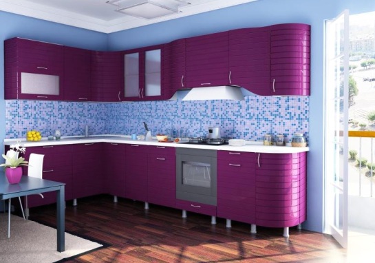
At the right combination and metered use, purple color may well fit into the interior of the kitchen.
The combination of colors in the interior of the kitchen
Someone by nature has a sense of color, others resort to the help of specialists. If you use the color wheel that designers work with, you can learn how to independently select colors and shades that are compatible with each other.

The primary colors are yellow, red and blue. Everything else is the result of mixing these three colors. By adding white to any color, we make it lighter in relation to the original. The more white, the lighter the shade (they are called pastel shades).
You can combine colors in several ways:
- Monochrome- this is a combination of colors of one sector, for example, red and pink, blue and cyan. In this case, one shade is darker, the other is lighter to achieve contrast.
- Opposite harmony- This is a combination of colors located in a circle opposite to each other. Green - red, blue - orange, purple - yellow. In this case, one color should be more than another.
- Neighborhood- this is a combination of colors from the rays located nearby: orange - yellow, blue - pistachio.
- triangle rule- This is a combination of colors located at the vertices of an equilateral triangle inscribed in the color wheel. Turning an imaginary triangle in a circle, we choose combinations: blue-red-yellow or purple-orange-green.
A harmonious combination of colors is a guarantee cozy interior. But at the same time, rely on your own feelings.
Visit design sites, where many collections of shades that can be combined with each other have already been created to help you.
feng shui kitchen color
Feng Shui is an ancient Taoist art of managing the energies of the surrounding space and bringing wealth, prosperity, health and good luck into the house. Feng Shui balances the five elements (Fire, Water, Earth, Metal and Wood).
The kitchen is one of the most important rooms in the house where food is prepared - a symbol of abundance and well-being. Therefore, the energies of yin and yang must be balanced.
First of all, the kitchen should be clean and bright. Wooden objects are yin energy, metal objects are yang. According to Feng Shui theory, a slight preponderance towards yang is acceptable. It is not advisable to use too bright and rich colors: red, dark blue, as well as black. Preference is given to pastel colors. White color creates a sense of space, visually enlarging the room. The predominance of a particular color in the kitchen is determined by the sector in which the kitchen is located.
The southern part is dominated by colors corresponding to the elements of fire (orange, peach), balanced by white.

In the northern part, the element of water is supported by blue. Use light shades blue combined with brown or green.

In the western and northwestern parts, the element of metal dominates. Preference should be given to gray, white shades and metallic colors.

The elements of wood are responsible for the eastern and southeastern sectors, so green is the most appropriate color for this part of the house.

The southwest and northeast are supported by the earth element, which is associated with shades of brown and yellow.

Choosing the color of the kitchen according to the laws of Feng Shui, avoid the conflict of the elements. So in the southern part - the elements of fire - you should not use the colors of the water element (blue, black), and in the northern - fiery shades. In the east zone, minimize gray and metal objects. In the western part, on the contrary, minimize wooden objects and colors that symbolize wood.
Whatever principles of kitchen arrangement you are guided by, the main thing is to achieve harmony and comfort, because we spend a lot of time in the kitchen (especially those who love to cook).